
Components
Alert - Expandable
Use with caution: Candidate- Contributors
- Leyda Hughes (VSA Facilities Team)
Examples
Default (Informational)
View va-alert-expandable in Storybook
 View va-alert-expandable in Storybook
Warning alert
View va-alert-expandable in Storybook
Success alert
View va-alert-expandable in Storybook
Usage
When to use Alert - Expandable
- Unprompted alerts. - A standard Alert should only appear when prompted by a user action. By contrast, Alert - Expandable is only to be used when a user action has NOT prompted the alert. In other words, the Alert - Expandable is already present when the user loads the page.
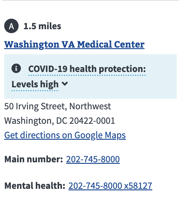
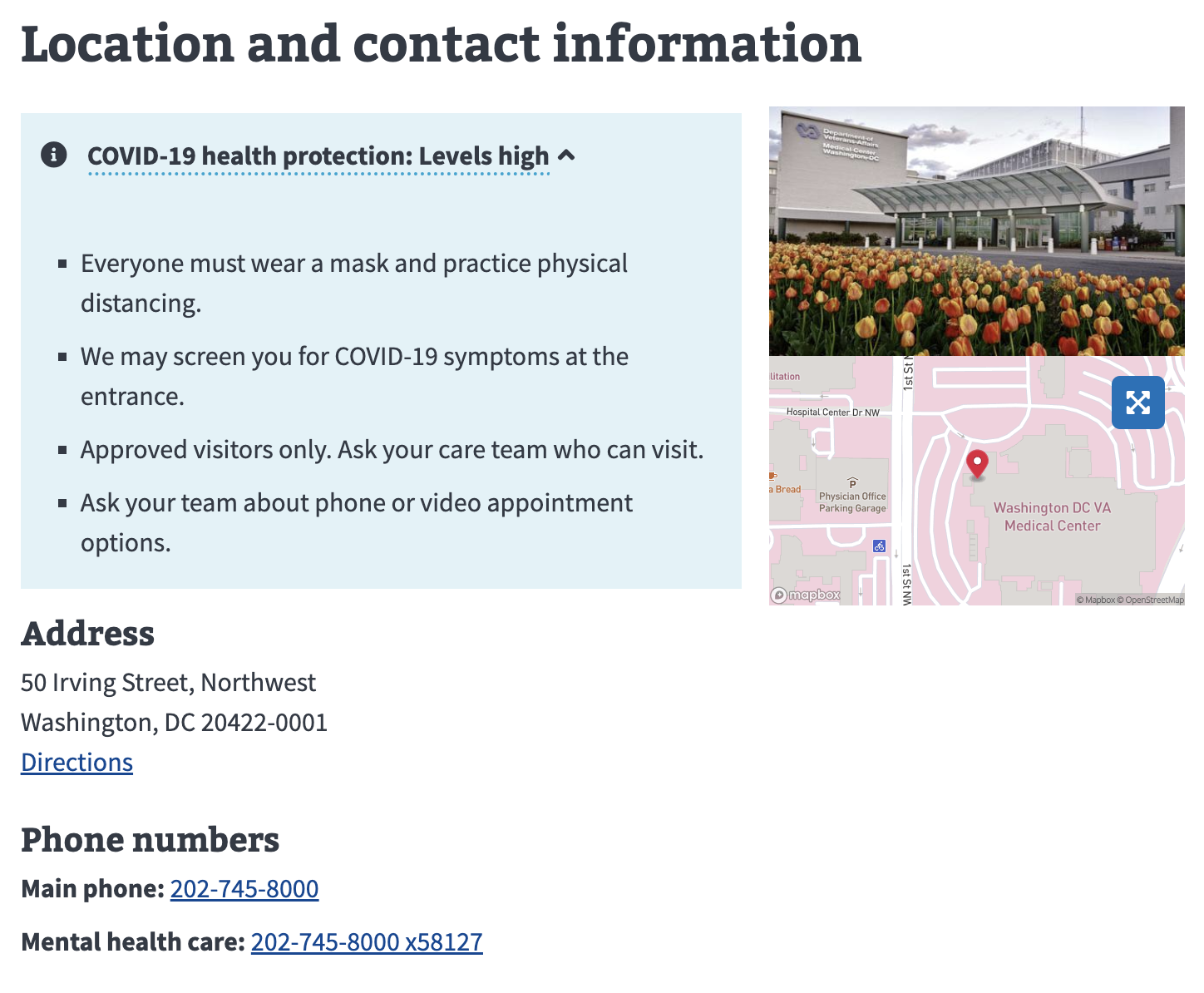
- In-page alerts. - A standard Alert should only be placed at the top of the page. By contrast, Alert - Expandable is only to be used within the contents of a page, not as a page-level alert. Thus it should be used sparingly to drive a user’s attention to important information related to the section it appears within. For example, this component has been used to highlight copay charges that are due.
- Provide more information without leaving the page. The more minimal style of the collapsed Alert - Expandable is intended to be less visually prominent than a standard Alert in order to not conflict with an Alert should it appear on the same page. It allows for providing more important information once expanded that can inform the user of an important situation.
When to consider something else
- User feedback. Use the Alert component when responding to an action taken by a user such as submitting a form.
- Clarifying background information. Use the Additional info component when clarifying outcomes for an input or a form question as well as providing background information. Keep in mind that Alert - Expandable should warrant an alert and be used sparingly. The value of any type of alert is diminished if the page is littered with alerts of equal weight.
Behavior
Choosing between variations
- Warning. Just like the standard Alert, the Warning variation is used to warn a user, such as when there are negative consequences, or when something has gone wrong.
- Informational. Just like the standard Alert, the Informational default variation is used to provide helpful information or something that warrants a user’s attention. It is not used for negative consequences.
- Success. Just like the standard Alert, the Success variation is used to provide helpful information that is beneficial for the user.
Placement
- Alert - Expandable must only appear within a section of a page, not at the top so as not to compete with the standard Alert placement.
Instances of this component in production
Facility status for COVID-19 in Location finder
Facility status for COVID-19 in Facility page
Code usage
Attributes and Properties
| Property | Attribute | Type | Default | Description |
|---|---|---|---|---|
disableAnalytics |
disable-analytics |
boolean |
false |
If `true`, doesn't fire the CustomEvent which can be used for analytics tracking. |
iconless |
iconless |
boolean |
false |
If `true`, the status icon is removed. |
status |
status |
"continue" | "error" | "info" | "success" | "warning" |
Determines the icon and background color. One of `info`, `error`, `success`, `warning`, or `continue` | |
trigger |
trigger |
string |
The text to trigger the expansion |
Events
| Name | Description |
|---|---|
component-library-analytics |
The event used to track usage of the component. This is emitted when an anchor link is clicked and disableAnalytics is not true. |
resize |
Accessibility considerations
- No auto-dismissal. Don’t automatically dismiss an alert based on a timer or time limit.
Assign an appropriate ARIA role
In some situations, an ARIA role may need to be added to the alert component for it to work best for people who use assistive technology. ARIA should be used sparingly to supplement and enhance the native features of HTML.
- Static alert: No Role. If the alert is a static alert that exists on the page when the page gets loaded, it doesn’t need a role.
- Important, time-sensitive information: Use role=”alert”. Use this role on alert components that appear after a user interaction. Alerts are assertive live regions, so setting
role="alert"is equivalent to settingaria-live="assertive"andaria-atomic="true".<va-alert role="alert" ...>...</va-alert>- This is for live updates to a page that would not get noticed otherwise. Updates to a page can occur without the user refreshing the page, so these may go unnoticed when using assistive technologies.
role="alert"ensures assistive technology announces these updates and keeps the user informed. - Because this can be intrusive to the user experience, this should be used sparingly for information that requires the user’s immediate attention.
- Interactive alerts: Use role=”alertdialog” instead. For alerts that fit the criteria of
role="alert", but also contain content requiring user interaction, userole="alertdialog"instead ofrole="alert". For example, expecting the user to acknowledge the alert by closing it before proceeding.<va-alert role="alertdialog" ...>...</va-alert>
- This is for live updates to a page that would not get noticed otherwise. Updates to a page can occur without the user refreshing the page, so these may go unnoticed when using assistive technologies.
- Advisory information, not important enough to have an alert role: Use role=”status”. Use this role on alert components that appear after a user interaction. This allows users with assistive tech to be notified of the change, but won’t immediately interrupt them from the current task. Elements with the
role=statushave an implicitaria-live=politeand an implicitaria-atomic=true.<va-alert role="status" ...>...</va-alert> - For must-read information that is present on page load, consider using a Summary box instead of an alert.
More on ARIA: alert role, ARIA: status role.
Alternative (alt) text for icons and images
For accessibility best practices, we differentiate between images that are decorative and images that are informative.
- Decorative images: Dividers or design items that do not provide additional context or content. They may exist on the page for purely aesthetic reasons. They don’t add to the information a user needs and they make little sense, or are unnecessary, when read with a screen reader.
- Informative images: convey some kind of information. To determine whether an image is informative or not, try removing it from the design. If information is missing with the image removed it means that the image is informative and needs alt text.
Consider the purpose of your graphic and whether alt text will provide any information, benefit, or feeling (e.g. the icons used in this Alert component) If the image will not provide information, benefit, or sentiment then do not provide alt text on the image. For more information on why we must provide relevant and meaningful alt text and how to create quality alt text please refer to the content style guide on Alternative text for images.
Research
Medical copay enhancement tool usability - July 2021
The alert was tested as part of a usability study with 9 participants. The alert was used to display copay charges referred to the Department of Treasury that needed to be resolved ASAP, so it was pertinent that the alert was immediately noticeable by Veterans.
View the component in the prototype here.
Findings
- The alert was often the first thing Veterans noticed when arriving on the page
- Some clicked on the alert to read more about the referred charge while others moved on to looking at other sections of the prototype
- Veterans generally understood that they could interact with the alert. However, one asked themselves, “Can I click on this?” before clicking on it. That may have been because they were interacting with a prototype where not every element was interactive rather than because they were unsure that the alert was clickable in general.
Related
Component checklist
Maturity
- Guidance
- Examples, usage, code usage, content considerations, and accessibility considerations are all complete.
- Research
- VFS team conducted research on this component which is linked from this page.
- Stability
- Component has been in production for more than 3 months with no significant issues found.
- Adoption
- Multiple teams have adopted this component.
- Note: If we can hear from teams using this component (Oct. 2022) then this component may be able to move up the maturity scale. Please reach out the Design System team if you have used this component successfully in 2022.
Accessibility
- Accessible use of color
- Color is not used as the only visual means of conveying information (WCAG 2.2 1.4.1).
- Accessible contrast
- Text has a contrast ratio of at least 4.5:1 for small text and at least 3:1 for large text (WCAG 2.2 1.4.3). Visual information required to identify components and states (except inactive components) has a contrast ratio of at least 3:1 (WCAG 2.2 1.4.11).
- Keyboard interactions
- Follows WCAG 2.2 standards for keyboard accessibility guidelines and includes a description of the keyboard interactions. All interactive elements can be selected and activated using the keyboard.
- Content zoom tested
- Component has been tested with the display set to 400% at 1280px viewport width to ensure that the component does not have overlapping text or elements and all interactive elements still operate.
- Tested in screen readers
- Tested with screen readers to ensure there are no issues with reading order, spelling, dynamic content, and interactive elements.
Code assets
- Variations
- Storybook includes all variations (style, size, orientation, optional iconography, selection, error state, etc.)
- Responsive
- Component depicted in all responsive breakpoints.
- Interactive states
- Includes all interactive states that are applicable (hover, active, focus, keyboard focus, disabled).
- Tokens
- All design attributes (color, typography, layout, etc.) are available as tokens.
- Internationalization
- Describes i18n attributes.
Visual assets
- Variations
- Sketch library includes all variations (style, size, orientation, optional iconography, selection, error state, etc.)
- Responsive
- Component designed to work in all responsive breakpoints.
- Interactive states
- Includes all interactive states that are applicable (hover, active, focus, keyboard focus, disabled).
- Tokens
- All design attributes (color, typography, layout, etc.) are available as tokens.
Legend:
- Complete
- Incomplete
- Not applicable