
Components
Tabs
Use with caution: Available
Tabs organize related groups of content within the same hierarchy into parallel views that a user can easily navigate between.
Examples
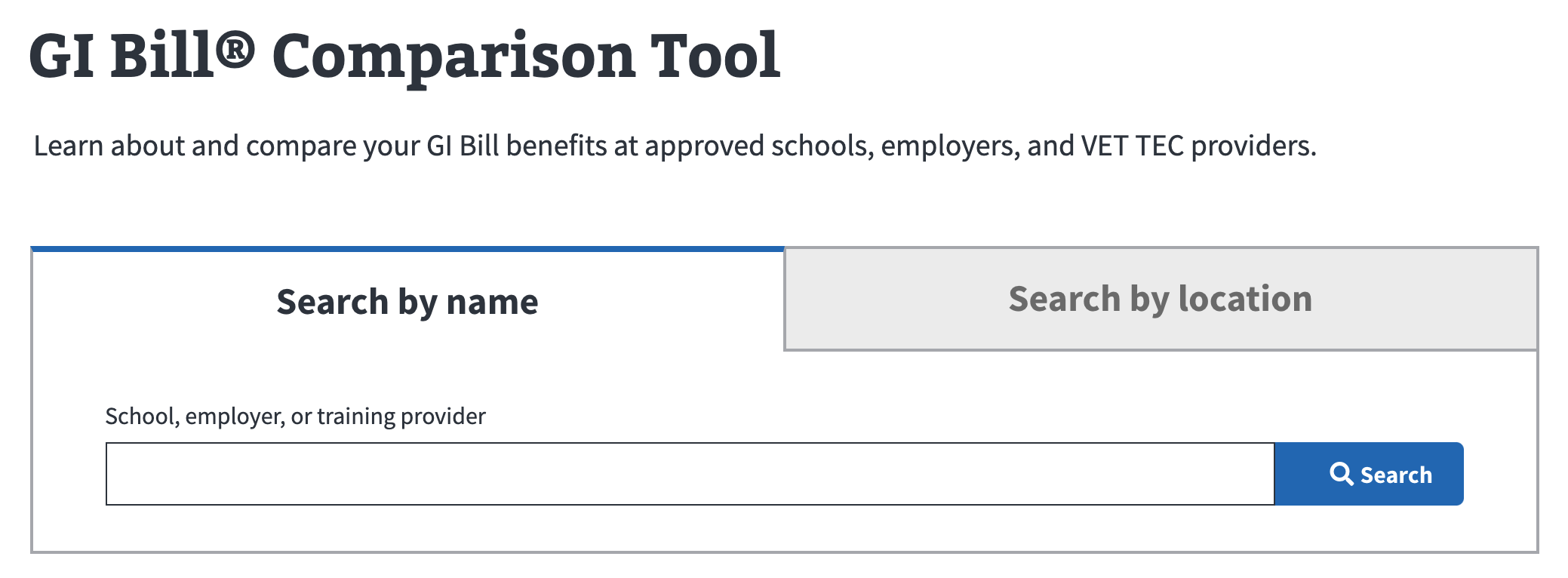
GI Bill Comparison Tool
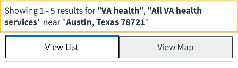
Facility locator mobile view
Usage
Because tabs stack horizontally or wrap to a second line, they’re not an optimal design solution for mobile viewports. In some cases, using 2 tabs (only) to present a set of complementary options is acceptable.
When to use tabs
- Secondary navigation within an application. Tabs allow users to navigate to sections of an application.
- Related content within an application. To group related content that the user doesn’t need to read at the same time.
When to consider something else
- Changing views of the same data. To allow the user to easily toggle between a binary set of options to see different views of the same data, use a Button - Group Segmented component. For example, for switching between viewing a list or a map.
- Chunking content. Consider using an Accordion to display one chunk of content at a time.
- Hierarchical content. If your content is hierarchical and/or sequential, consider using a single page of well-formatted headings and body text.
Behavior
- Allow the user to click anywhere on a tab to select it.
- Make sure the selected tab is highlighted and visually connected to the content below it.
- Never let a row of tabs wrap to a second line.
- Keep the interaction design simple. Document selected and not selected tab styles along with the focus state for each style. Hover and active states are optional for tabs.
Content considerations
- Keep tab labels succinct and use plain language. Labels should be 1 to 2 words.
- Use sentence case for tab labels.
Accessibility considerations
- Go to Mozilla’s ARIA: tab role documentation for guidance.
Related
Component checklist
Maturity
-
Guidance - Examples, usage, code usage, content considerations, and accessibility considerations are all complete.
-
Research - VFS team conducted research on this component which is linked from this page.
-
Stability - Component has been in production for more than 3 months with no significant issues found.
- Note: This component has mobile accessibility issues and should be used sparingly.
-
Adoption - Multiple teams have adopted this component.
Accessibility
While this component has been previously tested against older criteria, it has not yet been audited with the updated testing criteria.
Code assets
-
Variations - Storybook includes all variations (style, size, orientation, optional iconography, selection, error state, etc.)
-
Responsive - Component depicted in all responsive breakpoints.
-
Interactive states - Includes all interactive states that are applicable (hover, active, focus, keyboard focus, disabled).
-
Tokens - All design attributes (color, typography, layout, etc.) are available as tokens.
-
Internationalization - Describes i18n attributes.
Visual assets
-
Variations - Figma library includes all variations (style, size, orientation, optional iconography, selection, error state, etc.)
-
Responsive - Component designed to work in all responsive breakpoints.
-
Interactive states - Includes all interactive states that are applicable (hover, active, focus, keyboard focus, disabled).
-
Tokens - All design attributes (color, typography, layout, etc.) are available as tokens.
20% complete (2 of 10)
Legend:
-
Complete -
Incomplete -
Not applicable
Edit this page in GitHub
(Permissions required)
Last updated: Jun 13, 2025