
Components
Service List Item
Use with caution: candidate- Contributors
- Lynn Stahl (Agile Six)
- Adam Whitlock (Ad Hoc)
- Belle Poopongpanit (Agile Six)
- Christine Rose Steiffer (Agile Six)
- Kristen Faiferlick (Ad Hoc)
Examples
With only the required elements (header, status, details)
View va-service-list minimal base in Storybook
 View va-service-list minimal base in Storybook
With the Critical Action component
View va-service-list base with Critical Action in Storybook
With the optional link
View va-service-list base with optional link in Storybook
With all possible elements
View va-service-list maximal base in Storybook
Terms
- Benefit: Aid or assistance provided by VA to Veterans, family members, or caretakers. Examples include health care, education and training, disability compensation, life insurance, and pension.
- Tool: A digital product that Veterans, family members, or caretakers use to manage benefits. Examples include appointments, prescriptions, payments, secure messages, and claims.
- Service: A term used to describe both benefits and tools.
- Service List: A list of services. The “Help Users to… Manage Benefits and Tools” pattern describes how to build a Service list.
- Service List Item: An item in a service list. Each item contains a summary of the benefit or tool, with a link to for the user to get more information. This component explains how to use and build a Service List Item.
When to use Service List Item
- When you want to show benefits or tools the user is currently enrolled in or has access to.
When not to use Service List Item
- When you are representing items that are neither a benefit nor a tool. Do not use the same visual appearance or structured data to represent items that are not a benefit nor a tool. If you want to group short, related pieces of information that are not benefits or tools, consider using the Card component.
- When you want to put links, radio buttons, or checkboxes in a container. There are some components that have variations with containers around them. These might look like Service List Items, but they are distinct. Service List Items are exclusively for benefits and tools, offer a brief snapshot of information, and link to another page with more details. The guidance within the Not a card section of the Card component also applies to the Service List Item.
- When you want to show benefits within a form. Do not use this component to show benefits or services in an interactive list with checkboxes or other selection methods.
- When you want to display content in an unordered list. Content that can be shared with bullet points should use an unordered list. Find more information in the List component and the Bulleted list style guide.
Anatomy or layout details
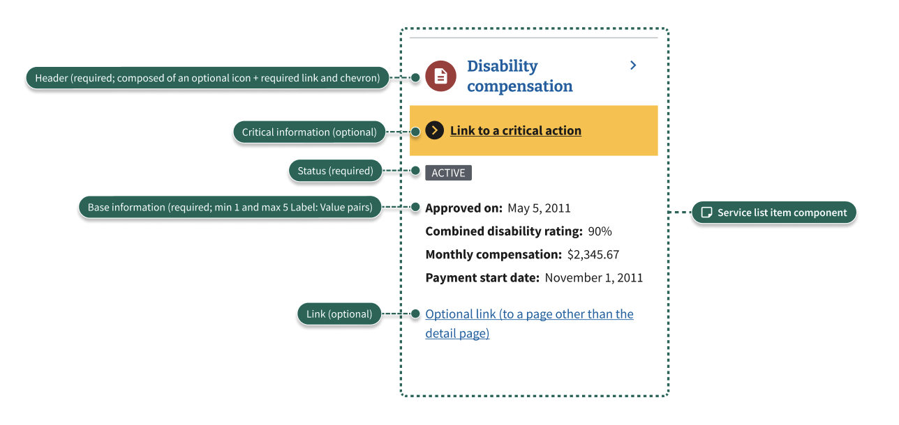
A Service List Item can have:
- Header (required)
- The header consists of an icon (optional), header text, and chevron. These elements combine to create a link to a page with more details about the benefit or tool. All Service List Items must link to a details page from the header.
- The icon should only be used when listing VA benefits. The icons should include the standard icons for VA benefits, placed within a circle using the color associated with each benefit.
- Headers should be visually consistent in each list item within the list. For example, if some list item headers have icons, all list items in the list should have icons.
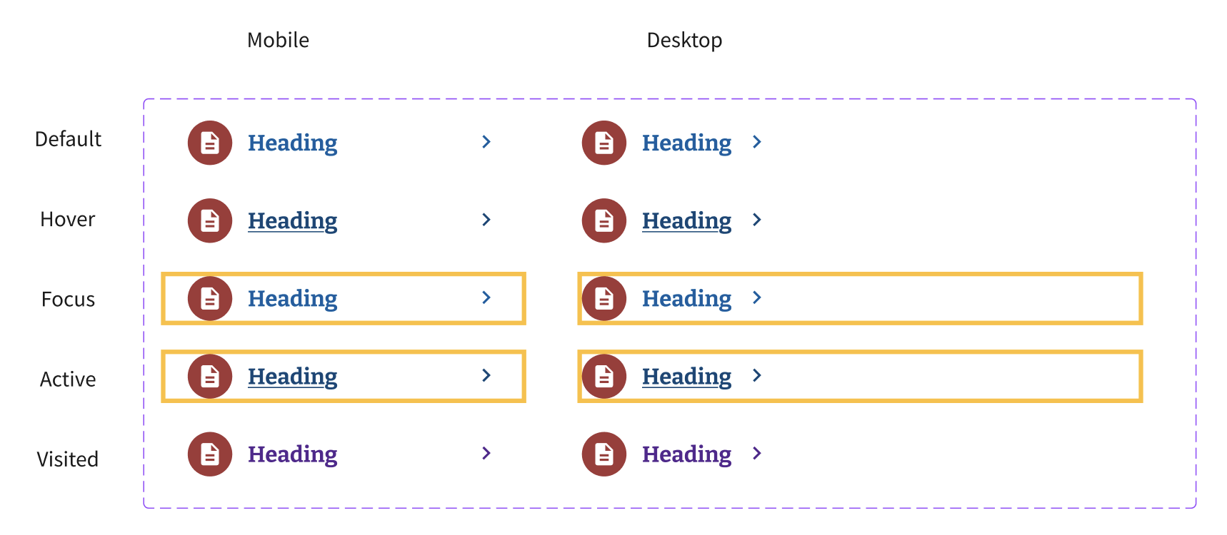
- The header has a default, hover, active, focus, and visited state. See details in the Header states section below.
- Status (required)
- Status must be represented by a gray Tag component.
- Every benefit or tool in a list has a set of internal states, which are used to track the progress of enrolling in that benefit or using that tool. A status is the way to communicate the item’s state to the user (such as Active, Pending, etc).
- Statuses do not have to mirror internal states in a one-to-one manner. (They can, but they are not required to.) Every state change does not necessarily warrant a status change.
- Critical Action
- The Critical Action component is still under development. It navigates the user to the most direct path to take action on the critical action. Future updates will include adjustments to color contrast, focus states, and more.
- Details (required)
- The details provide users with helpful information, formatted in a “Label: Value” structure (for example, “Approved on: May 5, 2011”).
- There can be anywhere from one to five lines of “Label: Value” pairs.
- Link (optional)
- Some Service List Items might require an additional link, in addition to the details page linked to from the header and the actionable link offered in the Critical Action component. In these cases, one additional link may be displayed at the bottom of the Service List Item. The link should use the standard default, hover, focus, active, and visited link states.
Header states
- Default: The link and chevron are the standard vads-color-link.
- Hover: The link becomes underlined and both the link and chevron turn to vads-color-link-active. There is no background shading.
- Focus: The background becomes yellow and the text, chevron, and icon background become black.
- Active: Similar to the focus state, but the text is underlined.
- Visited: Similar to the default state, but the color of the link and chevron turn to vads-color-link-visited once the link has been visited.
Content considerations
Teams used the Card component before this component existed. When evaluating if your team needs to use Service List Items instead of cards, consider if your content is either a “benefit” or “tool,” as defined in the Usage section.
Statuses should be normalized with the platform content team so that the same terms are used when the same meanings are intended (for example, “pending” versus “in-progress”). The platform content team will define which of those is correct across benefits and tools.
Code usage
Attributes and Properties
action
action
ServiceAction | string
Action associated with the service
icon
icon
string
The icon associated with the service
optionalLink
optional-link
VaLink | string
An optional link related to the service. All props of the va-link component are supported as properties of this object.
serviceDetails
service-details
ServiceDetails | string
Details about the service
serviceLink
service-link
string
The link to the service page
serviceName
service-name
string
The name of the service
serviceNameHeadingLevel
service-name-heading-level
number
3
The heading level for the service name (defaults to h3)
serviceStatus
service-status
string
The status of the service
Accessibility considerations
- Use appropriate heading levels within the Service List Item. Headings within the component are h3 by default, but teams should adjust the heading level if the structure of the page requires them to be a different level.
- Format the optional link to express what it will do. For example, if the link is a download link, include the standard download icon. If it takes users to an external site, display the standard “(opens in new tab)” text. See additional accessibility guidance in the Link component.
Related
Service List Item may be confused with several other components:
- List: See When not to use Service List Item for information on when to use a list instead of a Service List Item.
- Card: See When not to use Service List Item and Content considerations for information on when to use a card instead of a Service List Item.
The below components are nested within the Service List Item component:
Component checklist
Maturity
-
Guidance - Examples, usage, code usage, content considerations, and accessibility considerations are all complete.
-
Research - VFS team conducted research on this component which is linked from this page.
-
Stability - Component has been in production for more than 3 months with no significant issues found.
-
Adoption - Multiple teams have adopted this component.
Accessibility
While this component has been previously tested against older criteria, it has not yet been audited with the updated testing criteria.
Code assets
-
Variations - Storybook includes all variations (style, size, orientation, optional iconography, selection, error state, etc.)
-
Responsive - Component depicted in all responsive breakpoints.
-
Interactive states - Includes all interactive states that are applicable (hover, active, focus, keyboard focus, disabled).
-
Tokens - All design attributes (color, typography, layout, etc.) are available as tokens.
-
Internationalization - Describes i18n attributes.
Visual assets
-
Variations - Figma library includes all variations (style, size, orientation, optional iconography, selection, error state, etc.)
-
Responsive - Component designed to work in all responsive breakpoints.
-
Interactive states - Includes all interactive states that are applicable (hover, active, focus, keyboard focus, disabled).
-
Tokens - All design attributes (color, typography, layout, etc.) are available as tokens.