Templates
Signed out vs. signed in
Use: DeployedSite header
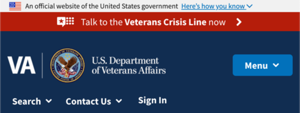
The site header appears at the top of every page. Since VA.gov is responsive, the header’s design adapts to the width of the screen.
Large screens
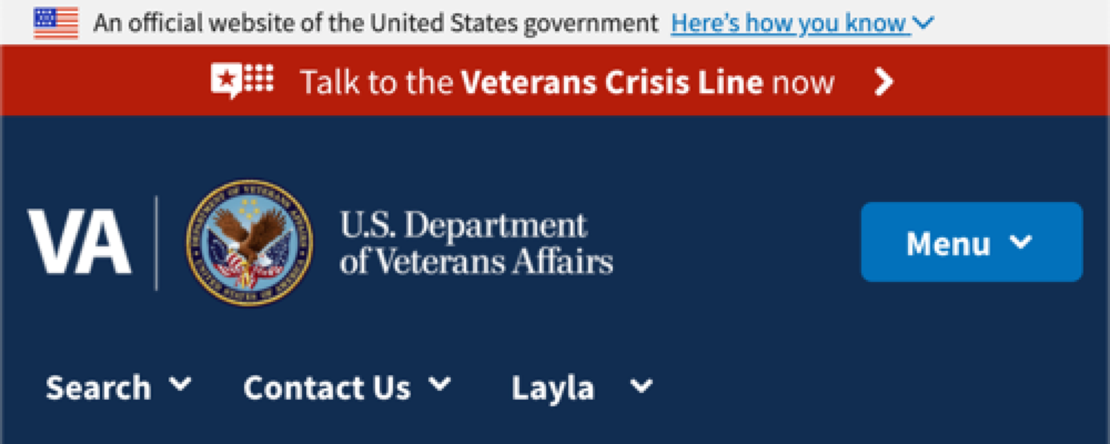
When users sign in, the Sign In button is replaced by a link displays the user’s first name. My VA and My Health are also shown as top navigation elements.
Small screens
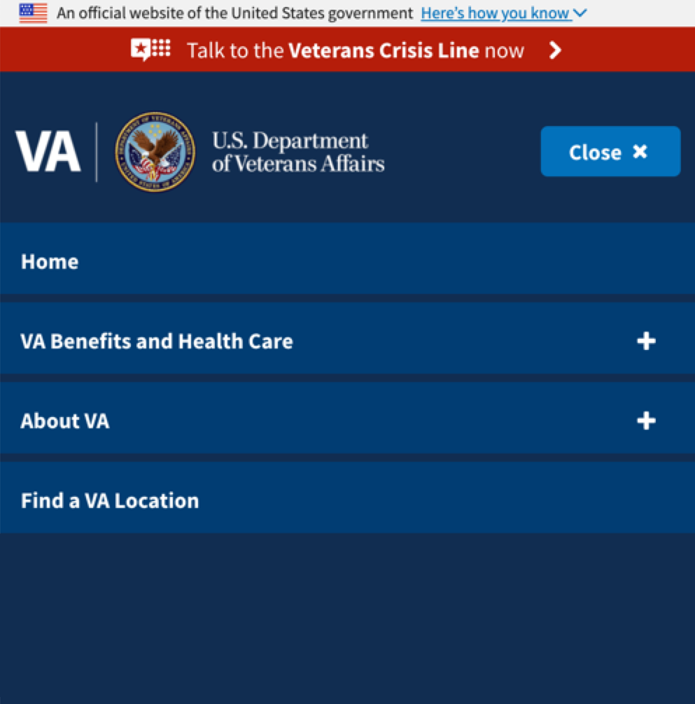
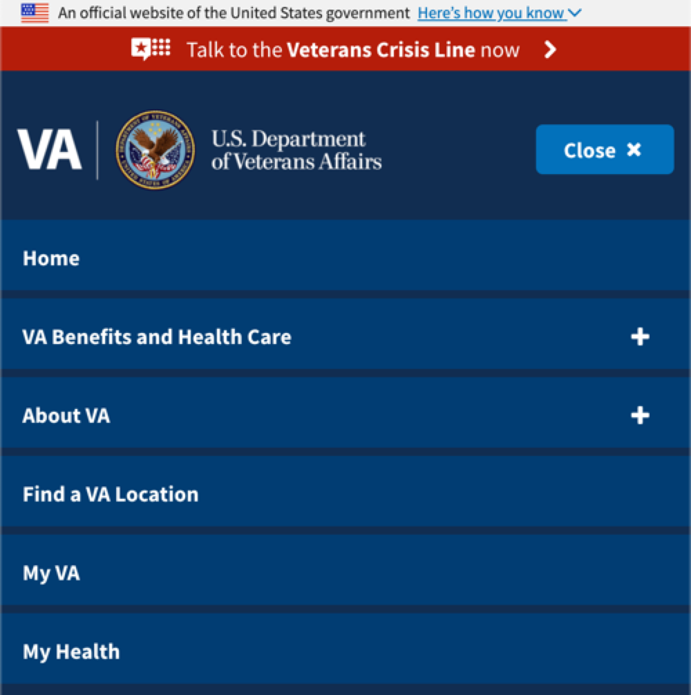
When users are signed into the site on a smaller device, the Sign In link is replaced with the user’s first name.
When users are signed in and have opened the menu, My VA and My Health are shown as options at the bottom of the list.
Contextual calls to action
A contextual CTA is used when an action is required or recommended before a user starts a process (like applying for a VA benefit.) Contextual CTAs are placed within a larger chunk of content on a page. Placement depends on its importance compared to other content on the page. Often it is placed immediately after introduction text on a page.
When is a contextual CTA appropriate?
Use a contextual CTA when:
- The user is required to do something before starting a process
- The user would benefit from doing something before starting a process
- The CTA includes important supplemental information
- An error has occurred and the user is blocked from proceeding
Use the alert component for contextual CTAs.
Possible states of a contextual CTA
A contextual CTA may change based on the authentication status of the user.
CTA required to continue
Use the green alert component when the user is required to do something before they can continue a process.
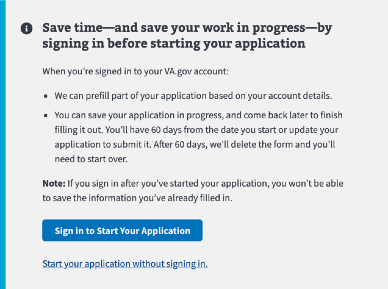
CTA beneficial, not required
Use the blue informational alert component when the call to action is beneficial, but not required to proceed. Usually, it is a better experience when the user is signed in, so the prompting the user to sign in first is the primary action.
Error
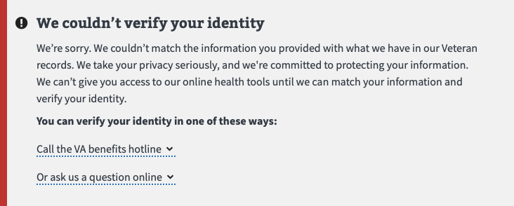
Use a red alert component when the user is blocked from continuing a process. Always offer at least one way for the user to resolve the error.
