
Components
Privacy Agreement
use: deployed USWDS v3
Examples
Default
View va-privacy-agreement default in Storybook
 View va-privacy-agreement default in Storybook
Error
View va-privacy-agreement error in Storybook
Usage
When to use Privacy Agreement
For all forms that collect Personally Identifiable Information (PII). As stated in the VA Privacy Policy:
The VA.gov web pages that collect personal information will have a hyperlink to the Limited Privacy Policy that applies to that particular web page.
This is a requirement of the Privacy Act of 1974.
How this component works
This component is used on the Review page of a form which is the last page in a form flow.
Behavior
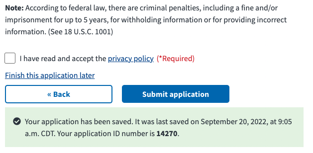
- Privacy Policy link. When clicked, the link will open in a new browser tab. This behavior is identified by an icon with the arrow pointing up and screen reader text “opens in new tab”.
- Checkbox Toggle After reviewing the privacy policy content in a new browser tab, the user can select the checkbox to confirm that they have read and accept the privacy policy.
Placement
This component appears at the bottom of a form, above the link to “Finish this application later” which is directly above the button pair for submitting the form.
Instances of this component in production
Code usage
Attributes and Properties
checked
checked
boolean
false
Whether the checkbox is checked or not.
enableAnalytics
enable-analytics
boolean
false
Emit component-library-analytics events on the blur event.
showError
show-error
boolean
false
Whether to display the error message or not.
Events
component-library-analytics
The event used to track usage of the component. This is emitted when the
checked value changes and enableAnalytics is true.
vaChange
The event emitted when the checkbox changes.
Accessibility considerations
Privacy policy opens in new tab or window. This component must detail to all users that the privacy policy link opens in a new window. This indication should be visible and auditory.
Component checklist
Maturity
-
Guidance - Examples, usage, code usage, content considerations, and accessibility considerations are all complete.
-
Research - VFS team conducted research on this component which is linked from this page.
-
Stability - Component has been in production for more than 3 months with no significant issues found.
- Note: This component was converted from React to a web-component in September 2022.
-
Adoption - Multiple teams have adopted this component.
Accessibility
While this component has been previously tested against older criteria, it has not yet been audited with the updated testing criteria.
Code assets
-
Variations - Storybook includes all variations (style, size, orientation, optional iconography, selection, error state, etc.)
-
Responsive - Component depicted in all responsive breakpoints.
-
Interactive states - Includes all interactive states that are applicable (hover, active, focus, keyboard focus, disabled).
-
Tokens - All design attributes (color, typography, layout, etc.) are available as tokens.
-
Internationalization - Describes i18n attributes.
Visual assets
-
Variations - Figma library includes all variations (style, size, orientation, optional iconography, selection, error state, etc.)
-
Responsive - Component designed to work in all responsive breakpoints.
-
Interactive states - Includes all interactive states that are applicable (hover, active, focus, keyboard focus, disabled).
-
Tokens - All design attributes (color, typography, layout, etc.) are available as tokens.
Legend:
-
Complete -
Incomplete -
Not applicable