
Components
Critical Action
use: deployed Web- Contributors
- Lynn Stahl (Agile Six)
- Adam Whitlock (Ad Hoc)
- Belle Poopongpanit (Agile Six)
- Christine Rose Steiffer (Agile Six)
- Kristen Faiferlick (Ad Hoc)
Examples
View va-critical-action default in Storybook
 View va-critical-action default in Storybook
View va-critical-action within a card component in Storybook
Usage
When to use Critical Action
- When you want to highlight a single task that will otherwise block the user from proceeding. Use the Critical Action component for important and time-sensitive tasks that prevent the user from accessing their VA benefits or VA services. For example, they might need to request a refill to continue using a specific prescription, check into an appointment, or pay an overdue debt to prevent VA from offsetting VA benefit payments.
When not to use Critical Action
- When an action is not urgent, time-sensitive, or required. Use the Alert component instead.
- When you need to alert the user about a system error. Use Alerts to express system errors.
- When you’re designing a form. Use the Alert component to display important messages in forms.
Anatomy or layout details
General guidance
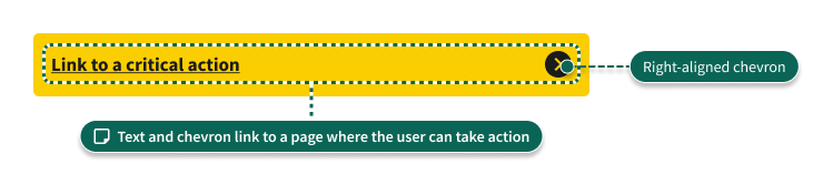
- The Critical Action component links to a detail page from which the user can complete the call to action.
- The Critical Action component is not dismissible. It should be removed when the user completes the call to action.
Placement details
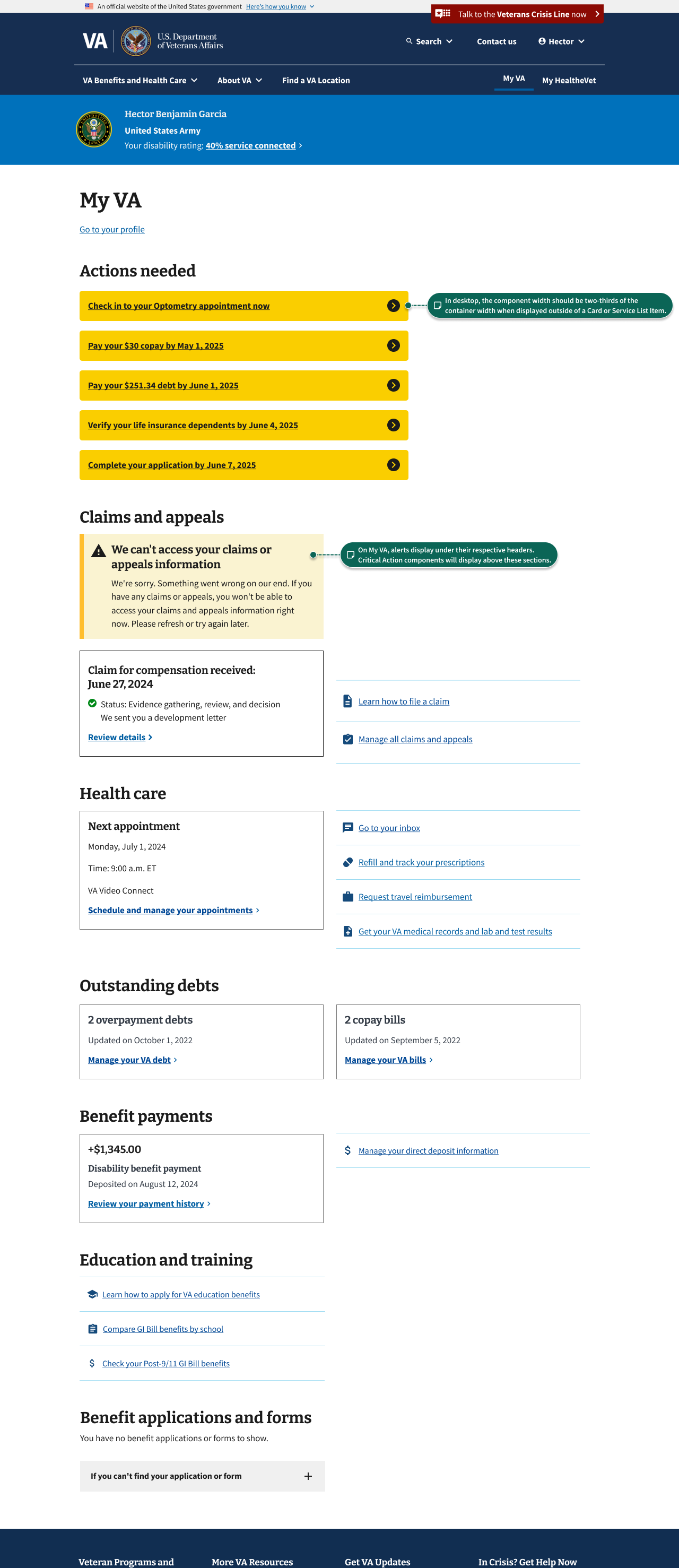
In most cases, display the Critical Action component in a Card or Service List Item component. Place the component near the Status Tag component and take up the width of the component it is nested within. Include only one Critical Action component in a Card or Service List Item. Do not include multiple Critical Action components in a single Card or Service List Item.
Note: Critical Action cannot be used in Card Status because Card Status only allows one call to action, and Critical Action is itself a link.
On the My VA page, Critical Action components can be placed within a card to call out a specific action the user has to take. Within the card, it should fill 100% of its parent component’s width. Currently, this component should not be stacked in any other context and should not appear outside of a card.
Code usage
Content considerations
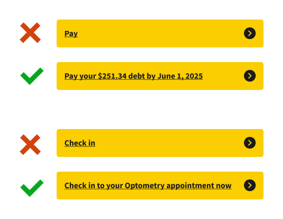
- Use the sentence structure “[Verb] by [date by which user must take the action]”. For example, “Verify your life insurance dependents by June 4, 2025” or “Pay your $30 copay by May 1, 2025”.
- Keep the text concise. Work with the Platform Content team to develop clear, short messages that tell the user the required action and deadline (if applicable).
- Content should be a single sentence without a period. If the Platform Content team advises using two sentences, each sentence should end with a period.
- You may display the Critical Action component inside a Card or Service List Item on My VA or other page that shows multiple VA benefits. In these cases, the component should be shown in context with the benefit the action relates to. It’s important that the content clearly communicates the action to the user. The examples below show appropriate levels of detail.
Accessibility considerations
- Critical Action always contains a link. Follow best practices for the Link and Link - Action components.
Related
Component checklist
Web Platform
7 of 12 complete
Maturity
-
Guidance
-
Web
Examples, usage, code usage, content considerations, and accessibility considerations are all complete. -
Research
-
Web
VFS team conducted research on this component which is linked from this page. -
Stability
-
Web
Component has been in production for more than 3 months with no significant issues found. -
Adoption
-
Web
Multiple teams have adopted this component.
Accessibility
While this component has been previously tested against older criteria, it has not yet been audited with the updated testing criteria.
Code assets
-
Variations
-
Web
Storybook includes all variations (style, size, orientation, optional iconography, selection, error state, etc.) -
Responsive
-
Web
Component depicted in all responsive breakpoints. -
Interactive states
-
Web
Includes all interactive states that are applicable (hover, active, focus, keyboard focus, disabled). -
Tokens
-
Web
All design attributes (color, typography, layout, etc.) are available as tokens. -
Internationalization
-
Web
Describes i18n attributes.
Visual assets
-
Variations
-
Web
Figma library includes all variations (style, size, orientation, optional iconography, selection, error state, etc.) -
Responsive
-
Web
Component designed to work in all responsive breakpoints. -
Interactive states
-
Web
Includes all interactive states that are applicable (hover, active, focus, keyboard focus, disabled). -
Tokens
-
Web
All design attributes (color, typography, layout, etc.) are available as tokens.
Legend:
-
Complete -
Incomplete - N/A Not applicable
Provide feedback
Share your feedback, report issues, or suggest improvements for the Critical Action component. Your input helps us make the design system better for everyone.
- Get immediate support in #platform-design-system for technical or urgent issues.
- Share feedback about the Critical Action component in the dedicated discussion thread.
- Explore all feedback channels for additional ways to share your input.