
Patterns
Help users to…
Navigate a long list
Also known as: Show more options
Use with caution: Candidate
Allows users to navigate and process a long list of items by progressively displaying additional items as needed.
- Contributors
- Peter Russo (VAOS)
Usage
When to use this pattern
- Progressively reveal more options. When you need to focus the user’s attention on the top of a long list of options. Hiding all but the most relevant or top/first options can help the user focus on evaluating a shorter list thereby reducing cognitive load.
- Most relevant results. This pattern is intended to be used when the first results are expected to be the most relevant. Thus it’s best paired with a default sort, or other tool to show that the results have been personalized.
When not to use this pattern
- Additional content. Do not use this pattern to disclose additional static content unrelated to the list or when you need to allow the user to show and hide information. If you need to reveal additional information, use the additional information component.
Examples
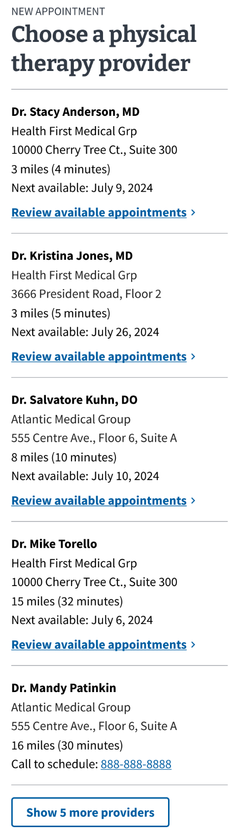
Disclaimer: These are not actual providers or health care facilities.
How to design and build
Anatomy or layout details
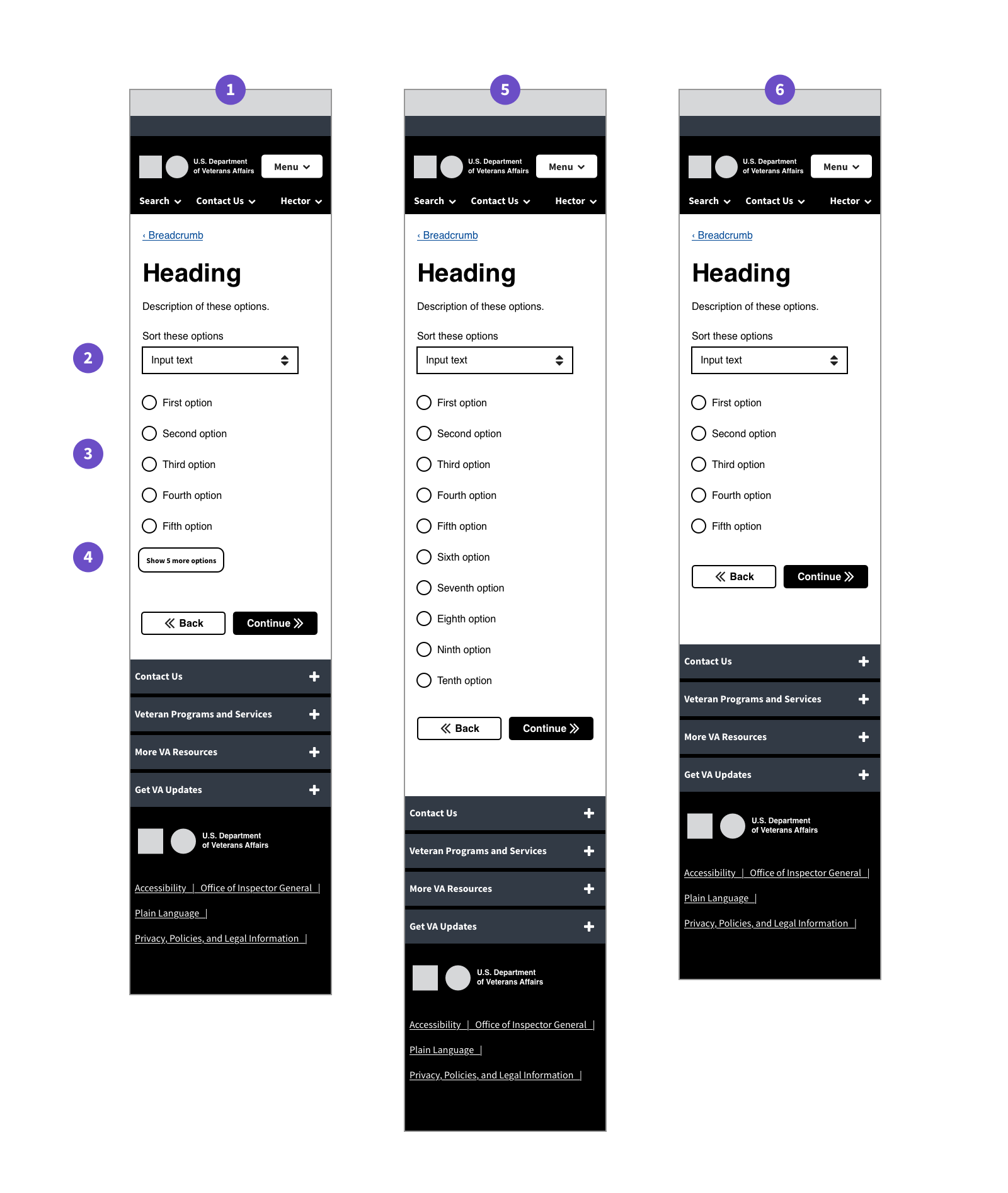
- Default state. A mobile screen of a page in a VA.gov form flow. The form question consists of a list with ten total options. 5 options are displayed. A button underneath reads “Show past updates (3)”
- Default state - sorter. A dropdown labeled “Sort these options”.
- Default state - radio options. Five generic radio buttons.
- Default state - show more button. Show more button exists between the options and the navigation buttons.
- State when all options are showing. A mobile screen of a page in a VA.gov form flow. Same as the first except 10 radio buttons are showing, and the button is not.
- State when there are only 5 total options. A mobile screen of a page in a VA.gov form flow. Same as the first except there is no button to show more options.
How this pattern works
- Given a long list of options, only the first 5 options are displayed.
- A button below the options acts as a trigger for revealing additional options.
- This button does not appear if there are 5 or less options.
- Clicking the button displays more options, 5 at a time.
- Once all options are displayed, the button disappears.
- Once the additional options are revealed, there may be no need, and thus no mechanism, to hide them.
Components used in this pattern
Page templates available for this pattern
- This pattern exists in VA Online Scheduling (VAOS) on the facility and provider sections of the “Start scheduling” flow.
- This pattern also exists in the VA Claim Status tool.
Content considerations
The text of the trigger button should be in the following format:
“Show [name of option] (#)”
For example, “Show past updates (3)”
Accessibility considerations
- Use aria-controls and aria-expanded attributes to convey the expand functionality to assistive technologies.
- The link element that acts as the trigger to reveal more options has a role of heading so it can be found in the page. Setting an aria-level is recommended.
Edit this page in GitHub
(Permissions required)
Last updated: Sep 04, 2024