
Components
Button
use: deployed USWDS v3
Examples
Web
Default - Primary
View va-button–primary in Storybook
 View va-button–primary in Storybook
Default - Secondary
View va-button–secondary in Storybook
Default - Big
View va-button–big in Storybook
Continue
View va-button–continue in Storybook
Back
View va-button–back in Storybook
Loading
View va-button–loading in Storybook
Mobile
Base - Primary
View va-mobile__button–base in Storybook
Base - Secondary
View va-mobile__button–base-secondary in Storybook
Destructive
View va-mobile__button–destructive in Storybook
Usage
Additional guidance for VA
When to use a button
- Actions. Use buttons for clickable actions you want users to take on a page, such as “Add”, “Close”, “Cancel”, or “Save.” Buttons do things, links go places. Refer to guidance on Links vs. buttons.
- Triggers. Buttons can also trigger functionality via Javascript. For example, closing a modal window.
When to consider something else
- Non-actions. For navigation between pages of a website, default to using links. Buttons can be used for navigation between pages within a form flow but otherwise use links. Read the guidance on links vs. buttons.
- Call-to-action. For a visually prominent call to action that links to another page, use an Action link.
Behavior
- Avoid using many primary buttons on a single page or section. Pages with many primary buttons reduces their impact and make it harder for users to know what to do next.
- Arrows are reserved. Arrow icons should only appear for “Back” and “Continue” buttons that appear in forms.
- Use icons only when necessary. Icons can be used in buttons when additional clarity is required and the icon is highly relevant to the action. Icons should not be used for decoration. Note that va-button does not support iconography, but has some variations that use an icon. Use of icons in buttons will be made on a case-by-case basis. If you feel you need an icon for a button, follow the process for requesting a new icon .
- Avoid disabling buttons. Disabling buttons is strongly discouraged.
Choosing between variations
- Use Primary for the most important action. Use the primary button for the most important action that you want the user to take on the page, or in a section. Also, use primary buttons to take the user to the next step in a process.
- Use Secondary for non-primary actions. Use secondary buttons for any actions that need to be downplayed against other actions on the page, or in a section. Also, use secondary buttons for actions that happen on the current page.
- Use Big primary buttons for the only action. Use the big variation of the primary button for the only action on the page.
- Use Continue and Back for advancing to the next step and returning to the previous step, respectively. Note that these buttons can be used as a pair from button pair. Also, note that the Back button should not be used if it is only navigating rather than taking an action (like submitting data ala the Continue button).
- Use Loading for actions that should only be triggered once. Use the loading variation when it is necessary to block the user from additional clicks of a button that might cause transaction issues.
- Use Base, primary and secondary, in dark mode in mobile applications. Use the base variations for dark mode or when primary buttons will not pass the required color contrast ratio.
- Use destructive for actions that have serious consequences. Use the destructive button for any action that cannot be reversed and may result in data loss. Currently used in the mobile app when canceling an appointment and when removing contact information.
- Don’t rely on the red color alone to communicate the destructive nature of the action. Always ensure the button text clearly communicates what will happen.
- Since destructive buttons have serious consequences, always add friction before completing the action. This can be in the form of a native confirmation message (alert or action sheet) in the mobile app or a modal on web.
Placement
- Buttons generally appear on their own line at the bottom of a form or section.
- Primary buttons usually appear first, or to the left, of a secondary button.
Instances of this component in production
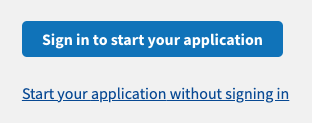
Primary button with a secondary link
- Links can substitute for secondary buttons. It is not always necessary to pair a secondary button with a primary button. In the example below a link can also suffice for a non-primary action.
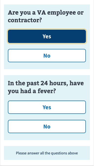
Secondary button as radio button
This variation substitutes the large tap target of a button where a radio button would traditionally be used. This serves a similar purpose to the USWDS Tile variation of a Radio button.
- Limit to Yes/No. This variation should be limited to Yes/No questions rather than used as a substitute for radio buttons which can more readily handle 3 or more responses.
- Reflect selections. The response of the user must change the button from a secondary button to a
$vads-color-primary-darkbackground in order to reflect the state of the user’s response.
Code usage
Attributes and Properties
back
back
boolean
false
If true, the button will use Back as its text and an icon to represent going back in form flows.
big
big
boolean
false
If true, the button will use the big variant.
continue
continue
boolean
false
If true, the button will use Continue as its text and an icon to represent proceeding forward in form flows.
disableAnalytics
disable-analytics
boolean
false
If true, the component-library-analytics event is disabled.
disabled
disabled
boolean
false
If true, the click event will not fire.
fullWidth
full-width
boolean
false
If true, the button will expand to the full available width of its container.
label
label
string
The aria-label of the component.
loading
loading
boolean
false
If true, the button will appear disabled, a loading icon will show next to the text, and the click event will not fire.
messageAriaDescribedby
message-aria-describedby
string
An optional message that will be read by screen readers when the input is focused.
primaryAlternate
primary-alternate
boolean
false
If true, the button will use the primary alternate variant.
secondary
secondary
boolean
false
If true, the button will use the secondary variant.
submit
submit
string
Having this attribute present will set the button type to submit.
The va-button component must be within a form element.
Prop options:
prevent will trigger the onsubmit callback on the form, but won’t submit the form.
skip will submit the form but not trigger the form onsubmit callback.
All other values will trigger the onsubmit and onclick callbacks, then submit the form, in that order.
text
text
string
The text displayed on the button.
Events
component-library-analytics
The event used to track usage of the component.
click
Content considerations
Button labels
Buttons signal important calls to action (CTA) and help people quickly see what’s the most important action they need to take on a page. Treat buttons like important or primary content, and prioritize their placement on pages as you would essential information.
For simple navigation to lead people between pages, use links instead of buttons.
- Use sentence case for button labels (except for Button - Icon).
- Make button labels as short as possible.
- Use “action words” that people recognize and clearly signal what will happen when they click the button.
- Keep the character limit for button labels to 35 characters. Button labels should be as short as possible with “trigger words” that your users will recognize to clearly explain what will happen when the button is clicked (for example, “Back” or “Continue”).
- Make it an action.
Like this
Create an account
File a complaint
Not this
Get started
Complaint filing
Accessibility considerations
Additional guidance for VA
- Button labels should never change dynamically or be used to communicate a status.
- Mind target size. We follow the WCAG 2.2 Target Size - Level AAA criteria which states:
“The size of the target for pointer inputs is at least 44 by 44 CSS pixels…”
That guidance agrees with Apple’s Human Interface Guidelines which recommend that:
“On a touchscreen, buttons need a hit target of at least 44x44 points to accommodate a fingertip. On all screens, it’s essential to include enough space around a button so that people can visually distinguish it from surrounding components and content, whether people use touch, a pointer, or a system that expands a button when it’s in focus.”
-
Use at least 1 spacing unit separating tappable elements.
-
Prioritize a clear and concise button label and only use
message-aria-describedbywhen it enhances understanding and accessibility. Themessage-aria-describedbyproperty emulates HTML’saria-describedbydue to web component limitations. It allows adding an additional description that is visually hidden, but screen reader accessible.- When to use:
- Providing additional context or instructions. If the button label is concise but requires further explanation.
- When not to use:
- Duplicating information. If the button’s label is clear and concise, adding additional information may be redundant and cumbersome for users of assistive technology.
- Providing essential information. Crucial information for the button’s purpose should be the button label itself, not solely relying on an additional description.
- When to use:
Choose the right element: Buttons vs. links
Many people struggle to select the right element when choosing between a button or link. Making the right choice can help make an interface easier to use, especially for people who use assistive technology. Buttons and links are the primary ways users interact with information on a web page. Links are for navigation; buttons are for action.
Accessibility problem being solved
In general, make links look like links and buttons look like buttons. Designing buttons as buttons and links as links improves usability and accessibility by:
- Setting honest expectations of interaction behavior
- Providing clear signifiers of affordances
- Creating experiences that are consistent with web standards
Assistive technology users rely on proper semantics to access web content. They may choose to navigate by button, or link, depending on what they’re looking for. It’s vital that our content meets users’ expectations - link items, coded as buttons, could make those links hard to find, for example.
Button and link confusion can be very frustrating for assistive technology users. A user with a screen reader may pull up a list of links and may not find a specific link because it turns out that it’s been designated as a button in the markup. It is important to use Action Links for calls to actions that link to another page rather than buttons, because screen readers always say “link” before links, and “button” before buttons.
Ideal state
Buttons are:
- Used for actions, including:
- Submitting a form
- Opening a modal
- Changing the state of something (such as “Back / Continue” buttons on a form)
- Expanding something (like an accordion)
- Created using the Button component or Button group component, or with standard semantic HTML button
- Styled to look like buttons and shouldn’t include link signifiers, such as underlines
Links are:
- Used for navigation:
- Navigation bars
- Skip links / jump links (such as the On this page component)
- Links to internal web pages
- Links to external websites (read the Content style guide for additional information)
- Links to PDFs, whether static or generated on the fly
- Rationale: The final product is a file, and the Veteran may not know that the PDF is generated on the fly.
- Exception: If the trigger to generate the PDF is “Generate PDF,” “Create PDF,” or other phrases that explicitly call out the “action” nature of the generation, use a button.
- Created using the Link component, the Action link component if you need extra visual emphasis, or with standard semantic HTML link
- When a file download is involved, it is best to use the download link component. This is because links are intended for navigation, and downloading a file is a navigational action to a resource.
- Styled to look like links and shouldn’t include button signifiers, such as borders
Implementation notes
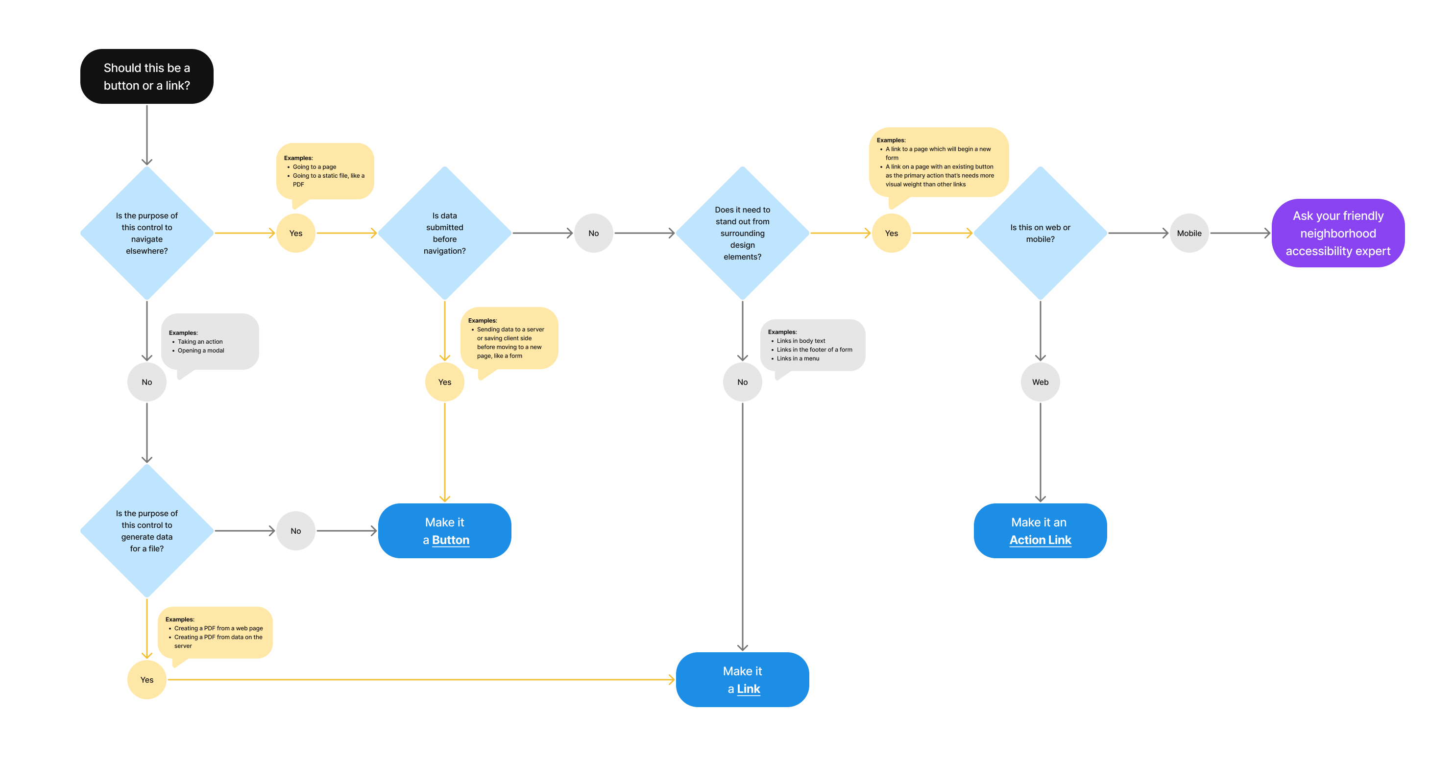
Should this be a button or link?
- Is the purpose of the control to navigate elsewhere?
- Yes
- Examples: Going to a page; Going to a static file, like a PDF
- Is data submitted before navigation?
- Yes
- Examples: Sending data to a server or saving client side before moving to a new page, like a form
- Make it a Button
- No
- Does it need to stand out from surrounding design elements?
- No
- Examples: Link in body text; Link in the footer of a form; Links in a menu
- Make it a Link
- Yes
- Examples: A link to a page which will begin a new form; A link on a page with an existing button as the primary action that’s needs more visual weight than other links
- Is this on web or mobile?
- Mobile
- Ask your friendly neighborhood accessibility expert
- Web
- Make it an Action Link
- Mobile
- Is this on web or mobile?
- Examples: A link to a page which will begin a new form; A link on a page with an existing button as the primary action that’s needs more visual weight than other links
- No
- Does it need to stand out from surrounding design elements?
- Yes
- No
- Is the purpose of this control to generate data for a file?
- Examples: Creating a PDF from a web page; Creating a PDF from data on the server
- Yes
- Make it a Link
- No
- Make it a Button
- Is the purpose of this control to generate data for a file?
- Yes
Do not disable form elements
Disabling form elements is discouraged as a design crutch. Thus most of our form components do not support a disabled property. If you feel that you have a unique design problem that requires a disabled field you may lobby the accessibility Community of Practice and the Design System Council but know that, thus far, exceptions to this rule are rarely granted.
Do not disable buttons
Normally, with regular form controls, it is best to fully remove anything the user can’t interact with or which serves no purpose. However, disabling a “button” to act as a guide to the level of form completion (i.e. you are not able to proceed to the next step until the form contains enough data) is a common anti-pattern.
Disabled buttons don’t explain what’s wrong
When buttons are inactive, some users– particularly those with cognitive disabilities- may not know how to activate them. Disabled buttons don’t explain what’s wrong. They communicate that something is off, but very often that is not enough information. As a result, users are left wondering what’s actually missing, and consequently are locked out entirely. For example, if someone were to type in a short acronym like “VA” to search and the button doesn’t become accessible, they may think the search field is broken.
In addition, disabled buttons can be unintentionally read out and accessed by mobile screen readers using touch controls.
What to do instead
While it is technically possible, we strongly discourage disabling buttons. Here are recommendations on how to handle specific interactions:
- Lack of required fields. When a user attempts to submit a form without entering all required form fields:
- Announce the error and shift focus to the first unfilled required form field.
- Properly indicate required form elements (the right thing will happen for you when you use the required property on form fields in the Design System).
- No longer valid options. If certain options in a form are no longer valid then there are two options:
- Replace the form elements that can no longer be changed with text representing the current value instead of the current value within a disabled input.
- Hide the form elements that are no longer valid.
Is it ever valid to disable a button?
Post-form submission or post-action it can be appropriate to disable the submit or action button as the system is in-between states and loading or taking action. This behavior is often seen on buttons that make a purchase or reservation to prevent the user from accidentally triggering the action multiple times.
Privacy guidance
Buttons shouldn’t include Personally Identifiable Information (PII) or Protected Health Information (PHI).
- This includes the button text as well as the URL referenced in the link, when applicable
Learn more on the URLs component page - If the button text must include PII/PHI, click events for that button can’t be tracked in analytics or other logs
Learn more on the Button labels page in the content style guide
Learn more about PII/PHI on the VA Platform website
Component checklist
Maturity
-
Guidance - Examples, usage, code usage, content considerations, and accessibility considerations are all complete.
-
Research - VFS team conducted research on this component which is linked from this page.
-
Stability - Component has been in production for more than 3 months with no significant issues found.
-
Adoption - Multiple teams have adopted this component.
Accessibility
While this component has been previously tested against older criteria, it has not yet been audited with the updated testing criteria.
Code assets
-
Variations - Storybook includes all variations (style, size, orientation, optional iconography, selection, error state, etc.)
-
Responsive - Component depicted in all responsive breakpoints.
-
Interactive states - Includes all interactive states that are applicable (hover, active, focus, keyboard focus, disabled).
-
Tokens - All design attributes (color, typography, layout, etc.) are available as tokens.
-
Internationalization - Describes i18n attributes.
Visual assets
-
Variations - Figma library includes all variations (style, size, orientation, optional iconography, selection, error state, etc.)
-
Responsive - Component designed to work in all responsive breakpoints.
-
Interactive states - Includes all interactive states that are applicable (hover, active, focus, keyboard focus, disabled).
-
Tokens - All design attributes (color, typography, layout, etc.) are available as tokens.
Legend:
-
Complete -
Incomplete -
Not applicable