
Templates
Form step
Use: DeployedAbout
This is a standardized template for all pages (besides the introduction, review, and confirmation page) of an online form that ask Veterans to enter information, select an answer option, or upload supporting documents. Within Figma, the placeholder section of the Form step template is the primary section of the page that you replace with a common form pattern or a custom local component.
Note: For designers using the Form step template in Figma, you can replace the placeholder with only a single component. You may need to create a custom local Figma component made of multiple design system components or patterns.
Go to the form step template page in VA Figma with padding and accessibility annotations
Variations
There are 2 versions of the form step template:
- Authenticated
- Unauthenticated
Authenticated
- Includes a header design showing the signed-in state.
- Includes a prefill informational alert near the top of the page that explains to a person that we can prefill certain information because they’re signed in to VA.gov. This alert should only appear on pages where we’ve prefilled information.
- Includes a text area message above the prefill alert notifying a person that we’ll save their application automatically and provides an ID number.
- Includes a success alert that reiterates when the form autosaves with a timestamp. This success alert only appears after a person interacts with a field. But for design purposes we show the alert as static on all Figma pages.
Unauthenticated
- No authenticated header
- No prefill alert
- No autosave messaging
Example: Authenticated
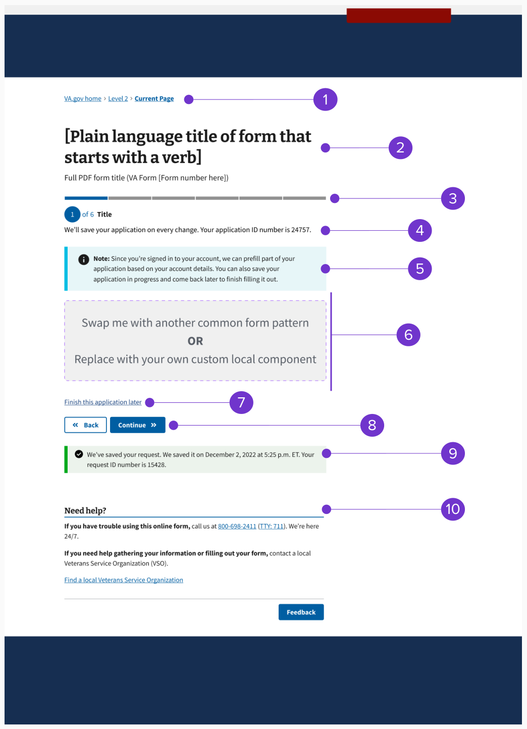
The authenticated form step template consists of these elements:
- Breadcrumb
- Form title and subtitle
- Progress bar - segmented (includes step header)
- Saved as message with application ID
- Prefill alert
- Form step content (includes page title)
- Finish this application later link
- Button pair (Back/Continue)
- Autosave alert
- Need help? component
Example: Unauthenticated
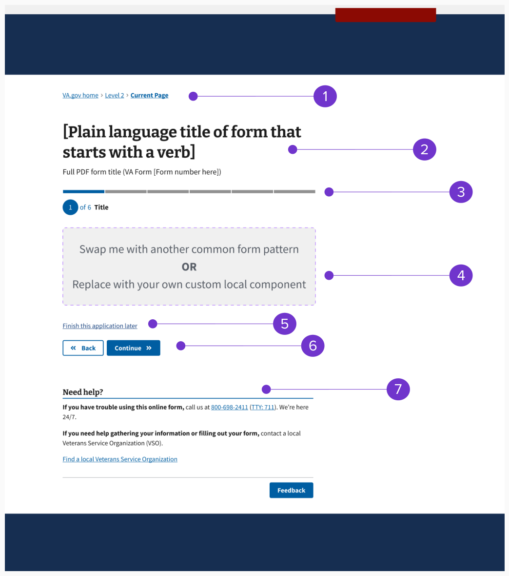
The unauthenticated form step template consists of these elements:
- Breadcrumb
- Form title and subtitle
- Progress bar - segmented (includes step header)
- Form step content (includes page title)
- Button pair (Back/Continue)
- Need help? component
Structure
Breadcrumb
The breadcrumb will remain static across all form step pages for a single form. We recommend that designers create a local breadcrumb component in Figma to insert into the form step template rather than manually updating each form step template page individually.
Learn more about expected breadcrumb behavior in the design system
Form title and subtitle
Use the same H1 form title and subtitle on all pages of the form, including the introduction, review, and confirmation pages. We recommend that designers create a local form title and subtitle component in Figma to insert into the form step template rather than manually updating each form step template page individually.
Review the form introduction template for form title and subtitle for more guidance and examples
Progress bar and overall form step structure
Use the Progress bar - segmented component to organize form steps. The progress bar will be the H2 for the form pages.
The name for each step within the progress bar is the “step header.” The way you organize the form steps will also impact the “page title” (the H3 that begins the form content section), pattern, and content. A step could, but doesn’t have to, include multiple pages. Because of limitations on the progress bar UI, we recommend limiting all forms to 13 steps total.
The step header (H2) should have different content than the page title (H3). The step header will be the general type of information you’re collecting (like Your personal information) and the page title will be more specific (like Your name and date of birth).
If your form contains conditionals, you may need multiple versions of the progress bar to cover all the possible paths (sometimes called user stories) that a person might take through a form. We recommend that designers create a local progress bar component in Figma for each possible path rather than manually updating each form step template page individually.
Crafting thoughtful step headers and page titles
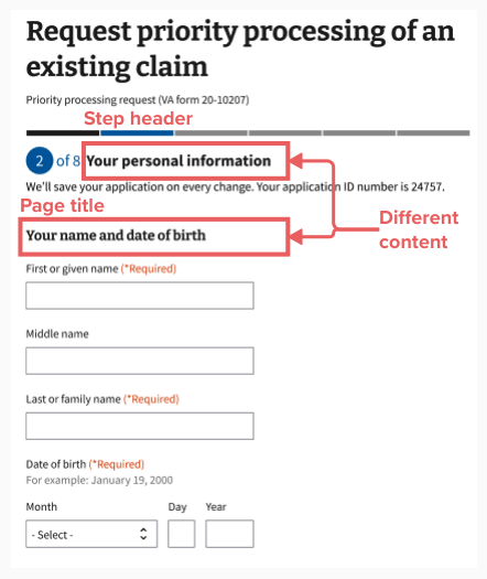
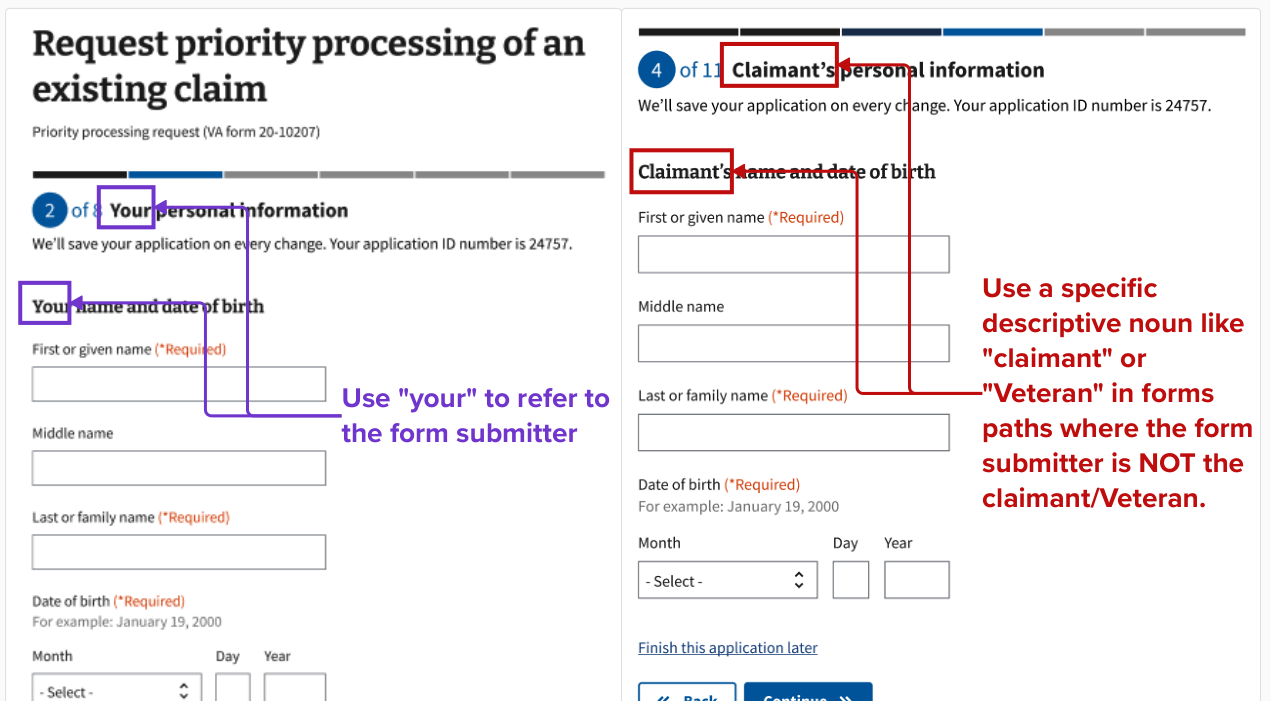
The step header and page title content are important tools to help the person filling out and submitting a form to understand when you’re asking for their information versus another person’s information. Use the step header and the page title to specify the role of the form submitter as needed. For example, use “your” only when referring to the person filling out and submitting the form.
It is an information architecture (IA) best practice to ask for information that is easiest to recall first. Therefore, organize your form to ask for the form submitter’s information first if they’re a different person than a Veteran or another claimant.
Identifying within your form’s IA who the form submitter is and which pages are asking for their information will also allow you to more easily leverage prefilled information since, as of right now, someone can only be signed in to VA.gov as themselves.
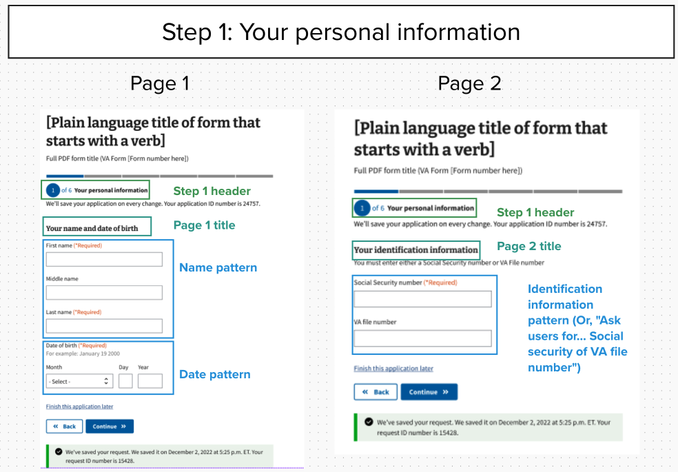
Example of form step structure mockup for form submitter’s personal information step
This is an example of the form step structure using mockups for step 1. The content of some patterns may be out of date. This step includes 2 pages.
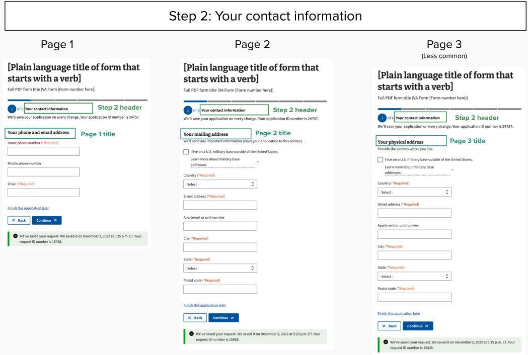
Example of form step structure mockup for form submitter’s contact information step
This is an example of the form step structure using mockups for step 2. The content of some patterns may be out of date. This step includes 3 pages.
Saved as message with application ID
Text area that tells the person we’ll save their application automatically and provides an application ID number. This only needs to appear on the first page of the form.
Form step content
Insert customized form step content in this section of the form step template. Consult the form step structure guidance on this page and the “One thing per page” design principle to determine how much form content to fit onto a single page.
Some components may include the option to add body text, hint text, or Details (expandable help content). Use these guidelines to decide which component to use.
Body text
Use body text to add clarifying information that’s relevant to all the information under a page title. The body text should either clarify what type of information we need or explain what we’re going to do with the data. Aim for fewer than 50 words in the body text. If you need more space, consider moving nonessential information to a Details component.
Hint text
Add hint text under a field label if it would help someone choose the right response, like “We’ll use your email address to confirm when we receive your form.” Knowing how we’ll use their email may help the person choose which email to enter. Or use hint text to help someone answer a question more easily, like “Select a month. Enter 1 or 2 digits for the day and 4 digits for the year.” Hint text should have an ending period if it’s a full sentence.
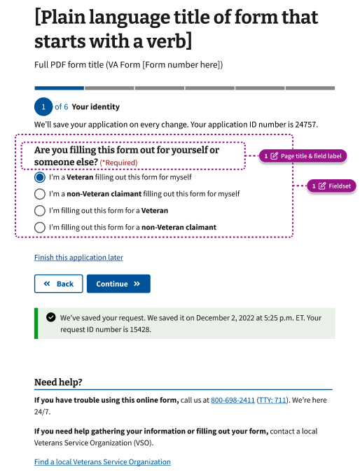
Field label text (also called legend)
On a form step page with only 1 question, you must create a separate page title and field label (also called the legend). The exceptions to this rule are that the page title could also be the field label only for a checkbox or radio button group. For example, the radio button question, “Are you filling this form out for yourself or someone else?” is both the page title and field label.
Details
Use the Details component if there’s relevant information that may be important for some people, but it’s not critical information for everyone filling out the form.
Review guidelines for using the Details component
Finish this application later link
A link that allows people who are authenticated (signed in) to exit the process with their progress saved.
Button pair
The Button pair component contains a secondary button labeled “Back” and primary button labeled “Continue.” On the last form step page, change “Continue” to “Submit.”
Autosave alert
The Autosave component provides the last saved date and time in a Alert - background only - Success variation. A related line of text just under the step header also tells people that we’ll save their form after every change. This only shows to people who are authenticated (signed in).
Need help?
The Need help? component appears on the bottom of every page of the form. This content tells people how to get additional help with the form or contact us about their related benefits. You can customize the content for the specific form.