
Components
Radio Button
use: best-practiceExamples
Web
Default
 View va-radio in Storybook
Tile
View va-radio tile in Storybook
Hint text
View va-radio with hint text in Storybook
Label header
View va-radio with label header in Storybook
On background
View va-radio on background in Storybook
Forms pattern single
View va-radio forms pattern single in Storybook
Forms pattern multiple
View va-radio forms pattern multiple in Storybook
Error
View va-radio error in Storybook
Forms pattern single error
View va-radio forms pattern single error in Storybook
Internationalization
View va-radio internationalization in Storybook
Mobile app
Default
View va-mobile_radio-button–default in Storybook
Tile
View va-mobile_radio-button–tile in Storybook
Error
Usage
Choosing the right component for the task
When deciding which component to use, consider the number of options available to the user. The total number of options will determine which component is right for the task:
- 2 - 5 options: Use Radio button when there are only a few options that can all be exposed at once.
- 6 - 15 options: Use Select for a limited number of options.
- 16 - 100 options: Use Combo box, which combines a select with typeahead functionality for easier selection.
- 101+ options: Use Search Input with typeahead to help users quickly find the right option from a large set.
Exceptions to consider when choosing a component
In some cases, there are common outliers and exceptions to account for:
- When the options are known and memorable. Options like months, days, states, countries, and other familiar data groupings can be considered exceptions to choosing the right component. For example, the Combo box works well for Countries or States that benefit from both scrolling or typing to find the selection. Consider your user and evaluate if typing or comparing options would be a better user experience when finalizing the component choice.
- When the radio button labels are long or radio tiles contain descriptive text. Long labels within a dropdown might make it difficult to read and select an option. Radio tiles often include descriptive text that cannot be used in a dropdown. In these cases, Radio button may be the better choice.
- When the task is to sort a set of results. Use the dedicated Sort component, which utilizes a Select component as its foundation.
Contact the Design System team via #platform-design-system for help if you have other use cases that may be considered exceptions.
When the task requires multiple selections
The components above are for single-selection tasks. For multiple selections, use Checkbox. The same count thresholds may not apply. However, consider breaking long checkbox lists into grouped categories or using a different interaction pattern if the list exceeds 15 options.
Choosing between variations
- Use the Hint text variation to provide additional information that pertains to the question being asked or all of the options presented.
- Use the Label header variation when a heading is required within the
legendthat acts as a label for the radio buttons. This can aid users in navigating the form questions, particularly in the sub-task pattern - Use the Description text variation to provide additional details about one or more radio button options. This variation is superseded by the Tile variation.
- Use the Tile variation to provide additional details about one or more radio button options within a large and well defined tap target.
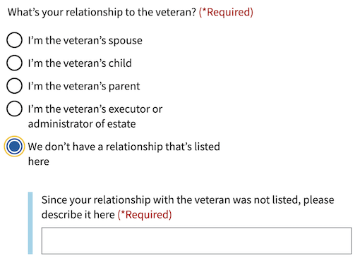
Conditionally revealed fields
Conditionally revealed fields show additional form elements only when a user selects a specific option. They help reduce visual complexity by showing follow-up questions only when they’re relevant.
When using conditionally revealed fields:
- Limit to one reveal per page. Avoid confusing the user with multiple expanding sections.
- Ensure keyboard accessibility. When a user selects the trigger option, they should be able to tab directly into the newly revealed field (which is why the trigger option is placed last).
- Make the revealed question self-explanatory. Avoid vague labels like “Other” for text fields. Instead, use clear, specific labels that work independently:
Since your relationship with the veteran was not listed, please describe it here
- Create distinct error messages. When using conditionally revealed fields, provide one error message for the main radio or checkbox group, and a separate error message for the newly required revealed field.


Errors
- Refer to the specific error examples above.
Hint text
- Refer to the hint text example above.
Code usage
Content considerations
Accessibility considerations
Privacy guidance
When Personally Identifiable Information (PII) or Protected Health Information (PHI) is an option in a selection list, selections can’t be tracked in analytics or passed into other page elements that may be tracked.
- Analytics tracking for this component must remain off if the options contain PII or PHI.
- Selections can’t be utilized in elements on follow-on or related pages, such as a parameter or title tag.
Example: A form application asks the user to select a health condition from a dropdown list. Details about a person’s health conditions are considered PHI. The option selected can be stored in our data systems, but the selection can’t be tracked in analytics or utilized as part of the title tag in the next page.
Learn more about PII/PHI on the VA Platform website
Provide feedback
Share your feedback, report issues, or suggest improvements for the Radio Button component. Your input helps us make the design system better for everyone.
- Get immediate support in #platform-design-system for technical or urgent issues.
- Explore all feedback channels for additional ways to share your input.