
Patterns
Ask users for…
A single response
Also known as: One Thing per Page
Use: Deployed- Contributors
- Jeana Clark (Ad Hoc)
- Jamie Klenetsky Fay (Coforma)
Usage
What is One thing per page?
We should always divide long forms into multiple smaller sections that make up a logical series of pages or steps. This helps make a long form less daunting, and easier to understand by allowing the user to focus on smaller tasks.
This is often referred to as the “One thing per page” design principle. While there is often only one form field element on the page, it does not necessarily mean that there can be only one element. The “One thing” refers to the information being gathered and not the actual number of form fields.
We have a number of patterns that use the One thing per page principle and below we outline how to implement this principle as a pattern using our form components.
When to use this pattern
- Collecting one, or a few, responses to gather related information from the user. A page with too many “things” - unrelated concepts - can be difficult to understand. When a page covers multiple topics, it’s hard to narrow down what the purpose of the page is, and what actions the user should take. Use this pattern to avoid this problem and to clearly divide the information being collected into logical parts.
When not to use this pattern
- Collecting the same data in a series of questions. Forms will often collect the same information about 1 or more items. For example, personal information about a Veteran’s dependents. The paper form equivalent would be a table where each row is an item and the columns are the questions. For this scenario, use the Ask users for multiple responses pattern. Note that the multiple responses pattern does leverage the single response pattern but does so in a loop so as to collect multiple instances of information.
- Collecting many possible responses. Some questions can have an unknown amount of answers, such as “list all the cities and states you’ve lived within.” When we don’t know how many responses to a question a user will provide, but we need to collect a number between 1 and “n,” where “n” is all possible responses, use the Ask users for multiple responses pattern.
Why we prefer this pattern
- Reduces cognitive load. The W3C Cognitive Accessibility Guidance provides more details on how to better meet the accessibility needs of people with cognitive and learning disabilities.
- Simplified error handling. Shorter, focused pages make it easier for the user to find and correct errors.
- Faster page loads. Shorter pages load and respond to user interaction faster than longer pages.
- Easier progress tracking. When users drop out of the “funnel” of completing a form it is simple to tell which questions may have contributed to that drop off.
- Simplified navigation. Returning to previous steps is easier as each step is focused and clear. This also makes returning to a step to make an edit easier.
- Improved experience on mobile. Shorter pages are easier to scan, navigate, and move through quickly.
- Simplified branching and conditional logic. Less complex pages are easier to code for conditional branches.
- Easier for screen readers. Less complex pages are easier for users of screen readers to use.
- Improved pattern reuse. Simple pages make pattern reuse more likely and thus simplify the design process.
- Simpler screens despite more clicks. While breaking forms into smaller chunks does result in more clicks, research both here and in the UK has shown that the process feels simple and easy and users do not get stuck.
Examples
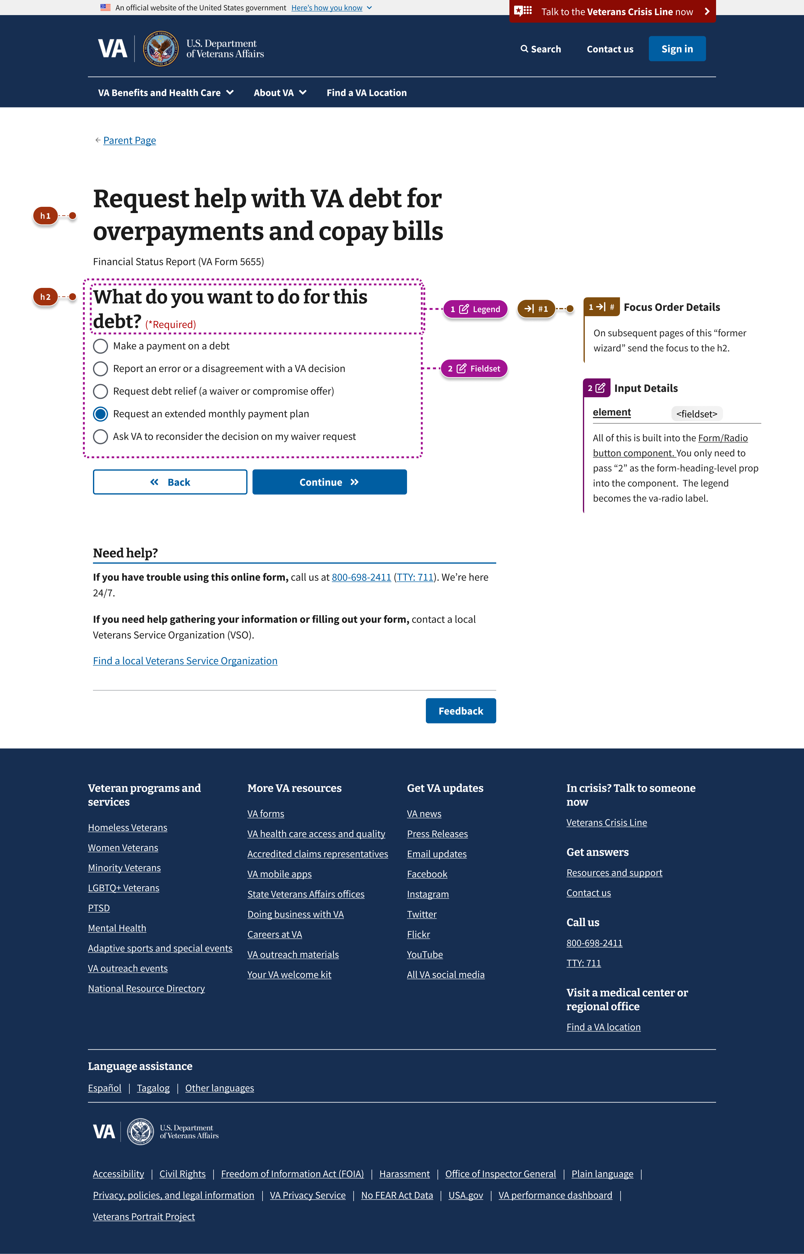
Annotated
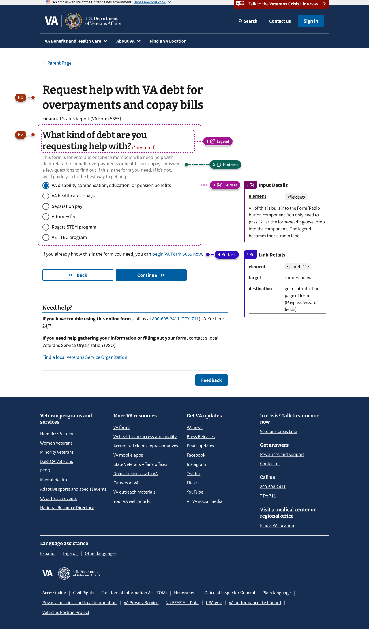
With form description
Examples in production
- Sign VA claim forms as an alternate signer (VA Form 21-0972)
- Submit a lay or witness statement to support a VA claim - Lay/Witness Statement (VA Form 21-10210)
- File a Supplemental Claim (VA Form 20-0995)
- Request personal records - Freedom of Information Act (FOIA) or Privacy Act (PA) Request (VA Form 20-10206)
Other relevant examples
- gov.uk Service Manual - Structuring forms
- Cognitive Accessibility Design Pattern: Make the Purpose of Your Page Clear
- Cognitive Accessibility Design Pattern: Avoid Too Much Content
- The Question Protocol: How to make sure every form field is necessary
How to design and build
Anatomy and layout details
Follow the annotated examples above and use the component variations listed below.
How this pattern works
Your goal is to figure out how users think of the “things” - the concepts, topics, or questions - you’re presenting to them. Which stand alone, and which go together?
Here are steps you can take to determine what the “things” are on your form or static web page:
- Brainstorm what concepts you’re trying to get across. Use sticky notes to create an unorganized list of concepts.
- Start with one concept - i.e., one sticky - per page. Assume, for the time being, that the concepts are individual “things” that belong on separate pages.
- Do a card sorting exercise. What concepts, to you, “go” together? Try it with your team.
- Do some desk research - how are these concepts linked together in the wild?
- Re-organize your stickies into related concept groups, where applicable. (Some stickies won’t be in a group - that means they’re a concept all their own!)
- Map out your flow with these groupings in mind.
- Test your new user flow with users. Note when users are either:
- Frustrated by the number of steps, or
- Confused by the amount of concepts on a page
- Iterate.
Components used in this pattern
View the full list of available component variations below.
Page templates available for this pattern
Examples for this pattern are available in Figma.
Additional page templates are available in the specific patterns that leverage this pattern in the Ask users for section.
Design principles
One thing per page is a content design principle that can be employed when structuring forms. It exists within a broader principle of splitting, or chunking, content in order to break it up for easier understanding. This pattern is an example of this principle and this principle can be applied to other patterns or form structure in general.
The “One thing” can be:
- One piece of information you’re telling a user
- One decision a user has to make
- One question a user has to answer
That one decision or question may require more than one input from the user as they fill out a form. However, by following this pattern you can reduce the cognitive load required to complete the form by focusing the user on a specific question and its answer.
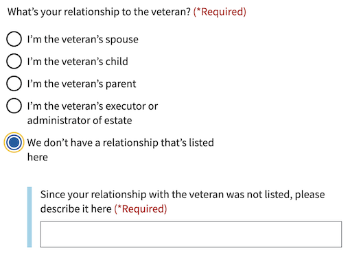
Conditionally revealed fields
Conditionally revealed fields show additional form elements only when a user selects a specific option. They help reduce visual complexity by showing follow-up questions only when they’re relevant.
When using conditionally revealed fields:
- Limit to one reveal per page. Avoid confusing the user with multiple expanding sections.
- Ensure keyboard accessibility. When a user selects the trigger option, they should be able to tab directly into the newly revealed field (which is why the trigger option is placed last).
- Make the revealed question self-explanatory. Avoid vague labels like “Other” for text fields. Instead, use clear, specific labels that work independently:
Since your relationship with the veteran was not listed, please describe it here
- Create distinct error messages. When using conditionally revealed fields, provide one error message for the main radio or checkbox group, and a separate error message for the newly required revealed field.


Code usage
Refer to the following component variations to implement this pattern:
Checkbox
Memorable date
Radio button
Select
Text input
Textarea
Content considerations
Follow the content style guide when writing form labels, hint text, and error messages. Use clear, plain language that helps users understand what information is being requested.
Accessibility considerations
Users with cognitive disabilities may have difficulties keeping focus, retaining information, and/or determining what actions they can take on a page. According to the W3C:
“Keeping content down to a small number of important points reduces the clutter, calms the user, and allows for better understanding while aiding memory.”
One way to do this is by following the “One thing per page” principle.