
Components
Header
Don't use: Proposed Web
A header helps users identify where they are and provides a quick, organized way to reach the main sections of a website.
This component is not officially supported
This component has not yet been built as a component in the Design System. Thus the Design System Team does not officially support this component. The Header - Minimal variation is supported. Guidance and design assets are provided as is.
Examples
Default

Usage
When to use Header
- The header is required to provide global navigation. Global navigation helps users find the information they need across all of VA.gov.
How this component works
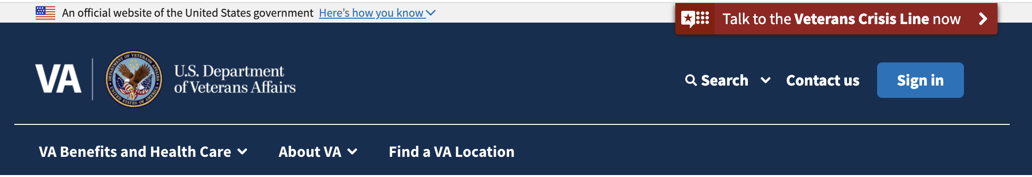
The header is made up of four parts:
- Banner - Official Gov. This component is required for all U.S. Government web sites.
- Header stripe. This part of the header holds the VA logo, agency badge and title, sign in button, search, contact us link, and the main menu.
- Crisis Line Modal. The Veterans Crisis Line modal is a button prominently placed over the Banner - Official Gov and Header stripe. When interacted with it opens a modal window.
- Main menu. The main menu provides top-level navigation across the whole of VA.gov
Behavior
- BEWARE! The header is injected on all pages of VA.gov. It is important for teams working on the header to be aware that the header is injected across different Content Management Systems at the VA. Here are some important things to keep in mind when working on the header:
- The header is not currently a web-component supported by the Design System Team. Instead, it is a shared global React component with logic onto itself.
- Web components do not currently load in Microsoft TeamSites, one of the Content Management Systems that the header is injected into.
- The Sitewide team owns the design of the header while the Design System Team owns the code of the header going forward. Thus the Design System Team is currently building out the web-components and will be working with other teams to support web-components in TeamSites.
Choosing between variations
- Use the Header - Minimal variation for use cases where navigating away would prevent the user from easily accomplishing their main task. We use the minimal header variation where we want to guide the user to task completion and where navigating away from the current task would be counter-productive or potentially lose user input. For example, a form flow is a use case where we want to help the user get through filling out the form without interruption. Also, in the check-in experience we deliberately use a header with no sign in button because that button caused confusion with users and took them to sign into VA.gov when they intended to check-in to their appointment.
Placement
- At the top of every page. The header appears at the top of every page within the va.gov domain, but not all sub-domains.
Provide feedback
Share your feedback, report issues, or suggest improvements for the Header component. Your input helps us make the design system better for everyone.
- Get immediate support in #platform-design-system for technical or urgent issues.
- Explore all feedback channels for additional ways to share your input.
Edit this page in GitHub
(Permissions required)
Last updated: May 01, 2026