
Components
Breadcrumbs
use: deployed USWDS v3
Examples
Default
View va-breadcrumbs in Storybook
 View va-breadcrumbs in Storybook
Default at mobile viewport width
View va-breadcrumbs in Storybook
Rerender state
View va-breadcrumbs v3 and adjust state in Storybook
Wrapping state
View va-breadcrumbs v3 wrapping state in Storybook
Usage
Additional guidance for VA
When to use
- For pages in hierarchies with more than 2 levels. Use a breadcrumb for sections of content that have more than 2 levels. The breadcrumb should be displayed starting at the level 2 page and persist on all child pages in the hierarchy. For example, if a level 2 page has child pages, all pages starting at that level 2 page would need a breadcrumb.
- To provide a consistent experience for similar pages. A breadcrumb can be used if similar pages or sections of a site are using breadcrumbs even if it doesn’t meet the requirements. For example, the Service Members benefit hub page is a level 2 page with no hierarchy and therefore wouldn’t normally have a breadcrumb. However, all other benefit hubs do have a breadcrumb, so providing one on this page creates a consistent experience when navigating various benefit hubs to learn about benefits.
When to consider something else
- The top level page of your site. A breadcrumb is not necessary for the top level page of your site. For example, the VA.gov home page should not have a breadcrumb.
- Level 2 pages with no children. A breadcrumb is not necessary for pages that are 2 levels deep and do not have any child pages. For example, the My VA page lives at
VA.gov home > My VA. Since this page is only 2 levels deep and does not have any child pages, it does not need a breadcrumb. - When using the minimal header component. When the Header - Minimal component is used, the breadcrumb can be removed to further prevent the user from easily navigating away and inadvertently interrupting their main task.
Behavior
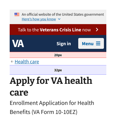
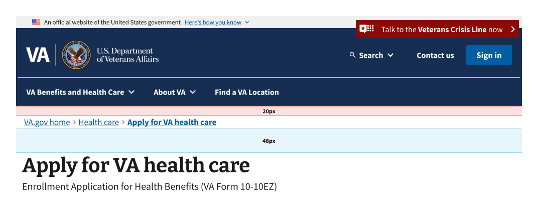
The breadcrumb should be placed below the header and above the main content
The placement of the breadcrumb must be consistent from page to page and across the entire site.
Spacing for the breadcrumb is built into the component and should be consistent throughout all layouts. The correct spacing is specified in the images below:
Use a descriptive label for the first segment of the breadcrumb
For the home page of a site, do not use icons or just Home. This ensures that the main site home page is differentiated from other types of landing pages on the site. For www.va.gov, the home page label should be VA.gov home.
Breadcrumbs must represent content hierarchy, not the user’s click path
Breadcrumbs represent hierarchical relationships between pages and their placement in that hierarchy, giving the user a sense of where they are in the overall site.
Each breadcrumb segment should use the full page title of the corresponding page
Do not shorten or truncate titles of a page (the H1) in the breadcrumb to reduce or eliminate wrapping. Consider alternative, shorter page titles if possible. Always follow the content style guide for writing page titles.
All segments of the breadcrumb should be interactive and link to their corresponding page
Each breadcrumb segment, including the current page segment, must link to its corresponding page. Making every segment a link allows screen readers to voice the page link whether the user navigates by element or by tabbing. Making the current page a link rather than text makes it a focusable and clickable element. This follows WAI-ARIA Authoring Practices Guide (APG) guidance, which states that an element with aria-current="page" should represent the current page.
Breadcrumbs for linear page flows
When a user starts a linear flow on the site (i.e. a form flow or task flow), the breadcrumb should represent the placement of the start of that flow within the site, but not follow the user as they step through the pages of the flow.
- The breadcrumb only represents the hierarchy up to the first page of the linear flow (i.e. often the introduction page for forms). As the user progresses through the flow, the breadcrumb does not change or progress with them, and instead remains displaying only up to that initial page.
- Example: for a form with the title ‘Apply for VA health care’, the breadcrumb for the introduction page, all pages within the flow, and confirmation page would be
VA.gov home > Health care > Apply for VA health care.
- Example: for a form with the title ‘Apply for VA health care’, the breadcrumb for the introduction page, all pages within the flow, and confirmation page would be
Final crumb link
- When used with the standard Form Step template, the breadcrumb for the final crumb must link to the Introduction page of the form. This ensures users can easily navigate back to the starting point of the form flow.
- This allows a user to use the breadcrumb to return to the beginning of the form flow. The breadcrumb combined with the Progress bar - Segmented component, provides context for where a user is on the site and within the flow.
- Other CTAs on the page, such as the Button group component, can be used to navigate between pages of the flow.
- When used with the new Form Step - Minimal template, the breadcrumb is a Back link throughout the form flow.
Code usage
Attributes and Properties
breadcrumbList
breadcrumb-list
Breadcrumb[] | string
Represents a list of breadcrumbs. Use a JSON array of objects with label and href properties, then wrap in a string if using non-React-binding version. See Storybook examples for React-binding version. For pure web components, here’s an example link: ``[{“href”: “/link1”, “label”: “Link 1”}]`.
currentPageRedirect
current-page-redirect
boolean
false
When true, the current page link will use the last href value provided in the breadcrumb list instead of the #content hash.
disableAnalytics
disable-analytics
boolean
false
Analytics tracking function(s) will not be called
homeVeteransAffairs
home-veterans-affairs
boolean
true
When true, the first breadcrumb label will be “VA.gov home”.
label
label
string
'Breadcrumb'
Adds an aria-label attribute to the <nav /> element.
wrapping
wrapping
boolean
false
Whether or not the component will wrap the breadcrumbs.
Events
component-library-analytics
The event used to track usage of the component. This is emitted when a
breadcrumb anchor is clicked and disableAnalytics is not true.
routeChange
Fires when user clicks on breadcrumb anchor tag.
Has no effect unless the href of anchor tag is part of
breadcrumb object that also has isRouterLink: true
Router link support
To use React Router with this component follow these instructions.
Accessibility considerations
Privacy guidance
URLs can’t include Personally Identifiable Information (PII) and Protected Health Information (PHI).
-
No part of the URL, including parameters and anchor tags, can include information that can be used either by itself or in combination with other information to uncover that individual’s identity or health information.