
Components
Side Navigation
Use with caution: candidateEnhancements Planned, Feedback Welcome
This component is available for use and will continue to evolve with additional features and functionality. It is planned to replace several existing side navigation implementations across VA.gov to promote consistency and improve usability.
If you want to help us continue to improve this component, join the discussion!
Examples
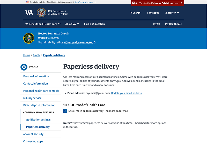
Default
View va-sidenav Default in Storybook
 View va-sidenav Default in Storybook
Categorized Links
View va-sidenav Categorized Links in Storybook
Nested Links
View va-sidenav Nested Links in Storybook
Usage
When to use Side Navigation
- To display a navigational hierarchy of one or two levels.
- To create a sub-navigation of closely related pages within the same section of a site.
When to consider something else
- If your section has fewer than 5 pages. A full navigation structure may not be necessary for small sections of the website.
- If you want users to navigate to different sections on the same page. Instead, use the On this page component.
- If the links aren’t closely related or don’t live in the same section of the website.
How this component works
Side Navigation provides secondary navigation within a specific section of a website. It helps users understand the scope of the current topic and move between closely related pages. This is distinct from the site-wide Header navigation, which covers the entire site, and the On this page component, which navigates within a single page.
The component is designed to reflect a user’s task-oriented goals, rather than the internal structure of the VA.
There are 2 primary ways to structure Side Navigation items that contain child pages:
-
Categorized Links: A top-level item can serve as a non-clickable heading for a group of child pages. This pattern is useful for organizing links into thematic categories, similar to the “spokes” on a VA.gov benefit hub page, where a title like “Manage benefits” introduces a list of related tasks.
-
Nested Links: A parent item can be a standard link that navigates to a landing page for that section, while also containing a nested list of links to child pages. This is a common pattern for hierarchical site structures.
Behavior
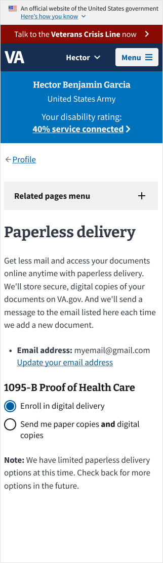
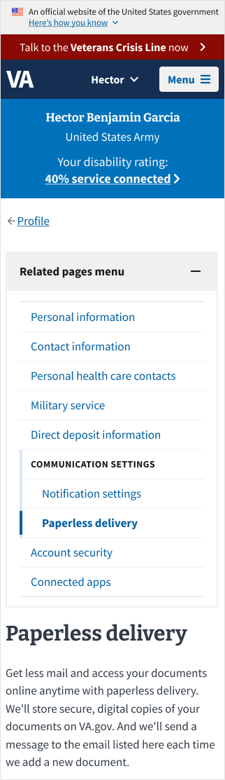
At mobile breakpoints, the navigation menu is collapsed by default to save space. A trigger button labeled “Related pages menu” reveals the navigation menu when activated. This works similarly to an Accordion.
Placement
The Side Navigation component should appear in a consistent location across desktop views and a consistent (but distinct) location across mobile views.
Desktop View
At desktop breakpoints, the component should be placed at the top of the left column in a two-column layout.
Mobile View
At mobile breakpoints, the Side Navigation should appear below the breadcrumb but above the page title and any content. It should be collapsed by default behind a “Related pages menu” button that toggles visibility. This ensures mobile users can access navigation without it taking up excessive screen space. When expanded, the menu should push content downward rather than overlaying it.
Code considerations
Side Navigation is built as a flexible component using a compositional architecture. This means we construct the final navigation menu by combining several smaller, internal child components within a parent container. This modular approach simplifies maintenance, improves future expandability, and allows for easy integration into different environments.
The component is composed of the following parts:
va-sidenav (Parent Component): This is the main container that wraps all the navigation elements. It can include an optional header with a title and an optional icon.
va-sidenav-item (Internal Child Component): This is the basic building block for a single, clickable navigation link. It includes properties for the link’s destination (href) and label. You can also flag it as the current-page for distinct styling.
va-sidenav-submenu (Internal Child Component): This component acts as a container for nesting va-sidenav-items. This allows you to create a hierarchical structure (child and grandchild links). The parent item of a submenu can optionally be a link itself.
This compositional structure allows developers to build complex navigation menus by slotting together the necessary child components. For single-page applications, the component supports router integration by firing a vaRouteChange event. This prevents native link routing and allows a routing library like React Router to handle the navigation.
Code usage
Attributes and Properties
header
header
string
Header text to display at the top of the side navigation.
iconBackgroundColor
icon-background-color
string
'vads-color-primary'
Adds a circle around the icon with the provided background VADS color token.
iconName
icon-name
string
The icon name for the icon that will display to the left of the header text. The icon-background-color prop must be set too.
Content considerations
- Link text should be concise and descriptive. Link text should be scannable and clearly convey the purpose of the page. It does not always need to match the related page’s title.
- Consider the impact of displaying long or complex link lists. If the navigation hierarchy is too long, users may miss items at the bottom. If it’s too deep, users may miss items that require too many clicks. Test with real users to find the right balance between breadth and depth.
Accessibility considerations
Focus order placement
- Place the Side Navigation in the focus order immediately after the breadcrumb and before the main content. This order helps screen reader and keyboard users understand their location in the section and how it relates to other pages nearby. Users can choose to bypass the navigation by using the “Skip to content” link that’s available at the top of each page, or by using landmark navigation in their screen reader to select their desired content region.
Markup placement
- Place the Side Navigation outside of <main>. We recommend placing the Side Navigation outside of the
<main>element, ideally in a landmark region like<aside>to help define the structure of the page and support assistive technology navigation. However, we recognize this may not be technically feasible in all implementations. If the side navigation must be placed inside<main>, make sure it’s placed above the main content in the focus order.
Related
Component checklist
Maturity
-
Guidance - Examples, usage, code usage, content considerations, and accessibility considerations are all complete.
-
Research - VFS team conducted research on this component which is linked from this page.
-
Stability - Component has been in production for more than 3 months with no significant issues found.
-
Adoption - Multiple teams have adopted this component.
Accessibility
While this component has been previously tested against older criteria, it has not yet been audited with the updated testing criteria.
Code assets
-
Variations - Storybook includes all variations (style, size, orientation, optional iconography, selection, error state, etc.)
-
Responsive - Component depicted in all responsive breakpoints.
-
Interactive states - Includes all interactive states that are applicable (hover, active, focus, keyboard focus, disabled).
-
Tokens - All design attributes (color, typography, layout, etc.) are available as tokens.
-
Internationalization - Describes i18n attributes.
Visual assets
-
Variations - Figma library includes all variations (style, size, orientation, optional iconography, selection, error state, etc.)
-
Responsive - Component designed to work in all responsive breakpoints.
-
Interactive states - Includes all interactive states that are applicable (hover, active, focus, keyboard focus, disabled).
-
Tokens - All design attributes (color, typography, layout, etc.) are available as tokens.
Legend:
-
Complete -
Incomplete -
Not applicable