
Patterns
Help users to…
Complete a sub task
Also known as: Sub-task, Wizard
Use with caution: Available
Helps users complete a shorter task before, or within, a larger process or flow.
Within our design philosophy of “Keep it simple” for users we state:
Limit the number of decisions a Veteran needs to make in 1 screen. We usually try to keep the number of questions under 5. 2 or 3 is even better.
The sub-task pattern provides guidance on how to “keep it simple.” This pattern replaces the deprecated Wizard pattern.
Usage
When to use this pattern
All of the use cases below are valid uses for this pattern.
- Task within a flow. Sometimes, the eligibility for a VA benefit or resource is so complex that it has multiple access pathways, depending on a user’s specific needs or circumstances. Users may experience consequences (like not getting the benefit or limiting benefit options), if they misunderstand eligibility content or choose the wrong pathway. Use this pattern to guide users down an optimal pathway for their circumstances. This is also known as branching eligibility choices.
- Task within a larger process. Use this pattern when we need the user to complete a shorter task, one that they can accomplish with a few questions, within a larger process that may span touchpoints.
Design principles
- Consider content first. Before adding a sub-task to a form flow, first consider whether we can convey the information through content alone. We can often describe the form’s purpose and instructions in the static content on the Introduction page, eliminating the need to add pages and time to the flow.
- Keep tasks focused. This pattern is an example of the One thing per page principle discussed in our Ask users for a single response pattern.
When not to use this pattern
- In place of a standard form flow. This pattern doesn’t replace a standard form flow and layout. This pattern exists within a larger flow or process, not by itself. It would be inappropriate to create a standalone form flow that doesn’t have a Progress bar - Segmented, Button group, and other components found in a typical form flow.
- For simple eligibility checks. Don’t use this pattern when we can clearly explain eligibility in 3 or fewer requirements. Use content on the Introduction page instead. This ensures the information is available via search and outside of any authentication requirements. For more complex eligibility with screening questions, use the Complete screening questions pattern.
When to use caution
- List and loop. While it’s possible, and encouraged, to explore a “One thing per page” principle using this pattern along with the List and loop pattern, it hasn’t been validated on VA.gov yet. If you’re interested in combining these patterns, work with the Design System team to define a research plan. Some teams are currently exploring this approach.
Examples
Supplemental claim
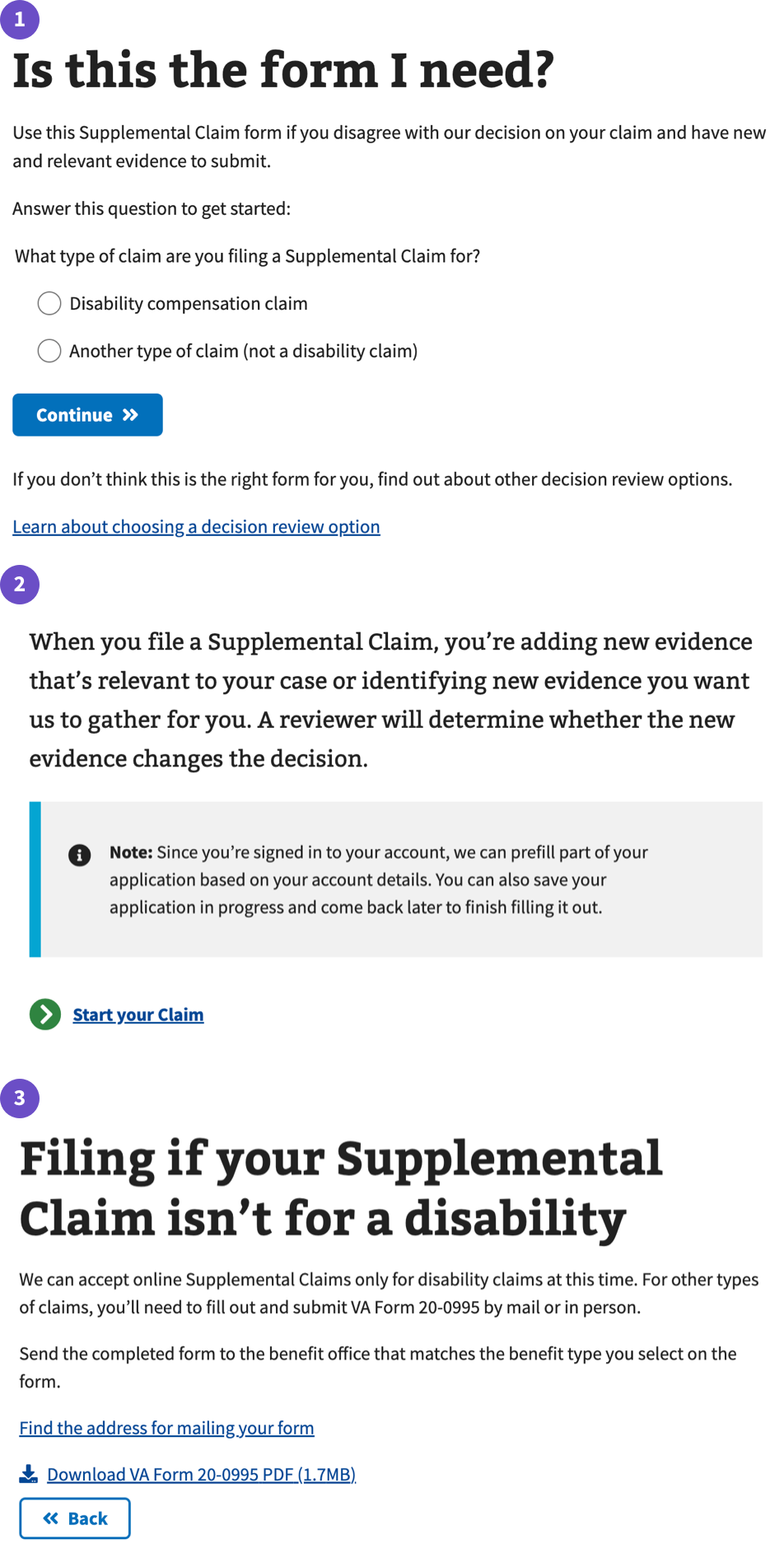
- An example of a task that helps the user determine if the supplemental claim service is suitable to their needs. It starts in screen 1 by asking the user to answer a single question via a radio button followed by a continue button that reveals either screen 2 or 3 based on the answer. This is in contrast to the deprecated Wizard pattern that progressively disclosed additional questions on the same screen.
- Once a user decides which type of Supplemental claim they’re filing they see screen 2 if they answer using the top radio button option or screen 3 if they answer using the bottom radio button option. Screen 2 allows the user to start the process and navigates to an introduction page. Screen 3 gives users a clear next step to take and ends the flow.
Pre-check-in experience
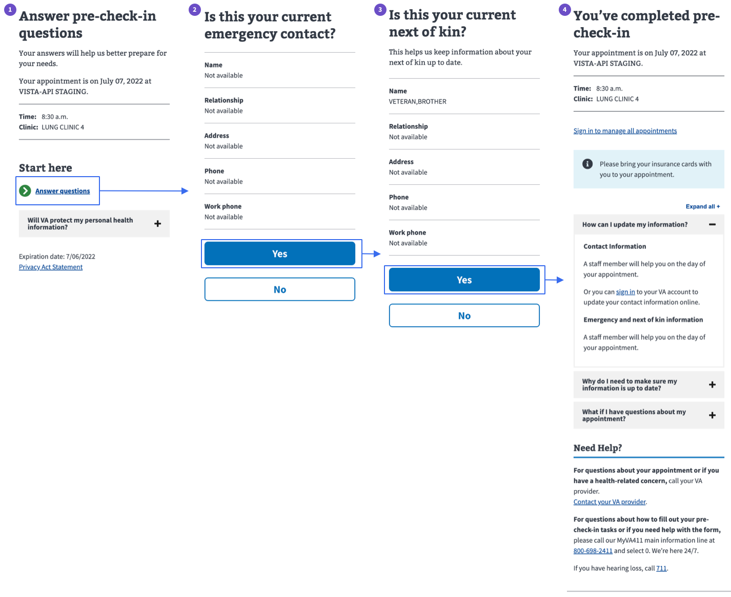
- An example of a task that helps determine if current information on file for a Veteran is correct before checking in at a facility. This example shows the success path.
- Note that this example features a Button group for yes/no that has some accessibility considerations.
VA Online Scheduling (VAOS) Vaccine sub-task
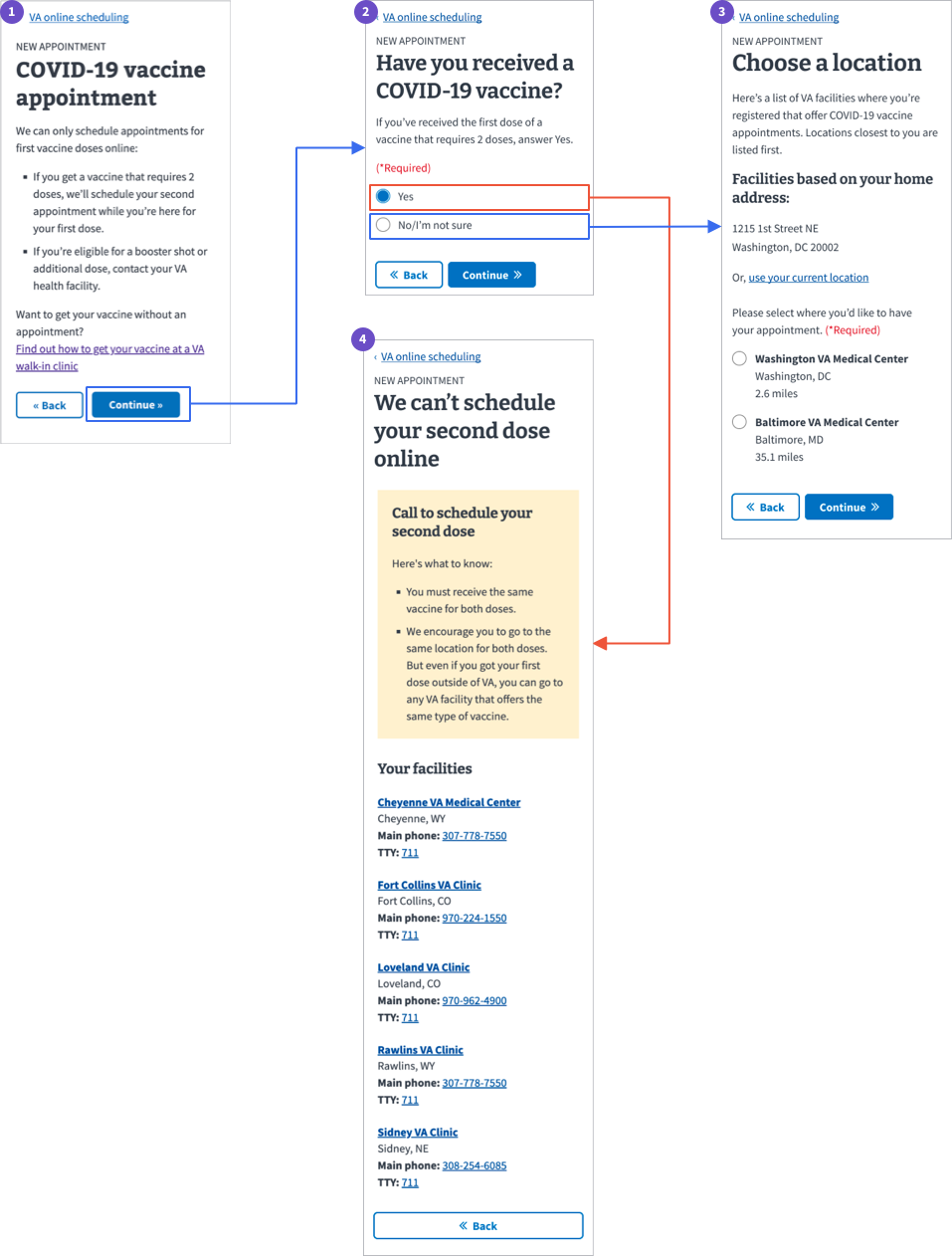
- An example of a short task within a larger process, the questions related to vaccination status are a sub-task that results in either the user moving forward in the process or reaching a stopping point. This is sometimes also referred to as a “screener question,” in that it screens out users from continuing along the larger process.
- Step 4 in this sub-task shows an example of an end point.
Other relevant examples
- SSA.gov. The Check eligibility for Social Security benefits flow is a preparation step ahead of applying for benefits and uses the “One thing per page” principle throughout.
- Better form design. There are many reasons why using this pattern with the underlying principle of “One thing per page” is preferred. Many of which are outlined in this article from Smashing Magazine.
How to design and build
How this pattern works
- Use the principle of “One thing per page” where the “thing” is:
- 1 piece of information you’re telling a user, or
- 1 decision a user has to make, or
- 1 question a user has to answer
- Start with the content design. Create a series of simple questions or decisions, written in plain language, and place them on distinct pages (rather than progressively disclosed on the same page).
- Structure the logic tree for questions to gather information from users in as few questions as possible, while still directing them to the best next step for their circumstances.
- Don’t show irrelevant content to users.
- Questions can be used to:
- Gather background information
- Gather information on specific needs/goals that can change the resulting form flow or experience
- Guide users through complex pathways with multiple options
Define clear end points
- There should be no dead ends. Users should always be given an outline of next steps that help them continue outside of the sub-task or via another touchpoint (such as on the phone or in-person).
- It should be clear when the user has reached an end point for the sub-task where they may need to leave the sub-task and continue with a different process or touchpoint. This can be best accomplished with a simple page that may feature an Alert.
- It should also be clear when the sub-task is complete and the user has returned or is ready to start the main task or process.
Components used in this pattern
This pattern can be implemented with standard form elements and other optional components:
- Standard form elements
- Accordion
- Alert
- Button group
- Link - Action
Content considerations
- Questions, decisions, and other pieces of information in the sub-task must be in plain language.
- Start with essential, required questions then move to optional questions if necessary.
- Don’t nest multiple questions within 1 question. Most questions should be answerable via the Yes/No button group.
Example: We wouldn’t ask, “Do you have a cat, and do you like that cat?” in o1 question. Those should be 2 separate questions. - Group similar questions into a series of questions around a topic. For example, contact information questions could be grouped so those questions appear in series rather than sporadically.
- Use research and card sorting to determine the best order of questions.
- Use clear and concise button labels.
- Reference writing questions for forms for additional considerations.
Accessibility considerations
- Titles (H1s) of sub-task pages must be unique.
- Title tags should pull from the form or task name, not the H1, for each page in the flow.
Example: Every page in a subtask flow for the Income Limits tool should have the title tag “Income Limits | Veterans Affairs,” regardless of what the H1 is. - Use of the Yes/No button pair is limited to mobile-specific flows as it doesn’t remember the user’s previous choice when navigating backwards in a flow. Using radio options along with a submit button is more materially honest and semantically correct as it splits the selection (input) from submission (button).
- This pattern replaces the deprecated Wizard pattern as it avoids the following problems with that pattern. Thus ensure that your Sub-task does not exhibit the following:
- No clear end point
- Easy for users to accidentally jump/tab out of the wizard
- No clear and explicit validation of input
- Nested fieldsets are problematic as the end of a fieldset isn’t announced by screen readers, making it impossible for screen reader users to confidently know which fields belong within which fieldset
- Providing results using dynamic show/hide behavior is spotty for screen reader users
- The point of this pattern is to keep the page minimal. Allowing screen reader users to quickly navigate to the first heading/question and start interacting with the form immediately should be the goal.
Edit this page in GitHub
(Permissions required)
Last updated: May 26, 2026