
Components
Checkbox
use: deployedExamples - Single
Web
Default
 View va-checkbox in Storybook
Tile
View va-checkbox tile in Storybook
Checked
View va-checkbox checked in Storybook
Hint text
View va-checkbox with hint text in Storybook
Description String
View va-checkbox with description string in Storybook
Description JSX
View va-checkbox with description JSX in Storybook
On background
View va-checkbox on a background in Storybook
Error
View va-checkbox error in Storybook
Required
View va-checkbox required in Storybook
Internationalization
Mobile app
Default
View va-mobile__checkbox–default in Storybook
Tile
View va-mobile__checkbox–tile in Storybook
Checkbox only
View va-mobile__checkbox–checkbox-only in Storybook
Error
Examples - Group
Web
Default
View va-checkbox-group default in Storybook
Label header
View va-checkbox group label header in Storybook
Hint text
View va-checkbox group with hint text in Storybook
Required
View va-checkbox group required in Storybook
Single checkbox
View va-checkbox group single checkbox in Storybook
Tile
View va-checkbox group tile in Storybook
Forms pattern - Single
View va-checkbox group forms pattern single in Storybook
Forms pattern - Single error
View Error state for single checkbox pattern in Storybook
Forms pattern - Multiple
View Multiple checkbox pattern example in Storybook
Error
View Checkbox group with error state in Storybook
Internationalization
View Checkbox group with internationalization in Storybook
Indeterminate checkbox state
Mobile app
Default
View va-mobile__checkbox-group–default in Storybook
Tile
View va-mobile__checkbox-group–tile in Storybook
Error
Usage
Additional guidance for VA
When to consider something else
- If there are too many options to display on a mobile screen.
- If a user can only select one option from a list (use radio buttons instead).
Choosing between variations
- Use the Forms pattern - Single and Forms pattern - Multiple variations for implementing the Ask users for a single response pattern. These component variations are specifically designed to help implement the single response pattern. The Forms pattern - Single error variation shows error handling for the component variation. For checkbox groups used outside of this pattern, for example on a longer form page, use the Label header checkbox group variation.
- Use the indeterminate state only on a parent checkbox that controls a group of related child checkboxes.
The parent checkbox may appear in a mixed (indeterminate) state when some, but not all child checkboxes are selected.
- Use in hierarchical groups where the parent represents the aggregate state of the child items.
- Use for “Select all” controls to reflect partial or complete selection.
- Don’t apply the indeterminate state to child checkboxes. Child checkboxes can only be checked or unchecked.
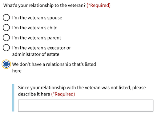
Conditionally revealed fields
Conditionally revealed fields show additional form elements only when a user selects a specific option. They help reduce visual complexity by showing follow-up questions only when they’re relevant.
When using conditionally revealed fields:
- Limit to one reveal per page. Avoid confusing the user with multiple expanding sections.
- Ensure keyboard accessibility. When a user selects the trigger option, they should be able to tab directly into the newly revealed field (which is why the trigger option is placed last).
- Make the revealed question self-explanatory. Avoid vague labels like “Other” for text fields. Instead, use clear, specific labels that work independently:
Since your relationship with the veteran was not listed, please describe it here
- Create distinct error messages. When using conditionally revealed fields, provide one error message for the main radio or checkbox group, and a separate error message for the newly required revealed field.


Indeterminate checkbox
Parent checkbox behavior:
- When clicked in an indeterminate state, the parent checkbox typically selects all child checkboxes.
- When clicked in the checked state, the parent checkbox typically deselects all child checkboxes.
- The parent’s checked, unchecked, or mixed state must always match the computed state of its children.
Child checkbox influence:
- All children selected → parent is checked
- Some children selected → parent is indeterminate
- No children selected → parent is unchecked
Note: Review the indeterminate state accessibility considerations before implementing.
Errors
- Refer to the specific error examples above.
Hint text
- Refer to the hint text example above.
Code usage
Using message-aria-describedby
In HTML, the attribute aria-describedby accepts ids of the elements that describe an object. This is used to establish a relationship between an element and text elsewhere that describes it for screen readers.
However, the VA.gov Design System uses web components and the shadow DOM, which prevents HTML’s aria-describedby from being able to establish the relationship between elements. Because of that, the message-aria-describedby prop is used in our components instead. Instead of accepting ids, it accepts a message string to read out. This message is placed inside the shadow DOM, hidden visually, but made accessible to screen readers. This allows it to function similarly to aria-describedby and have the descriptive text read out when the element is focused.
Native Events
The native onBlur event is available on this component. It can be used by adding the event handler to your component and it will then listen to the event and respond accordingly when the event fires.
Content considerations
Ordering checkbox options
When presenting multiple checkbox options, choose an intentional ordering principle. Avoid checkbox lists with no clear organizing principle. See Bulleted and numbered lists for guidance on ordering lists.
Accessibility considerations
Indeterminate state
Screen reader behavior for the indeterminate state varies significantly across assistive technologies.
This can create confusion for non-visual users who don’t see the parent-child relationship.
Screen reader announcement examples:
- VoiceOver (iOS/macOS): often “mixed,” “partially selected,” or sometimes reads only “selected”
- NVDA (Windows): “partially checked”
- JAWS (Windows): “mixed” or “partially checked”
- Narrator: “indeterminate”
Because these announcements differ, don’t rely on the term “mixed” alone to explain the control’s purpose.
To ensure all users understand the control:
-
Use a clear label that describes the group the parent checkbox controls
-
Provide optional hint text that explains the parent checkbox selects or deselects all related options
-
Use semantic grouping (fieldset/legend or role=”group”) so screen reader users understand the parent-child relationship
-
For large or complex groups, consider adding hidden screen reader text (such as “2 of 5 selected”) to help clarify why the parent is in a mixed state
-
Test with actual screen reader users to verify the interaction is understandable
These enhancements help ensure that screen reader users understand what the parent checkbox represents, even when their technology announces “mixed,” “partially checked,” or another inconsistent term.
Privacy guidance
When Personally Identifiable Information (PII) or Protected Health Information (PHI) is an option in a selection list, selections can’t be tracked in analytics or passed into other page elements that may be tracked.
- Analytics tracking for this component must remain off if the options contain PII or PHI.
- Selections can’t be utilized in elements on follow-on or related pages, such as a parameter or title tag.
Example: A form application asks the user to select a health condition from a dropdown list. Details about a person’s health conditions are considered PHI. The option selected can be stored in our data systems, but the selection can’t be tracked in analytics or utilized as part of the title tag in the next page.
Learn more about PII/PHI on the VA Platform website
Provide feedback
Share your feedback, report issues, or suggest improvements for the Checkbox component. Your input helps us make the design system better for everyone.
- Get immediate support in #platform-design-system for technical or urgent issues.
- Explore all feedback channels for additional ways to share your input.