
Components
Address Block
Use: Best practice WebExamples
 View this in Storybook
Usage
When to use address block
- Addresses in content blocks: Use an address block to call out an address when it sits within a content block. The blue bar will bring attention to the address block and make it easier to find when scanning a page.
- Form intro pages: Use an address block on form introductory pages where the mailing address is needed.
When to consider something else
- Clear Address header: If the Address is directly below a clear header named “Address”, as it is on VA Health Center pages, then the address block with blue border is not necessary.
- Accordions for a series: If you have a series of addresses in the body of a page and outside of a form or tool then an Accordion can be used. For example, if you have 3 or more addresses in succession.
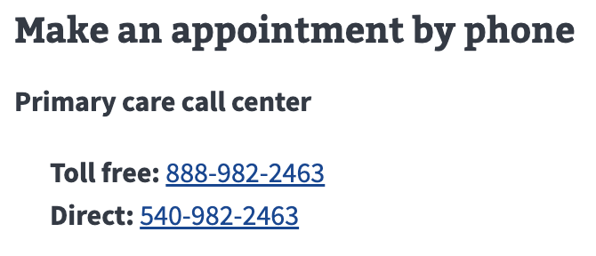
- Phone numbers in isolation: If you need to show one or more phone numbers, use the Telephone component.
Placement
- Address Block can appear within a block of content following a paragraph, list, or header.
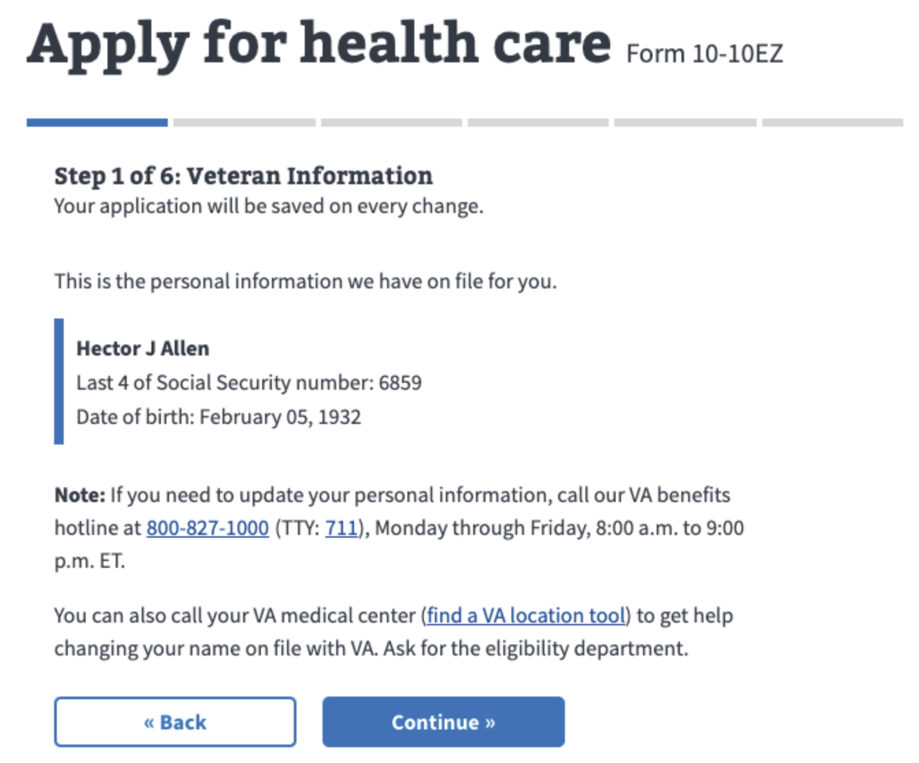
Instances of this component in production
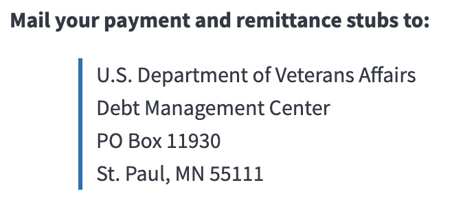
Like this
Not this
Code usage
- The Address Block component is created by applying the CSS class
.va-address-blockto a<p>HTML element. - Only use the
<address>HTML element for contact information related to the current page.<address>is only intended for contact information and not physical addresses (e.g. not for a Health Center facility address).
Content considerations
Don’t use periods in PO for PO Box.
Write out street names (street, road, avenue, boulevard, highway, etc.) in both body copy and in address blocks. Don’t abbreviate.
When a street address contains a compass point (like north or south), defer to the way it’s referenced locally. For example, some cities may abbreviate compass points like north and south for some but not all streets.
In the examples, we spell out the street names and style the compass points the way they're locally referenced in Washington, DC, and New York City, which both abbreviate compass points.
Like this
1600 Pennsylvania Avenue, NW
Washington, DC 20500
123 E. 45th Street
New York, NY 67890
Not this
1600 Pennsylvania Ave. Northwest
Washington, DC 20500
123 East 45th St.
New York, NY 67890
Zip codes and postal codes
- When we know an address is a U.S. address, use “zip code.” If the address is outside the U.S. or if you’re unsure of the country, use “postal code.”
Note: The Ask users for addresses pattern uses “postal code” for the field label. But the error message will say “Enter a valid 5-digit zip code” if we know the address is in the U.S. - When Veterans fill out their address, we don’t require them to include the extra 4 digits of their zip code. They only need to provide the 5-digit zip code.
- When we provide an address to Veterans, we sometimes include the extra 4 digits of the zip code. If we include the extra 4 digits, use a hyphen (ex. 12345-6789).
Component checklist
Web Platform
7 of 8 complete
Maturity
-
Guidance
-
Web
Examples, usage, code usage, content considerations, and accessibility considerations are all complete. -
Research
-
Web
VFS team conducted research on this component which is linked from this page. -
Stability
-
Web
Component has been in production for more than 3 months with no significant issues found. -
Adoption
-
Web
Multiple teams have adopted this component.
Accessibility
While this component has been previously tested against older criteria, it has not yet been audited with the updated testing criteria.
Code assets
-
Variations
-
Web
Storybook includes all variations (style, size, orientation, optional iconography, selection, error state, etc.) -
Responsive
-
Web
Component depicted in all responsive breakpoints. -
Interactive states
-
N/A Web
Includes all interactive states that are applicable (hover, active, focus, keyboard focus, disabled). -
Tokens
-
N/A Web
All design attributes (color, typography, layout, etc.) are available as tokens. -
Internationalization
-
N/A Web
Describes i18n attributes.
Visual assets
-
Variations
-
Web
Figma library includes all variations (style, size, orientation, optional iconography, selection, error state, etc.) -
Responsive
-
Web
Component designed to work in all responsive breakpoints. -
Interactive states
-
N/A Web
Includes all interactive states that are applicable (hover, active, focus, keyboard focus, disabled). -
Tokens
-
N/A Web
All design attributes (color, typography, layout, etc.) are available as tokens.
Legend:
-
Complete -
Incomplete - N/A Not applicable
Provide feedback
Share your feedback, report issues, or suggest improvements for the Address Block component. Your input helps us make the design system better for everyone.
- Get immediate support in #platform-design-system for technical or urgent issues.
- Explore all feedback channels for additional ways to share your input.