
About
Accessibility annotations for VA.gov applications
For example, you can document the order of heading structure, how a screen reader user should experience the product, error states, and more.
The guidance provided here are examples, not mandates. We hope that as designers and developers working on VA.gov applications, you are inspired to learn more about annotations and how to make your products more accessible. If you’d like to learn more or have questions, join us in #annotation-help in the Office of the CTO @ VA Slack.
Who it is for
Annotations help communicate accessibility decisions to other designers, developers, and the Platform Governance team. Annotations push designers to incorporate accessibility as part of the design work rather than an afterthought. Annotations also help to reduce developer decision-making (and guesswork) by providing clear guidance for semantic HTML and UI interactions.
However, the real benefit of annotations is for the end user. Thinking about structures and accessibility before engineering work begins ensures we build our products from the beginning with accessibility in mind. Ultimately, annotations can help ensure that users with disabilities and people who use assistive technologies like screen readers have a smooth experience when using VA properties.
When to add annotations
Designers should add annotations before the design/developer hand-off. The Collaboration Cycle strongly recommends you go to midpoint review with annotations in your mockup files.
Library
With the transition to Figma, we have added an open-source accessibility annotation kit from CVS to the VADS Figma Library collection. At the time of this writing, the kit is located on the VA.gov Platform, in the VA Design System folder, titled “VADS Web Annotation Kit.” Soon, it will be automatically added to all files created with VA.gov Platform accounts.
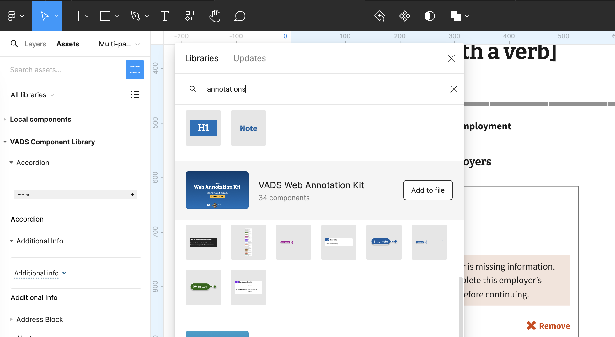
How to use the library
Most annotations have three symbols: details card, lasso stamp, and pin stamp.
Pin
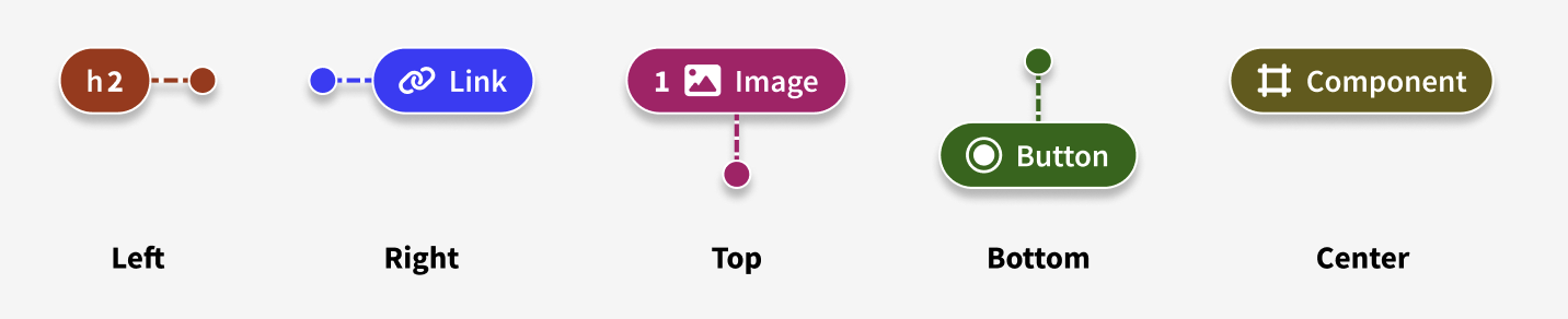
Lasso
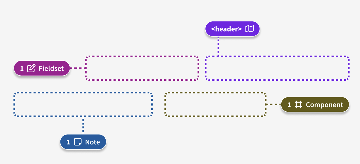
Details card
Figma for details card examples
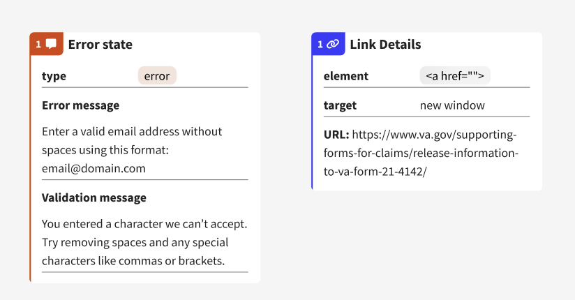
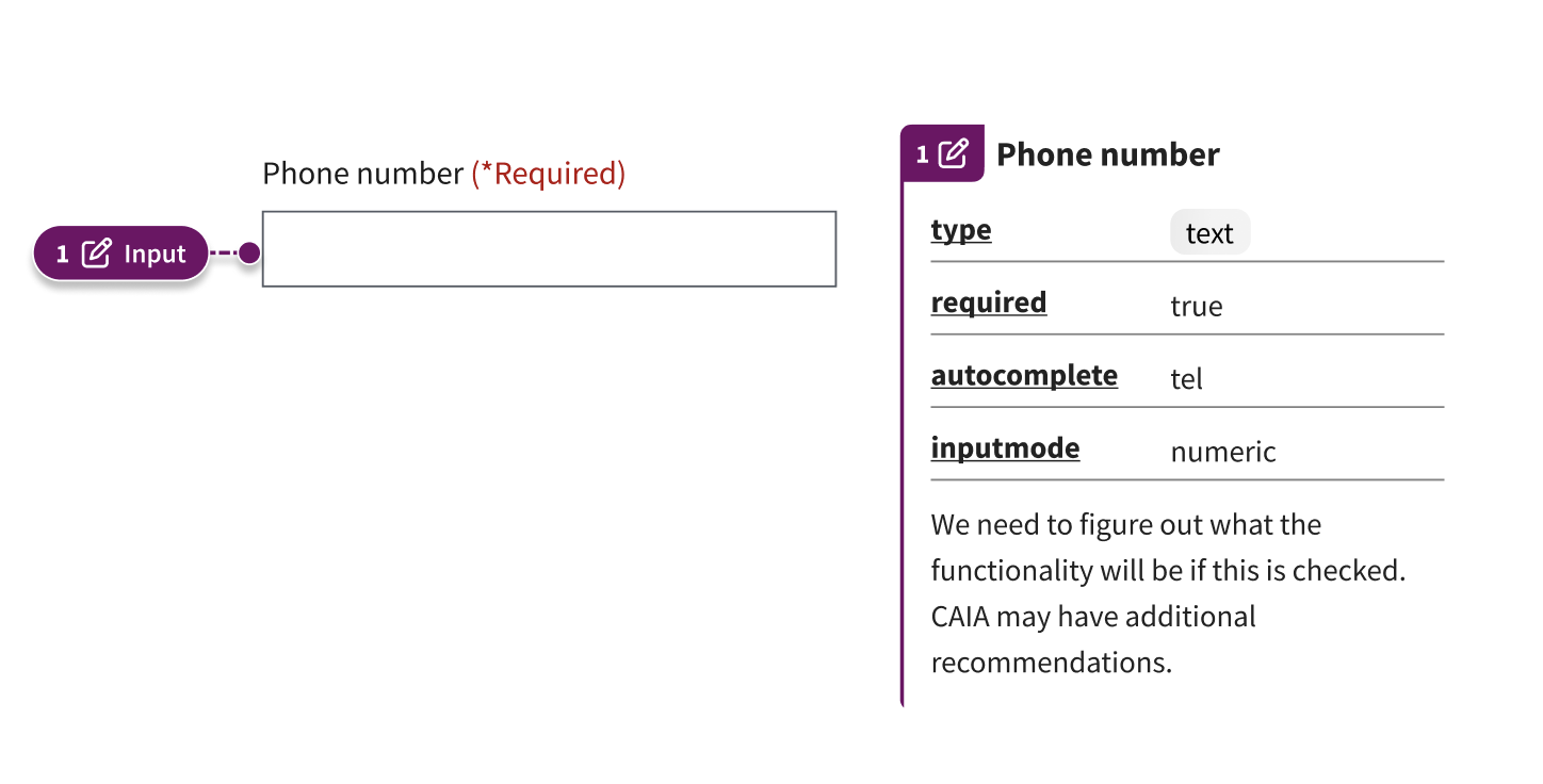
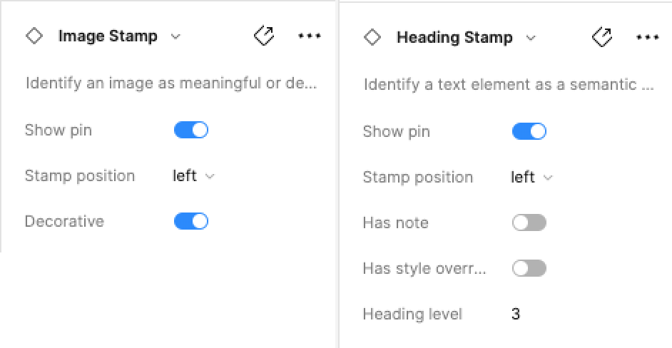
Some detail cards have underlined elements. For example, on the “Input” details card, “type,” “required,” “autocomplete,” and “inputmode” are all underlined. Selecting the underlined element will navigate you to the MDN Web docs page to learn more about that element.
Figma for details card - input type example
Different detail cards will have different information you can toggle or fill in. Check the right-hand panel of Figma to see what you can edit for each annotation symbol.
Types of annotations available in the library
Included in the library are multiple formats of annotation components. Keep in mind that not all of these annotations are required for every application all of the time. This is just what’s available to you in the library. You’ll use your own experience and discretion as to what to use, and we’ll provide some guidance further below.
- Buttons - Interactive elements that perform an action, such as submitting a form or opening a dialog.
- DS - Allows you to provide more details about components or patterns that are part of the VA design system.
- Feedback - Identifies error messages, warning messages, and other communications to the user.
- Focus order - A sequential order of focusable components that preserves meaning and operability.
- Headings - Semantic levels within a page’s section hierarchy.
- Images - Describe informative with alt text or mark decorative images.
- Inputs - Fields and controls for forms to accept data from users.
- Landmarks - Regions of a page that a user might want quick access to.
- Links - Interactive elements that navigate to web pages, files, or anything that changes a URL.
- Lists - Ordered or unordered lists of similar components.
- Notes - Any details that don’t fit into the other annotation categories. For example, if you’re uncertain how an interaction may work (eg. for assistive technology users) and want to call attention to that unknown.
- Reading order - The sequential order in which assistive technology will read content.
- Utilities - Several references to aid in the developer experience.
For more detailed information about the annotation symbols, refer to the CVS Wiki.
What you should annotate in applications
Annotations are most valuable for anything not visible or explicit in the design. Another way to think about it is when an engineer needs to make decisions about something that’s not baked into a component or forms library code; the design should be annotated.
For example, engineers have to make decisions about:
- Heading levels
- Aria labels & accessible names
- Where to place the fieldset/legend
- Error messages
- Focus management
Annotating these things ensures a more thoughtful handoff from UX to engineering.
You should also annotate instances where you’re using custom code that looks like a VA Design System component but isn’t. Then, in the annotation, you can provide an explanation of what behavior needs to be implemented that’s not available in the existing VADS component. You can use the “note details card” to do this.
You can use the component details card to call out specific VADS components that you are using in your design. Use the “DS Details” annotation to add notes about your particular use of the component.
Form annotations should cover elements below the breadcrumb and above the need help component at the bottom of the page.
We recommend that designers chat with engineers to find out what would be most helpful for them - everyone has a different level of expertise. When in doubt, it’s probably best to over-annotate than under-annotate.
Examples of how to use the annotation components
Heading levels
Figma for heading levels example
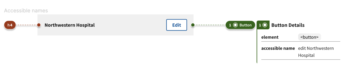
Accessible names
Figma for accessible name example
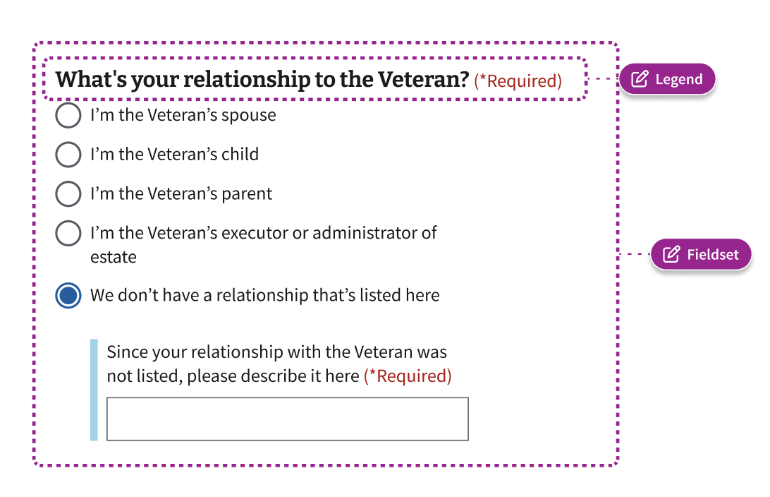
Fieldsets & Legends
Figma for fieldsets & legends example
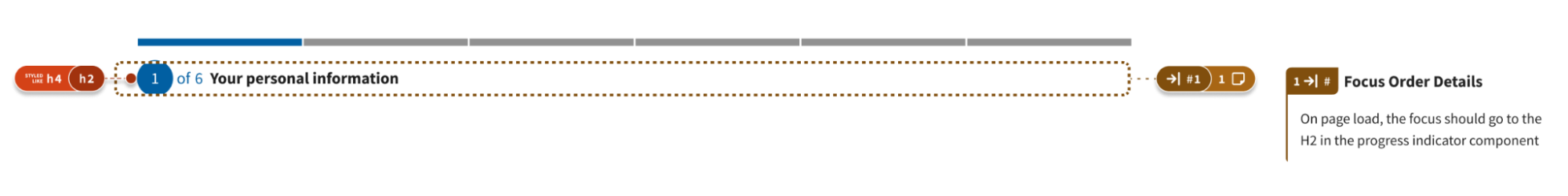
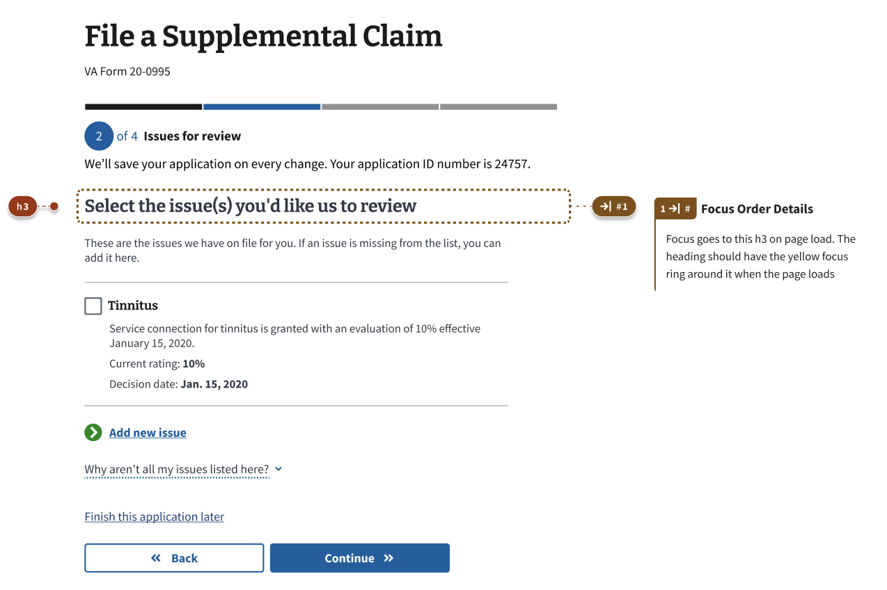
Focus order
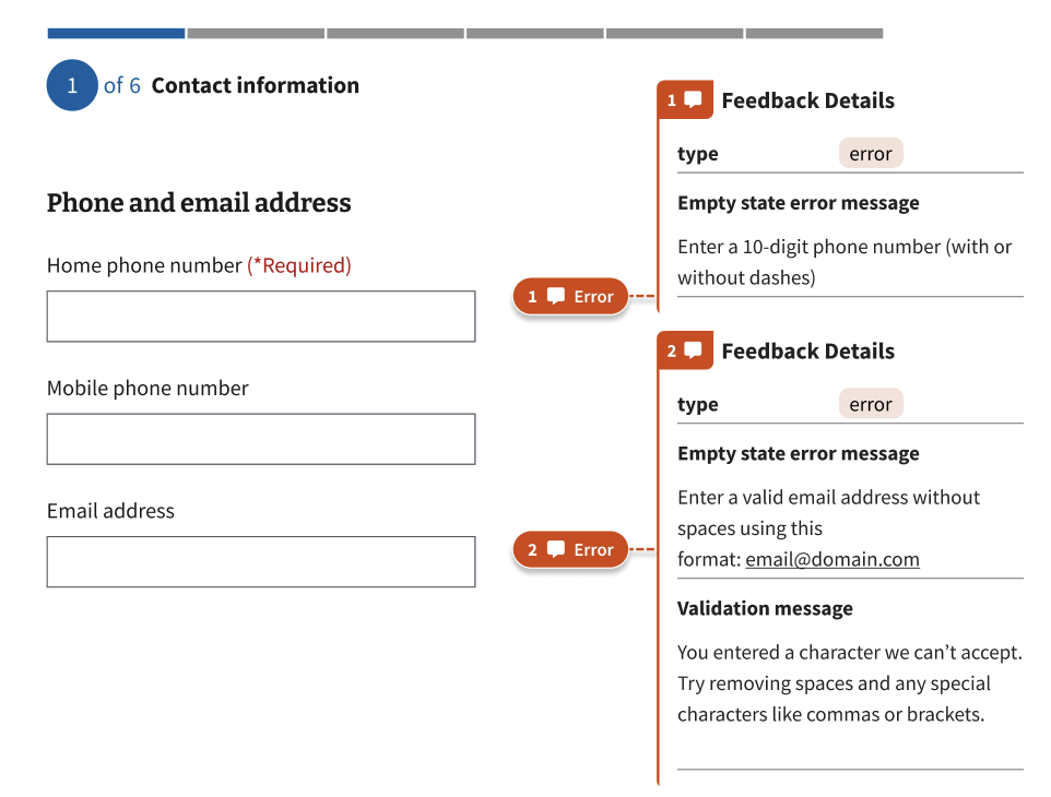
Error messages
Figma for error messages example
Annotations on static pages
Figma for static pages example
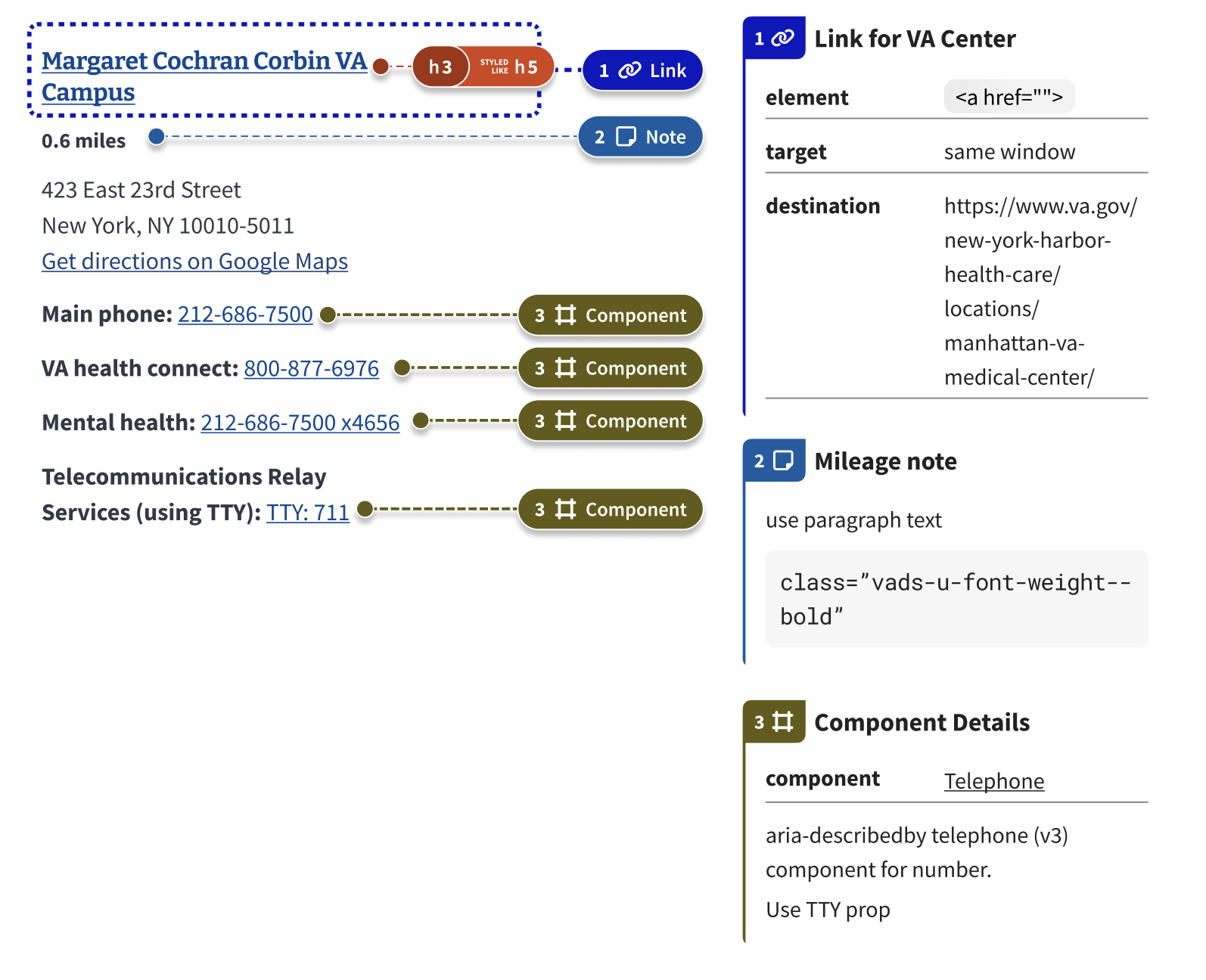
The DS details card also allows you to identify the VA Design system component you want to use. The card then links directly to the storybook guidance. Designers may leave notes in the details card calling out particular props or attributes the component may need.
Deep dive into why verbose annotations are often most useful
When annotating, it’s important to consider a few things:
- The level of accessibility expertise of the engineers who will be building the experience
- The level of familiarity engineers have with the VA design system
- If you have any custom components or patterns
In our experience, it’s better to over-annotate than under-annotate for a few reasons:
- It encourages communication between designers and engineers
- The annotating designer is forced to think through the experience more deeply and may catch issues that can be fixed with a simple design change
- It takes some guesswork out for engineers
Example 1
In Example 1, the first two parts of the screen were annotated with the “Additional files are required” alert and the “Review and sign” accordions.
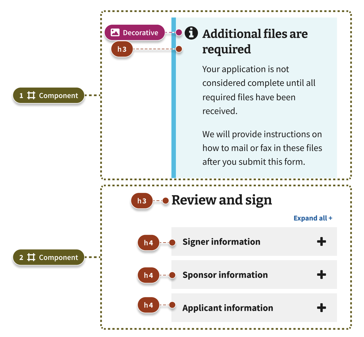
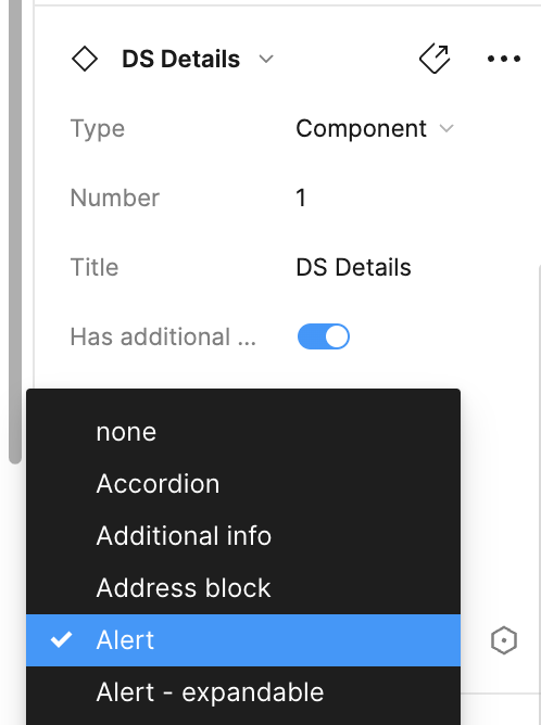
In theory, the alert could have been handled with just the DS annotation with the component type selected. To create the DS annotation, draw the border around the area with the DS Lasso stamp and then add the details card. Select the details card, and you will see “type.” For components, select components for patterns. select Patterns. You can choose the appropriate component at the bottom of the DS Details section.
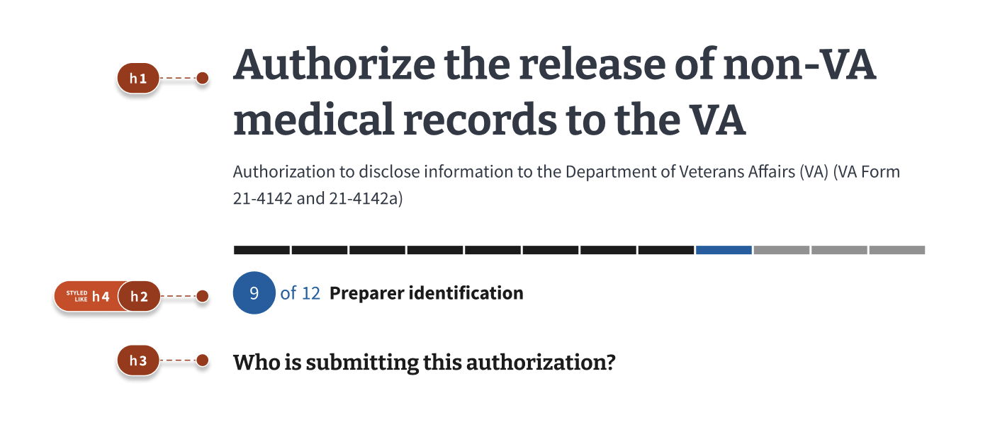
In this case, the designer also chose to annotate the image in the component as decorative and the heading level as an H3 to eliminate confusion for the engineer. Heading levels can be difficult for engineers to determine without understanding the intended experience, especially if the visual styling doesn’t match the information architecture.
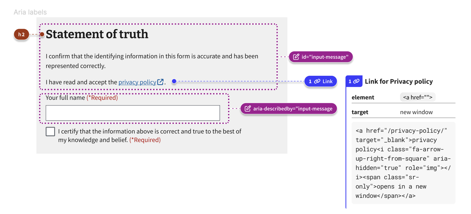
The second part of the screen the designer chose to annotate was the “Statement of Truth” component. Again, this could have been handled with the DS pattern stamp, but there is enough nuance here that the designer chose to annotate further.
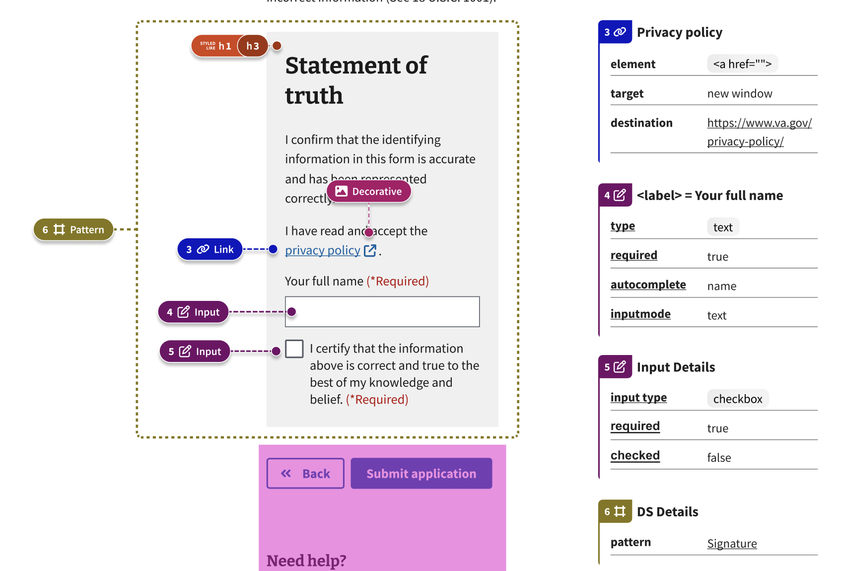
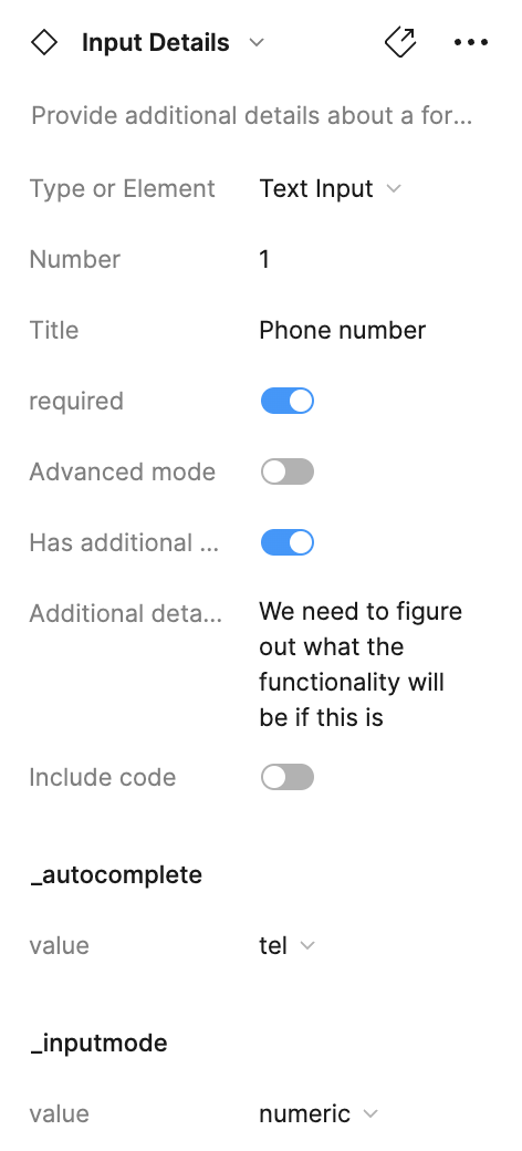
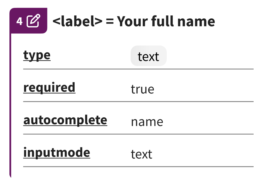
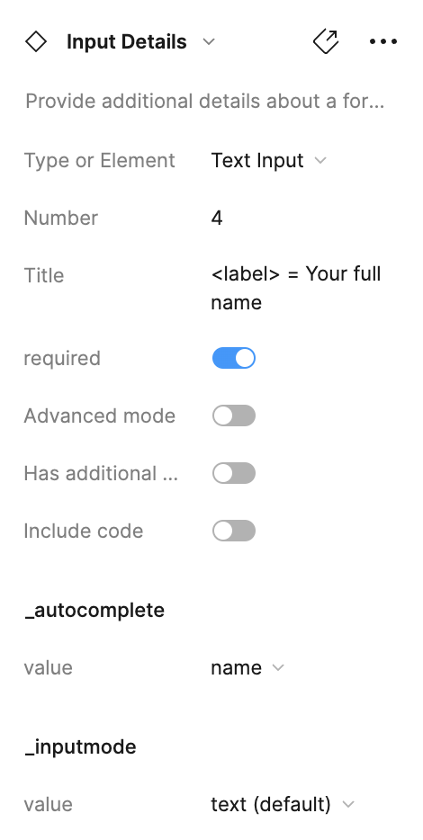
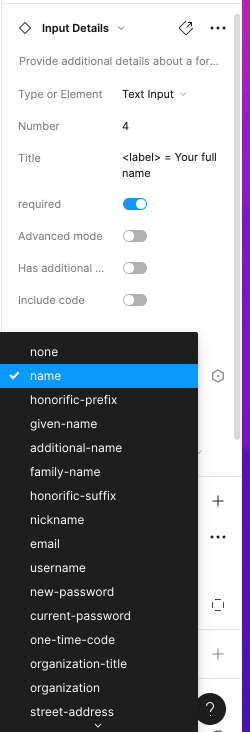
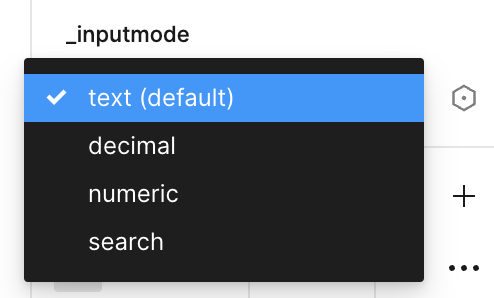
First, though the heading visually looks like an H1, in the page’s information architecture, it functions as an H3. The designer also wanted to communicate that the link target would open in a new window while marking the icon appended to the link as decorative. The designer also wanted to communicate further details about the inputs with the engineers. For example, the details card for inputs allows you to choose the input type, whether or not the field is required, autocomplete details, and the input mode.
Input details card
Input Details menu
Autocomplete options
Input mode options
Example 2
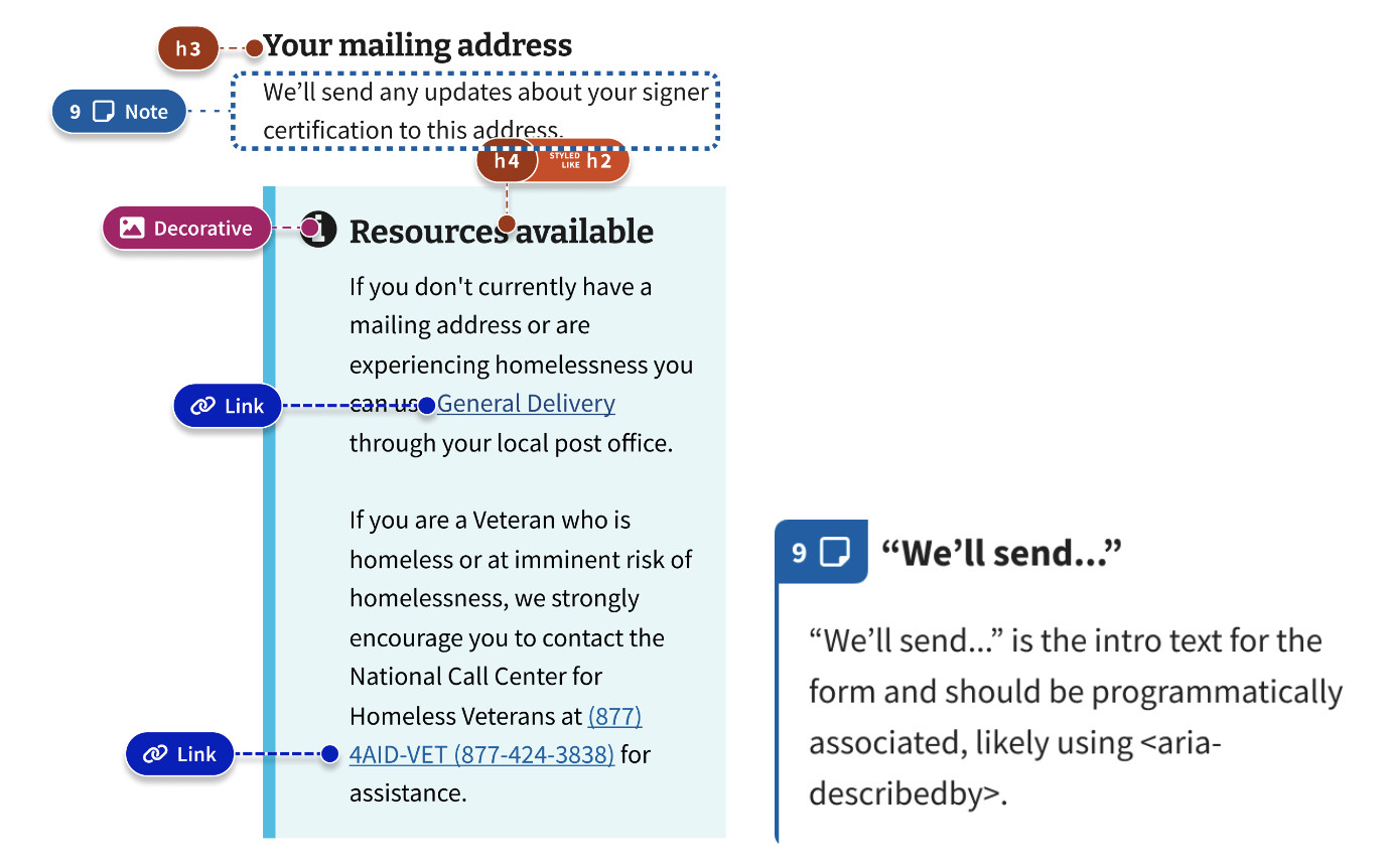
In Example 2, the first part of the page that was annotated was the form’s intro text (Note 9) and the “Resources available” info alert.
Note 9 demonstrates how annotations can create conversations between designers and developers. The designer knew the intro text needed to be programmatically associated with the form so that assistive technologies operating in forms mode wouldn’t miss the crucial information. The designer suggested <aria-describedby> and noted that the text should be programmatically associated, but also left room for the engineer to figure out the best way to make those associations and perhaps use a different ARIA label if there was a better fit. This annotation led to discussions between the designer and engineer about the best way to create a smooth user experience.
The designer also annotated the alert component more in-depth for a few reasons. First, it contained an H4 styled like an H2; second, it contained links that do not come standard in that component.
The second part of Example 2 that the designer annotated was the address input area.
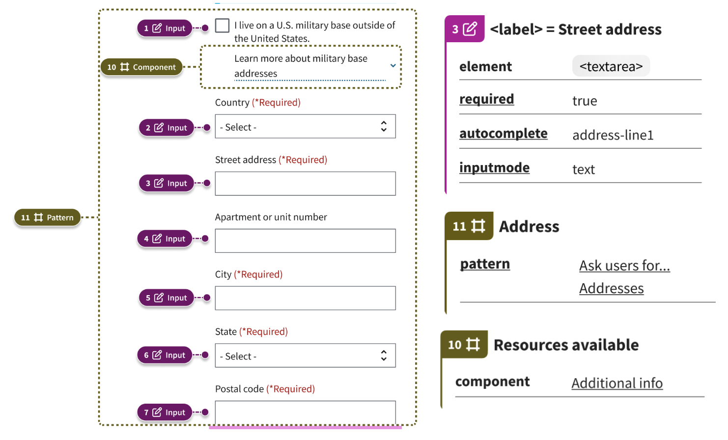
In theory, since the whole address input is a pattern in the design system, it could have been handled with the “Pattern” annotation component and details card.
However, since this was the first time the designer was collaborating with their developers, they wanted to provide extra details. The designer decided to annotate the “Learn more about…” using the Additional info component, as well as the individual address inputs to provide additional information on proper elements and autocomplete features.
Make annotations a communication tool
Annotations help designers and engineers think about accessibility throughout the design and development process. Designers can use annotations to make sure they’ve thought through the experience of assistive technology users, keyboard users, and others. And engineers can use annotations to know how to make those designs accessible through code.
Each team may utilize the annotation kit differently, but you’ll only know what works best for your team through constant communication between designers and engineers.
As teams mature, the way you annotate today may be different than how you annotate in the future.
Here are some examples of form annotations from various teams:
Annotations and the Collaboration Cycle
Platform Governance team recommends that you provide annotations with your finalized prototypes at midpoint review. This gives the Governance team accessibility specialist insight into the decisions you’ve made up to that point and is an opportunity for them to suggest changes prior to your engineer hand-off. If you have any open accessibility questions, your annotated prototype is a good opportunity to surface them with the Governance team.