
Components
Link
use: deployedExamples
Web
Default
 View va-link in Storybook
Back
View back va-link in Storybook
Active
View active va-link in Storybook
Calendar
View calendar va-link in Storybook
Channel
View channel va-link in Storybook
Download
View download va-link in Storybook
External
View external va-link in Storybook
Video
View video va-link in Storybook
Mobile
Default
View va-mobile__link–default in Storybook
Attachment
View va-mobile__link–attachment in Storybook
Calendar
View va-mobile__link–calendar in Storybook
Directions
View va-mobile__link–directions in Storybook
External link
View va-mobile__link–external in Storybook
Phone
View va-mobile__link–phone in Storybook
Phone TTY
View va-mobile__link–phone-tty in Storybook
Text (SMS)
View va-mobile__link–text in Storybook
Usage
When to use a default link
- Navigation between pages. Navigating to another page (internal or external).
- Navigation within a page. Anchor, or jump, to a specific header and section on a page.
- Trigger an appropriate supporting application. Make email addresses and phone numbers open the relevant app by clicking or tapping them.
When to use an Active link
- Collections, such as Hub pages. Active links can be seen on Hub pages
- Less prominent links. For links that need less prominence than an Action link and may appear in a collection, we recommend using an Active Link. Active Links have a hover behavior that includes a background color change and an animated right-facing chevron icon for more emphasis.
When to use a Back link
- As a replacement for breadcrumb on:
- Conventional Multi-step Forms that also:
- Have a minimal header and minimal footer
- Follow the one thing per page pattern pattern
- Use the
H1element to represent the headline for the current form page, rather than the step title in the step indicator - Include only a
Continuebutton and do not have aBackbutton after the form
- Short Forms that has a small amount of short, concise steps. For example, the Pact Act Wizard.
- Non-Form Pages where the current page was accessed from a related page and does not have additional navigation. For example, an appointment details page.
- Conventional Multi-step Forms that also:
When to use a Calendar link
- Adding an event to a calendar. Use when the link adds an event to a digital calendar.
When to use a Channel link
- YouTube channel. Use when linking to a YouTube channel.
When to use a Download link
- Downloading files. Use for download links including but not limited to PDFs and Excel files.
When to use a Video link
- YouTube Video. Use when linking directly to a YouTube video.
When to consider something else
- Use buttons for actions. Use a Button when you want to make a state change or submit a form. Example actions include, but are not limited to, “Add”, “Close”, “Cancel”, or “Save”. Buttons do things, links go places. Refer to guidance on Links vs. buttons
- Use action links for calls-to-action. When you want to draw attention to an important call-to-action (CTA) on the page, such as a link that launches a benefit application, use an Action link. Calls-to-action are not actions themselves (see the previous point).
- Table of contents. When you want to make a long page of content with two or more H2s easier to navigate, use an On this page link.
- Triggering the generation of a PDF. When using for a PDF, use only for linking directly to a PDF, not as a trigger for a process that generates a PDF. For generating a PDF, use a button.
How this component works
- Use icons as defined. Icons defined in the link variations above are reserved for that distinct usage. These icons should not be used for another purpose without explicit permission to do so from the Design System Council.
Implementation details
If for some reason you do not use a link web-component links must meet the following criteria:
- All links use Source Sans Pro (Regular), underlined, at vads-font-size-source-sans-normalized.
- All links share the same color, vads-color-link for icon, link text, and underline. On mobile, dark mode changes the link color to vads-color-link-on-dark.
- All text links should be underlined. This is especially important for low-vision users. (Exception: side navigation links should not be underlined.)
Behavior
Web
- Open links in the same window, with exceptions. Links on VA.gov should open in a new tab only if clicking the link will cause the user to lose progress or data. This should be avoided when possible. In all other cases, links should open in the same window.
Review guidance on link text in the content style guide for more information - Use appropriate encodings for email and phone links. Use mailto: for email links and tel: for phone links.
Choosing between variations
Review “Usage” for guidance.
Mobile
- Link opens within the app:
- In a full panel if the content is within the app.
- In a webview if the content is not within the app and does not require a separate sign-in.
- Link opens another app:
- In the browser app if the user needs to sign in to access the content or is being linked to a third party. Always use a native alert to warn the user before leaving the app. Once confirmed, open the default browser app.
- If the user is performing an action such as making a phone call, getting directions, or downloading a file. Consider using a confirmation message (like a native alert or action sheet) to warn the user before leaving the app. These variants include the onPress logic for app teams, ensuring a native confirmation message is displayed when needed.
- Attachment: Display the attachment in the app with the ability to download to their device.
- Calendar: Display the event information to allow the user to review and confirm before adding to their calendar. Once confirmed, add to the default calendar app.
- Directions: Display an Action Sheet to allow the user to select their preferred maps app (Apple Maps, Google Maps, etc.). Once selected, open the maps app with the destination.
- Phone: Display an Action Sheet to allow the user to confirm the phone call. Once confirmed, open the default phone app.
- Phone TTY: Display an Action Sheet to allow user to confirm the TTY call. Once confirmed, open the default phone app.
- Text (SMS): Open the default messages app.
- NOTE: The Link component currently does not support inline links. A Paragraph component will be created in the future to support inline links, ensuring proper text wrapping and accessibility in React Native.
Code usage
Links to content in another language
Links that point to localized content in another language should have an hreflang attribute and a lang attribute in the following format:
<a
  href="#"
  hreflang="es"
  lang="es"
>En Español</a>
Content considerations
Refer to the Content Style Guide on Links.
Accessibility considerations
- Material honesty. Do not style a link to look or behave like a button (material honesty).
- Keyboard navigation. The user must be able to navigate to links using the Tab key and activate links using the Enter key.
- Purpose and target. Link text that doesn’t indicate a clear purpose or destination makes it harder for everyone–especially screen reader users–to understand where they’re getting routed off to.
- External links must indicate that they are external. Follow the methods detailed in linking to external sites.
- By default, the link component’s external link variation will append the text, “(opens in a new tab)”, instead of using an icon. This follows Techniques for WCAG 2.0 advice on providing users with both a spoken and visual warning that this link opens in a new tab.
Choose the right element: Buttons vs. links
Many people struggle to select the right element when choosing between a button or link. Making the right choice can help make an interface easier to use, especially for people who use assistive technology. Buttons and links are the primary ways users interact with information on a web page. Links are for navigation; buttons are for action.
Accessibility problem being solved
In general, make links look like links and buttons look like buttons. Designing buttons as buttons and links as links improves usability and accessibility by:
- Setting honest expectations of interaction behavior
- Providing clear signifiers of affordances
- Creating experiences that are consistent with web standards
Assistive technology users rely on proper semantics to access web content. They may choose to navigate by button, or link, depending on what they’re looking for. It’s vital that our content meets users’ expectations - link items, coded as buttons, could make those links hard to find, for example.
Button and link confusion can be very frustrating for assistive technology users. A user with a screen reader may pull up a list of links and may not find a specific link because it turns out that it’s been designated as a button in the markup. It is important to use Action Links for calls to actions that link to another page rather than buttons, because screen readers always say “link” before links, and “button” before buttons.
Ideal state
Buttons are:
- Used for actions, including:
- Submitting a form
- Opening a modal
- Changing the state of something (such as “Back / Continue” buttons on a form)
- Expanding something (like an accordion)
- Created using the Button component or Button group component, or with standard semantic HTML button
- Styled to look like buttons and shouldn’t include link signifiers, such as underlines
Links are:
- Used for navigation:
- Navigation bars
- Skip links / jump links (such as the On this page component)
- Links to internal web pages
- Links to external websites (read the Content style guide for additional information)
- Links to PDFs, whether static or generated on the fly
- Rationale: The final product is a file, and the Veteran may not know that the PDF is generated on the fly.
- Exception: If the trigger to generate the PDF is “Generate PDF,” “Create PDF,” or other phrases that explicitly call out the “action” nature of the generation, use a button.
- Created using the Link component, the Action link component if you need extra visual emphasis, or with standard semantic HTML link
- When a file download is involved, it is best to use the download link component. This is because links are intended for navigation, and downloading a file is a navigational action to a resource.
- Styled to look like links and shouldn’t include button signifiers, such as borders
Implementation notes
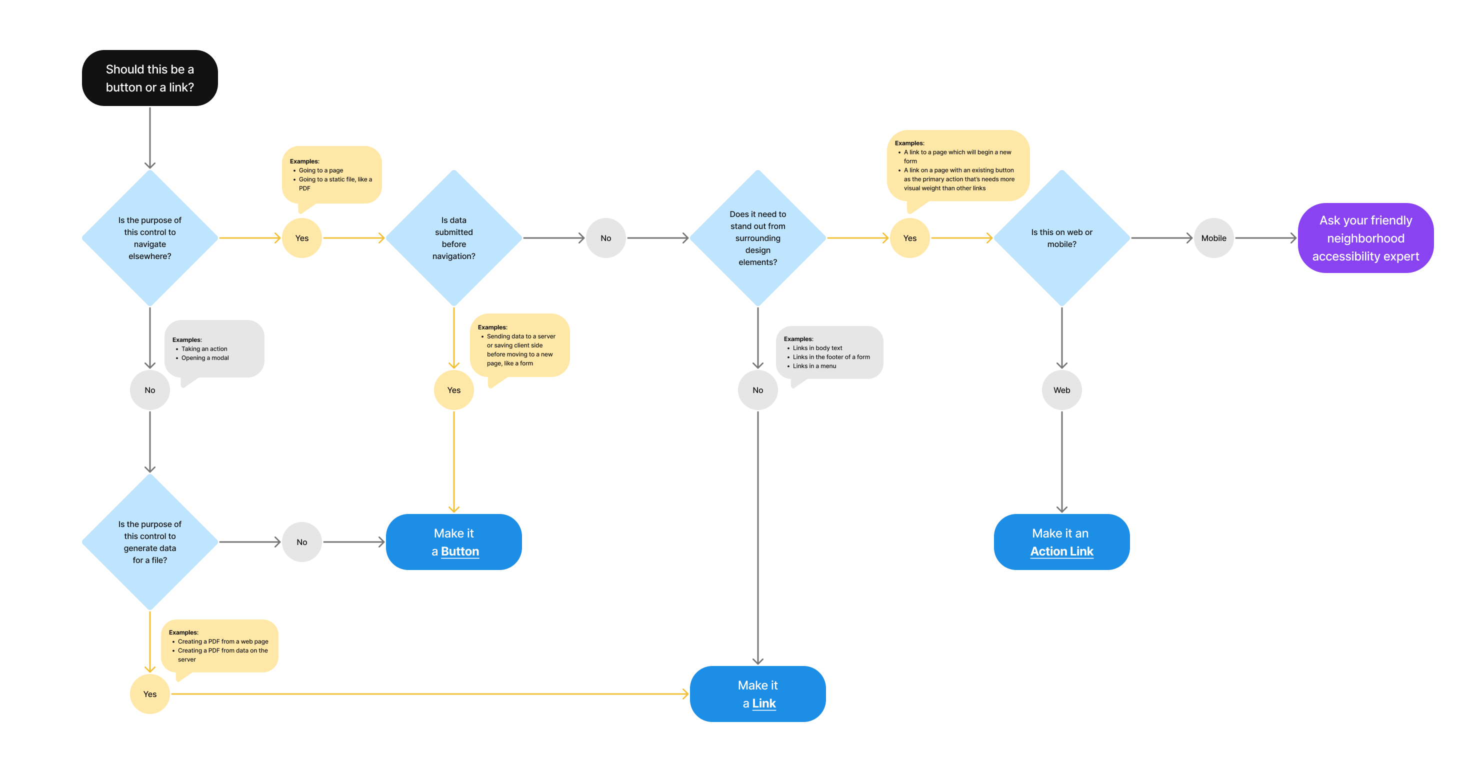
Should this be a button or link?
- Is the purpose of the control to navigate elsewhere?
- Yes
- Examples: Going to a page; Going to a static file, like a PDF
- Is data submitted before navigation?
- Yes
- Examples: Sending data to a server or saving client side before moving to a new page, like a form
- Make it a Button
- No
- Does it need to stand out from surrounding design elements?
- No
- Examples: Link in body text; Link in the footer of a form; Links in a menu
- Make it a Link
- Yes
- Examples: A link to a page which will begin a new form; A link on a page with an existing button as the primary action that’s needs more visual weight than other links
- Is this on web or mobile?
- Mobile
- Ask your friendly neighborhood accessibility expert
- Web
- Make it an Action Link
- Mobile
- Is this on web or mobile?
- Examples: A link to a page which will begin a new form; A link on a page with an existing button as the primary action that’s needs more visual weight than other links
- No
- Does it need to stand out from surrounding design elements?
- Yes
- No
- Is the purpose of this control to generate data for a file?
- Examples: Creating a PDF from a web page; Creating a PDF from data on the server
- Yes
- Make it a Link
- No
- Make it a Button
- Is the purpose of this control to generate data for a file?
- Yes
Avoid turning headers into links in most contexts
Why avoid headers as links?
- Cognitive load and user expectations. Headings serve as structural elements that help users with assistive technologies understand page organization. When a heading is also a link, it creates dual functionality that can confuse users. Screen reader users may not expect headings to be actionable.
- Challenging keyboard navigation. Keyboard users tab through links as a primary navigation method. Headers that are links can be accidentally activated during normal page exploration.
- Confusing screen reader announcements. Screen readers announce headings and links differently. Combining them results in unclear announcements like “Heading level 2, link, Text,” making it harder to understand the element’s purpose.
- Unnecessary redundancy. The linked text in a heading is often repeated elsewhere on the page, creating distracting duplication.
When it’s appropriate to use links in headers
An exception can be made in the Card component, where:
- Space is limited, and combining the heading and link reduces visual clutter
- The card functions as a single actionable unit (such as linking to a detail page)
- The design makes the linked heading the primary call-to-action in the card, minimizing confusion
When it’s not appropriate
- In normal page content where headings primarily serve as organizational aids
- When multiple links are associated with the heading, making the primary action unclear
- When the link in the heading duplicates another visible link that immediately follows it
Privacy guidance
Links shouldn’t include Personally Identifiable Information (PII) or Protected Health Information (PHI).
- This includes the link text as well as the URL referenced in the link
Learn more on the URLs component page - If the link text must include PII/PHI, click events for that link can’t be tracked in analytics or other logs
Learn more on the Links page in the content style guide
Learn more about PII/PHI on the VA Platform website.
File downloads
- No PII/PHI can be in the names of downloaded files except for the user’s name and download date
- Include a reminder to delete files on a public computer