
Components
Form
Use: DeployedGet help creating forms
Learn how to digitize a form at the VA.
View documentation for building forms using the Forms Library.
Accessibility considerations for all form elements
Do not disable form elements
Disabling form elements is discouraged as a design crutch. Thus most of our form components do not support a disabled property. If you feel that you have a unique design problem that requires a disabled field you may lobby the accessibility Community of Practice and the Design System Council but know that, thus far, exceptions to this rule are rarely granted.
Do not disable buttons
Normally, with regular form controls, it is best to fully remove anything the user can’t interact with or which serves no purpose. However, disabling a “button” to act as a guide to the level of form completion (i.e. you are not able to proceed to the next step until the form contains enough data) is a common anti-pattern.
Disabled buttons don’t explain what’s wrong
When buttons are inactive, some users– particularly those with cognitive disabilities- may not know how to activate them. Disabled buttons don’t explain what’s wrong. They communicate that something is off, but very often that is not enough information. As a result, users are left wondering what’s actually missing, and consequently are locked out entirely. For example, if someone were to type in a short acronym like “VA” to search and the button doesn’t become accessible, they may think the search field is broken.
In addition, disabled buttons can be unintentionally read out and accessed by mobile screen readers using touch controls.
What to do instead
While it is technically possible, we strongly discourage disabling buttons. Here are recommendations on how to handle specific interactions:
- Lack of required fields. When a user attempts to submit a form without entering all required form fields:
- Announce the error and shift focus to the first unfilled required form field.
- Properly indicate required form elements (the right thing will happen for you when you use the required property on form fields in the Design System).
- No longer valid options. If certain options in a form are no longer valid then there are two options:
- Replace the form elements that can no longer be changed with text representing the current value instead of the current value within a disabled input.
- Hide the form elements that are no longer valid.
Is it ever valid to disable a button?
Post-form submission or post-action it can be appropriate to disable the submit or action button as the system is in-between states and loading or taking action. This behavior is often seen on buttons that make a purchase or reservation to prevent the user from accidentally triggering the action multiple times.
Fieldsets, legends, and labels
Best practices
Quick HTML Tutorial
<input> is how a user enters information (radio buttons, text boxes, etc.)
<label> tells a user what the <input> is for
<fieldset> puts more than one <input> into a group, and <legend> describes the group.
Accessibility problem being solved
By placing the checkboxes or radio buttons in a fieldset, and the appropriate label or question for the options in the legend, the label or question is programmatically connected to the presented options. Without this programmatic association, screen reader users would only hear the labels on the radio button or checkboxes announced and wouldn’t know why they should choose a particular option.
You can also use fieldsets and legends to multiple questions about the same topic. For example, an address is composed of many fields for street, city, state. You may place the words “Mailing address” in the legend, and all of the address fields in the fieldset. This helps users understand that you are collecting a mailing address vs. some other type of address.
When to use a fieldset and legend
You should use fieldsets and legends when:
- You ask a question that has multiple choices (using radio buttons or checkboxes)
- You have several items you need to group relating to the same topic (like with text inputs, selects, etc)
When not to use a fieldset and legend
You should not use a fieldset and legend when:
- You have a single form field where the label is descriptive enough to capture the information needed.
Ideal State
Example 1 - Text input
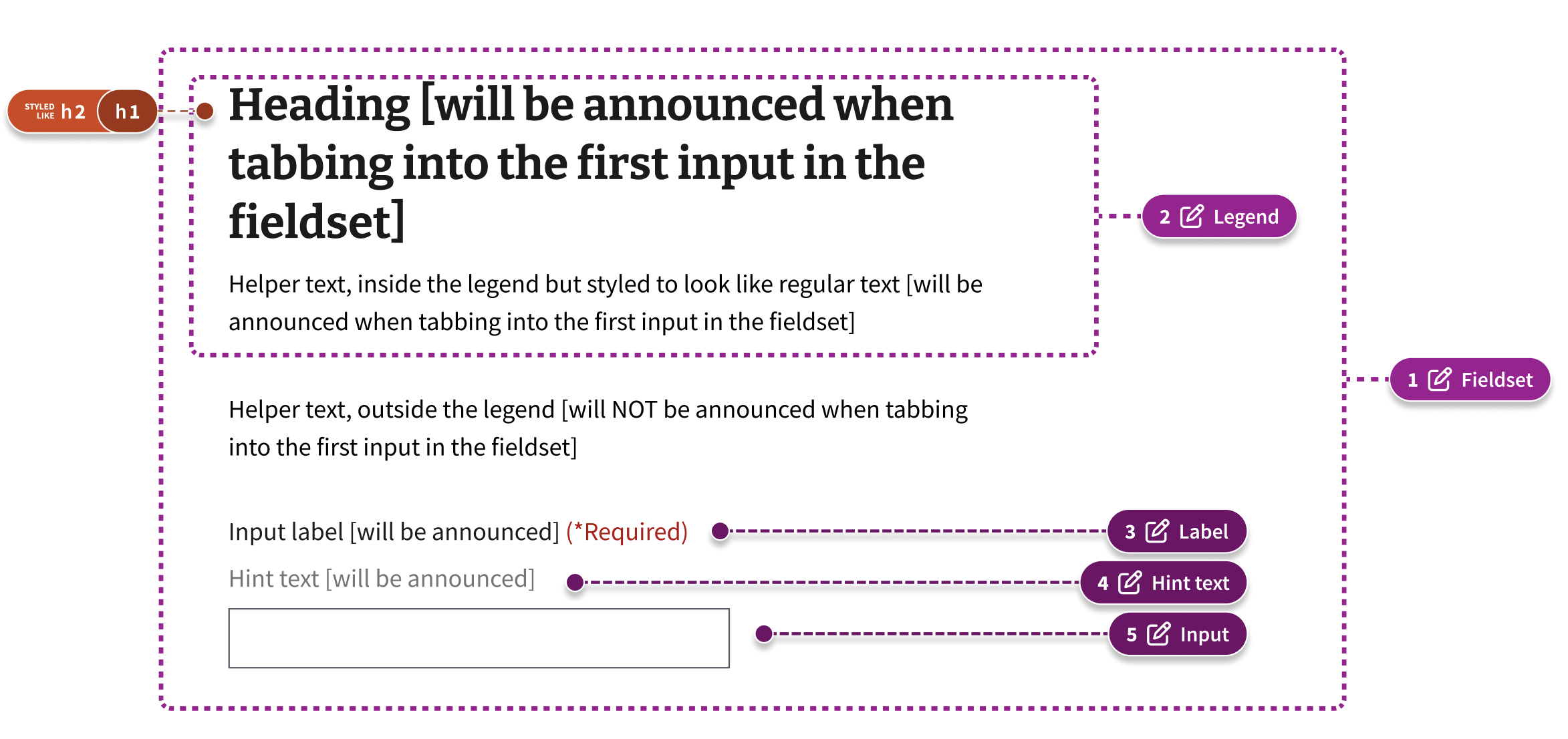
Coded example
<fieldset>
  <legend>
    <h1 class="some-heading-class">Heading [will be announced when tabbing into the first input in the fieldset]</h1>
    <span class="some-helper-text-class">Helper text, inside the legend but styled to look like regular text [will be announced when tabbing into the first input in the fieldset]</span>
  </legend>
  <p>Helper text, outside the legend [will NOT be announced when tabbing into the first input in the fieldset]</p>
  <va-text-input label="Input label [will be announced]" hint="Hint text [will be announced etc]" />
</fieldset>
Example 2 - Checkbox group
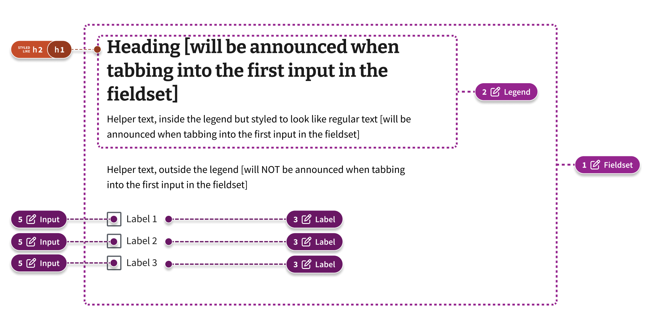
Code example
Other considerations
Headings as <label> or <legend>
There’s a semantic difference when you want to make a <label> a heading or a <legend> a heading.
For example, if you have only a text input or text area label, and you want to make that a heading, the heading tag has to be wrapped around the label.
Note: This is only partially supported in the VA Design System. More to come.
However, if you want to have a heading over a group of fields, or a checkbox/radio group, you will place the heading inside the legend
Content considerations
Besides a heading, strings of text can also be placed within the legend. However, they cannot have any other semantic meaning. List items cannot be placed in a legend. Links, or multiple paragraphs also cannot be placed in a legend.
Designers should consider only adding text that is necessary for screen readers to understand the context of the question or task. Adding a lot of text can lead to verbosity that’s hard for some users to comprehend.
Focus management
Sending focus to the legend may cause the heading to be read multiple times depending on the screen reader.
Further Reading
- Foundations: grouping forms with
<fieldset>and<legend> - Use legend and fieldset (Adrian Roselli)
- Styling options for labels and fieldsets (Gov.UK)
- Fieldsets, Legends and Screen Readers again (TPGi)
- Grouping form controls with headings (Accessibility Developer Guide)
- How to guides: Making labels and legends headings (Gov.UK)
Error handling
View va-text-input with error in Storybook
 View va-text-input with error in Storybook
- In all cases, only show error validation messages or stylings after a user has interacted with a particular field.
- The form field and its corresponding
<label>are wrapped in a container which provides a thick border and padding to visual indicate an error message to users who might have difficulty perceiving contrast. It also changes the border of the input to red as a secondary indicator. - An error message is placed between the label and the form field.
- The form field receives an
aria-describedbyattribute that references theidof the error message. - Prepending
<span class="sr-only">Error</span>to error messages alerts screen readers clearly that an error exists.
Hint text
When a detailed form input label is not enough to convey the meaning or purpose of the input, we have three options for including additional context:
Default hint text
View Label with hint text in Storybook
This should be used in the case where the needed clarification is a little longer, but less than two sentences. These should ideally not wrap more than twice for a total of three lines.
Inline within the label
View Label with inline hint text in Storybook
This should be used in the case where the needed clarification is very short.
With Additional info
View Label with additional info hint text in Storybook
Using the additional info component should only be done in cases where the needed clarification is long, complex, requiring more than two sentences or multiple paragraphs, or special formatting (bullet points, links, etc.).
We want to avoid this variation when possible. Use of this component for this purpose is a last resort when attempts at reducing the content have failed. If a field needs a lot of explanation, it should ideally be moved to a distinct page with explanation on the page itself.