
Components
Input message
Don't use: Deprecated Web- Contributors
- Liz Lantz (VSA Authenticated Experience Team)
Examples
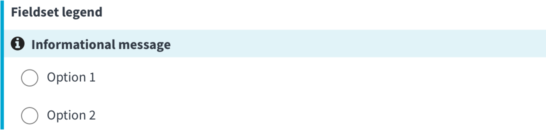
Informational
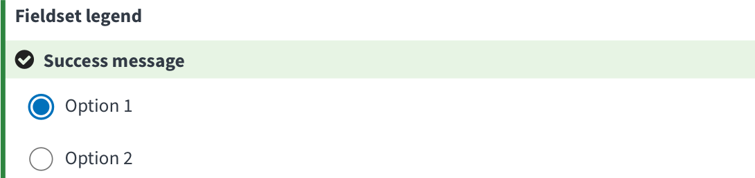
Success
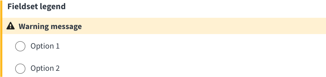
Warning
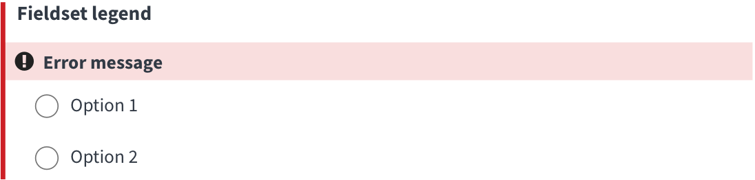
Error
Mock-ups
- Mock-up demonstrating an update to existing settings. First fieldset is interactive.
- Mock-up demonstrating use case of a Veteran who has never updated their settings.
- All field sets are interactive
- Last fieldset demonstrates error state
Usage
When to use this variation
This message pattern is a mobile friendly, in-line way to communicate information about inputs. It was developed to entice users to take an action on an optional input, and has 4 states:
- Success (green) communicates the successful update of information, via an API call
- Warning (yellow) draws attention to an input, usually before an API call is made.
- Error (red) communicates the failure of an update of information, via an API call
- Information (blue) draws attention to an input, usually before an API call is made.
When to consider something else
If you need to tell the Veteran they’ve missed a required field on an application, or they’ve entered data in the wrong format, use the current error pattern instead.
How to use Input Messages
- Keep message content short.
- Use the feedback icons from the design system (filter by Feedback category).
- Use the success, warning, error states on forms that don’t require the user to click a button to submit the form.
Other input message styles
Error messages
- When a user is filling out an online application, use the current error pattern when a user has
- missed a required field
- entered data incorrectly
Code usage
Radio inputs for notification settings
Accessibility considerations
-
Icon needs to have alternative text (use sr-only text or an aria-label) so screen readers have an equivalent understanding of the purpose/nature of the message.
-
When the message changes after a user interacts with an input, use
aria-live="polite"to announce the change.
Research
- This component was evaluated as part of a Feb 2023 usability study for VA.gov’s notification settings feature. The feature uses an auto-save functionality and relies on the input message pattern to communicate to users after they interact with an input.
- Participants stated the feedback provided by this compontent made them feel confident that their changes had been saved.
It’s notifying me that it’s been saved. I’m trusting that this is going to work and I don’t need to call. -P9
Component checklist
Web Platform
2 of 10 complete
Maturity
-
Guidance
-
Web
Examples, usage, code usage, content considerations, and accessibility considerations are all complete. -
Research
-
Web
VFS team conducted research on this component which is linked from this page. -
Stability
-
Web
Component has been in production for more than 3 months with no significant issues found. -
Adoption
-
Web
Multiple teams have adopted this component.
Accessibility
While this component has been previously tested against older criteria, it has not yet been audited with the updated testing criteria.
Code assets
-
Variations
-
Web
Storybook includes all variations (style, size, orientation, optional iconography, selection, error state, etc.) -
Responsive
-
Web
Component depicted in all responsive breakpoints. -
Interactive states
-
Web
Includes all interactive states that are applicable (hover, active, focus, keyboard focus, disabled). -
Tokens
-
N/A Web
All design attributes (color, typography, layout, etc.) are available as tokens. -
Internationalization
-
N/A Web
Describes i18n attributes.
Visual assets
-
Variations
-
Web
Figma library includes all variations (style, size, orientation, optional iconography, selection, error state, etc.) -
Responsive
-
Web
Component designed to work in all responsive breakpoints. -
Interactive states
-
Web
Includes all interactive states that are applicable (hover, active, focus, keyboard focus, disabled). -
Tokens
-
N/A Web
All design attributes (color, typography, layout, etc.) are available as tokens.
Legend:
-
Complete -
Incomplete - N/A Not applicable
Provide feedback
Share your feedback, report issues, or suggest improvements for the Input message component. Your input helps us make the design system better for everyone.
- Get immediate support in #platform-design-system for technical or urgent issues.
- Explore all feedback channels for additional ways to share your input.