
Components
Card
use: deployed WebExamples
Default
View va-card default in Storybook
 View va-card default in Storybook
With Background
View va-card with background in Storybook
With Drop Shadow
View va-card with drop shadow in Storybook
With Icon
View va-card with icon in Storybook
Usage
When to use Card
- Collections. Cards usually appear in a collection, rather than in isolation, contain identical or similar information, and are uniform in their look and feel so that users can easily scan the collection of related items and actions.
- Framing a call to action. Cards help highlight and frame a specific call to action or decision a user needs to take.
When to consider something else
- When you need a structured status card. Use Card - Status when you need a consistent, structured component with defined props for status, heading, body, and action link. Card Status enforces patterns for action-required scenarios and handles accessibility automatically.
- Eligibility information. When you want to show benefits or tools the user is currently enrolled in or has access to, use the Service list item component.
- Other content highlight. The Summary box component, which is the only card-like element represented in Drupal, is meant to act as a content highlight for the most important information on the page. It was originally intended to highlight eligibility information. Featured content is not a Card and you shouldn’t use them interchangeably. Use the Summary box once on the page, and don’t stack it in a list as you would the Card component or Service list item component.
- Dynamic content. Do not use a Card when inserting content into the page in response to a user action. In those cases use a variation of an Alert component.
- Forms - A Card is not a Fieldset. Use a fieldset to cluster related form fields into a sub-section of a form. The visual design of a fieldset should not mimic a Card.
- Large data - A Card is not a Table row. A collection of cards does not scale up to large data sets. If users need to compare large amounts of data consider a table.
- Navigation - A Card is not a Button or a Link. While a Card may contain a call-to-action link, it is not a navigation element. Do not use a Card to act as a large tap target.
When to use caution
- Search results. You can use cards as a treatment for search results depending on the density of the data. However, the card may in fact add unnecessary visual noise when displaying a list of results. In those cases, if the data density is low consider removing the card container and having rows of results. If the data density is high consider adding pagination and the ability to search and/or filter the results.
How this component works
Card is a flexible container component. Teams build and pass in their own content, giving them full control over the structure and elements within the card. Below are some examples on how teams can do this.
Default
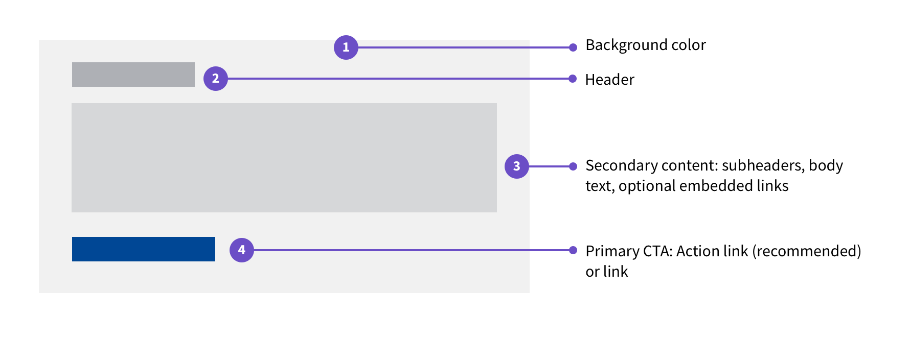
- Background color. White or $color-gray-lightest - set via component props.
- Header. Teams provide their own header content that summarizes the card.
- Secondary content. Teams provide body text, which can include any combination of text, dates, or other content.
- Call to action. Teams add their own links - typically an action link or link.
Note: You can use Tag - Status in either Card or Card - Status. Card Status is required if you need an error state on the card, as it’s the only card component that supports error states. Use Card Status when you need a consistent, structured pattern with a single action link. Use the default Card component when you need multiple calls to action or flexible content structure.
You can see these options in use in the variations below.
Variations
Choosing between variations
Currently (06/2025), there are 4 variations to choose from:
1. Default
This variation is the default. New variations of Card start with this variation as the base.
2. With Background
This variation was the previous default and is the Card variation most widely found across VA.gov. However, it is no longer preferred. Visually, it features a gray background ($color-gray-lightest) with no border or drop shadow.
3. With Drop Shadow
Use this variation for emphasis, for example at the top of a page or section, or as the primary card in a series of cards. When using in a series, use with the default white variation. Do not combine this variation with the default gray variation.
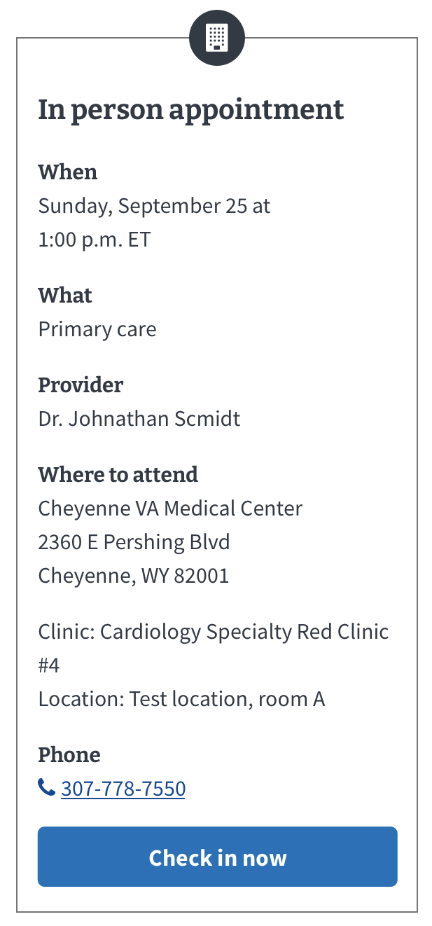
4. With Icon
Use this variation to provide additional descriptive information about the contents of the Card. For example, in the context of appointments this variation features an icon that helps differentiate between cards related to in-person and remote appointments.
Instances of this component in production
There are many instances of the Card component in production. This is not an exhaustive list but does serve to augment the examples above and highlight well defined instances of a Card.
Appointment, large with icon
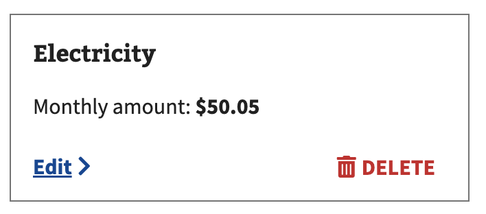
Financial Status Report
Media

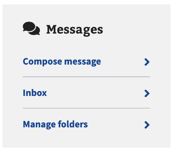
Navigation
Number highlight
With status indicator

Behavior
Calls to action
- Make cards actionable. A Card should be actionable. Accomplish this by using the action link component.
- Action links for primary CTA. Use an action link for the primary call to action.
- Max 3 CTAs. A card should not contain more than three calls to action (CTAs).
- Secondary and tertiary actions. Secondary and tertiary actions can use the secondary variation of action link, an active or other link variation, or a default link.
Placement
Dimensions
Cards use the following widths:
- $mobile up to $medium-screen:
- Card maximum width = 304px
- Card minimum width = 280px
- $medium-screen through $desktop-lg and above:
- Card maximum width = 752px
- Card minimum width = 384px
Layout
Cards can sit inside or outside of a grid layout. Cards start with 1.5 spacing units (1.2rem/12px) below each card to separate them. Then the spacing increases to 2 spacing units (1.6rem/16px) of margin on all sides at the $medium-screen and above breakpoint.
Code usage
Not a Card
There are a few design elements that look like a Card but do not behave like a Card and are actually instances, or variations, of other components or are simply containers that share the same background color as a Card. These Card adjacent designs should not be thought of as a Card component and do not adhere to the guidelines defined here.
Containers for links in the Mobile app
The Mobile App uses a Card-like container around an active link to make the link a large tap target on mobile. Think of this treatment as a mobile-specific link variation rather than an instance of a Card.
Containers for asking users for multiple responses (aka List and Loop) in forms
The pattern for asking users for multiple responses (aka List and Loop) uses a Card-like container to enter the loop to edit or remove an item in the list. This treatment is specific to that pattern—don’t think of it as an instance of a Card.
Containers for radio button tiles and checkboxes
A radio button tile has a title and description within the label and a Card-like container around the radio button and label. You can see this treatment in the Radio button - Tile variation. It is also in use around checkboxes in parts of VA.gov. This treatment is specific to radio buttons and checkboxes—don’t think of it as an instance of a Card.
A list of services or tools
View va-service-list-item maximal example in Storybook
When you want to show benefits or tools the user is currently enrolled in or has access to, use the Service list item component instead of the Card component.
Content considerations
- Concise headers and text. Keep card content (especially header text) short, crisp, and to-the-point: Users should be able to glean the most important information at-a-glance, and have the option to view additional details by clicking a link or action link.
- Translation proof. Avoid using dynamic content within the middle of a sentence to future-proof the card for translation.
Accessibility considerations
- Use the appropriate heading level for your page. Set the heading level based on the content of your page to make sure card headings are in the correct, logical outline order. Use CSS to style the header visually if you need a different visual representation.
- Use unordered lists and list items. Use a
ulfor a card group and anlifor each card. This formatting allows screen readers to enumerate the items in the card group and allows shortcuts between list items. - Keyboard navigation. The tab key should bring focus to the call to action within the card. The enter key or spacebar should open a Link or Link - Action.
Related
- Card - Status - Use when cards need to display status information
- Service list item - Use for benefits or tools the user is enrolled in
- Eyebrow heading - A small, scannable heading to group cards or pages
- Section titles
- Link - Action
- Link
Component checklist
Maturity
-
Guidance
-
Web
Examples, usage, code usage, content considerations, and accessibility considerations are all complete. -
Research
-
Web
VFS team conducted research on this component which is linked from this page. -
Stability
-
Web
Component has been in production for more than 3 months with no significant issues found. -
Adoption
-
Web
Multiple teams have adopted this component.
Accessibility
While this component has been previously tested against older criteria, it has not yet been audited with the updated testing criteria.
Code assets
-
Variations
-
Web
Storybook includes all variations (style, size, orientation, optional iconography, selection, error state, etc.) -
Responsive
-
Web
Component depicted in all responsive breakpoints. -
Interactive states
-
Web
Includes all interactive states that are applicable (hover, active, focus, keyboard focus, disabled). -
Tokens
-
Web
All design attributes (color, typography, layout, etc.) are available as tokens. -
Internationalization
-
Web
Describes i18n attributes.
Visual assets
-
Variations
-
Web
Figma library includes all variations (style, size, orientation, optional iconography, selection, error state, etc.) -
Responsive
-
Web
Component designed to work in all responsive breakpoints. -
Interactive states
-
Web
Includes all interactive states that are applicable (hover, active, focus, keyboard focus, disabled). -
Tokens
-
Web
All design attributes (color, typography, layout, etc.) are available as tokens.
Legend:
-
Complete -
Incomplete - N/A Not applicable
Provide feedback
Share your feedback, report issues, or suggest improvements for the Card component. Your input helps us make the design system better for everyone.
- Get immediate support in #platform-design-system for technical or urgent issues.
- Explore all feedback channels for additional ways to share your input.